Supermarket Decor is not something we have an excess of in Houston. In fact, in a talk with Randall Onstead, I had a while back, we discussed the declining role of style and looks in grocery. Randall expressed that there was a disconnect between the older generations, who valued looks and feel, and modern shoppers, who were price-conscious above anything else. The emphasis on everyday low prices means grocery shopping really isn’t what it once was. Even if we’re still asked for paper or plastic, when was the last time someone carried your order out to the car? It’s a decline that has not been equal; for example, in the Northwest, design and service still seem to reign supreme. However, there is something to be said about a modern look. While I do love stores like Reasors (which based their stores off Texas grocers!), the design language is completely different from that of the rest of the U.S. The “national” design language has evolved over the last decades to become very neutral tone-based and with clear graphics. When Whole Foods announced a new store at the base of a residential tower in the late 2010s, I didn’t know what exactly to expect. The WFM locations I had been to emphasized Earth Tones and natural woods in a sort of sterile concrete environment. When I finally visited the location, shortly after its closing was announced, I was surprised to find that Whole Foods had thrown out most of what I knew about its design language. According to an employee, this store was meant to fit into the community.
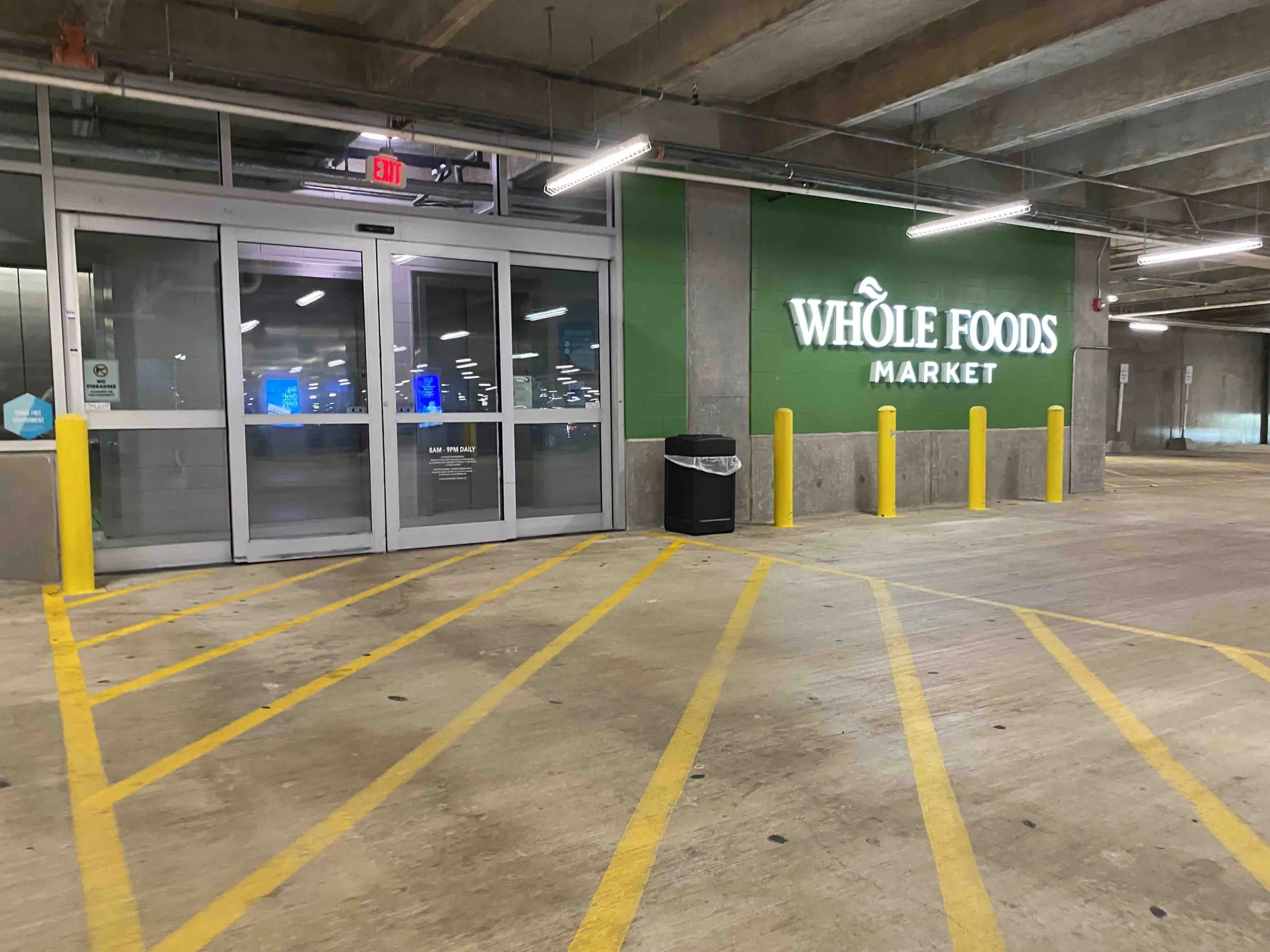
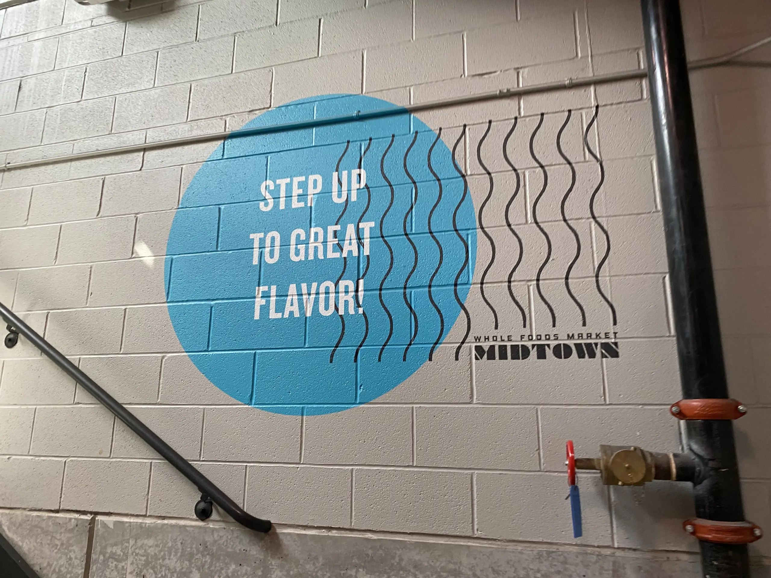
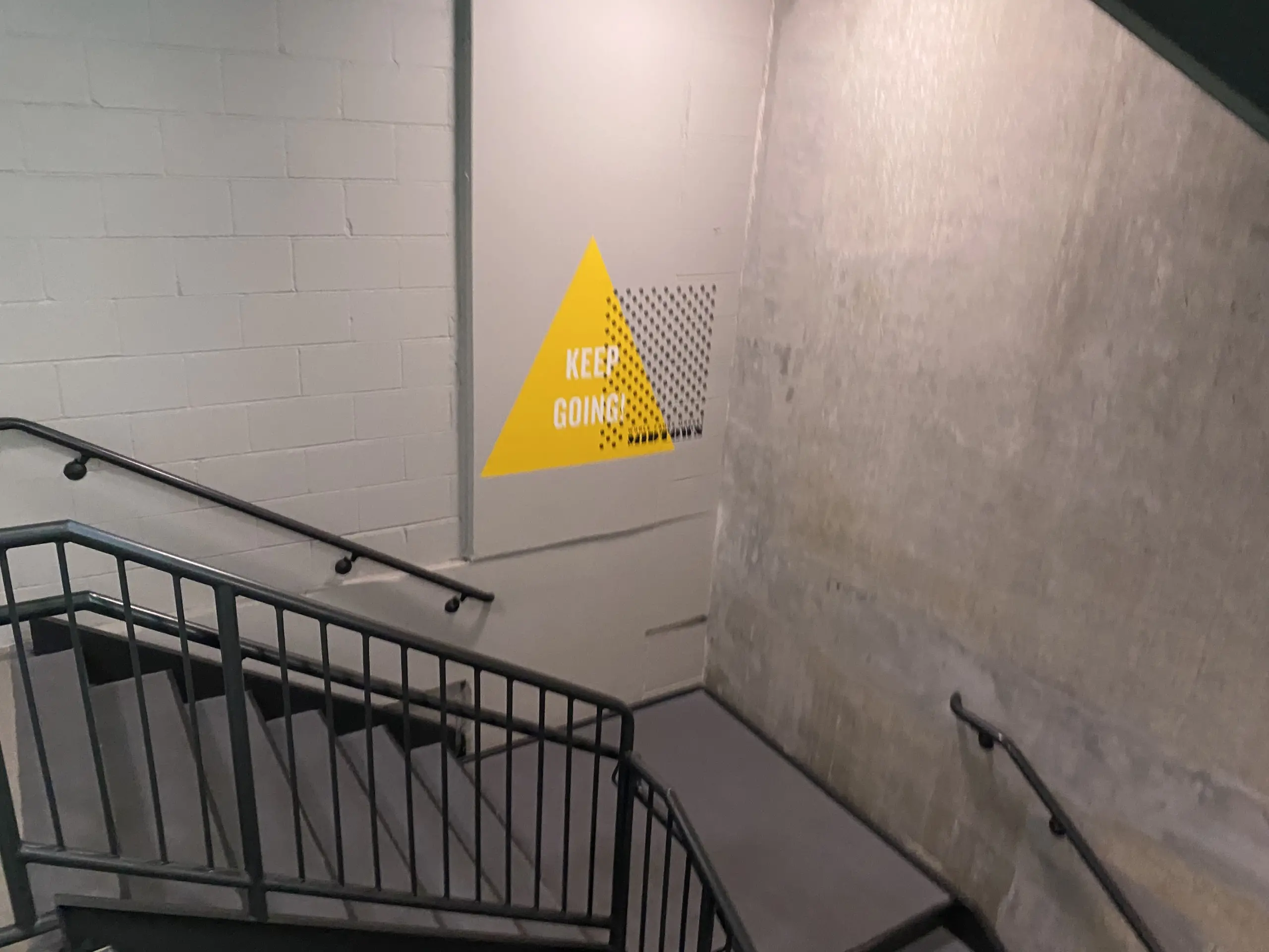
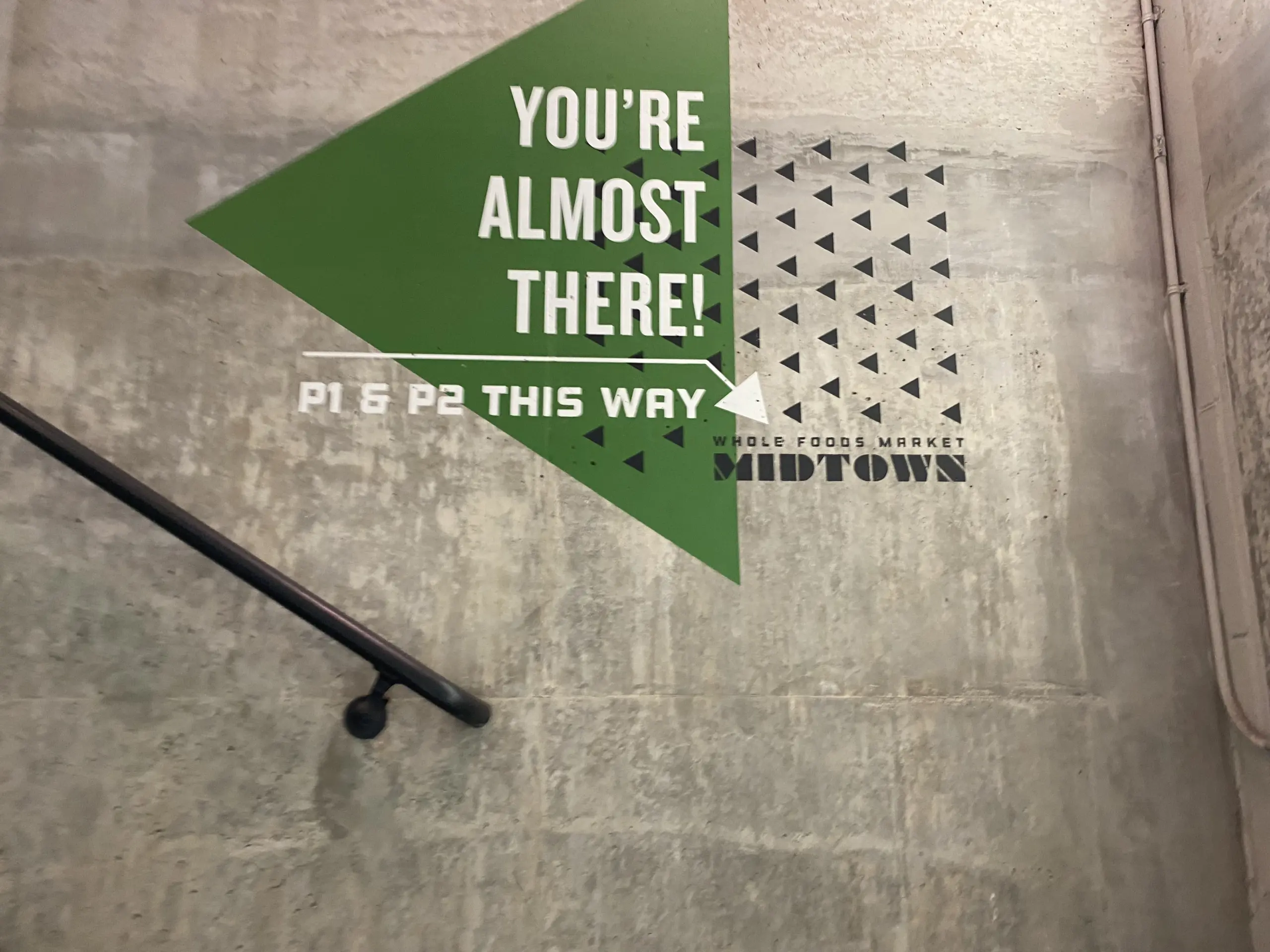
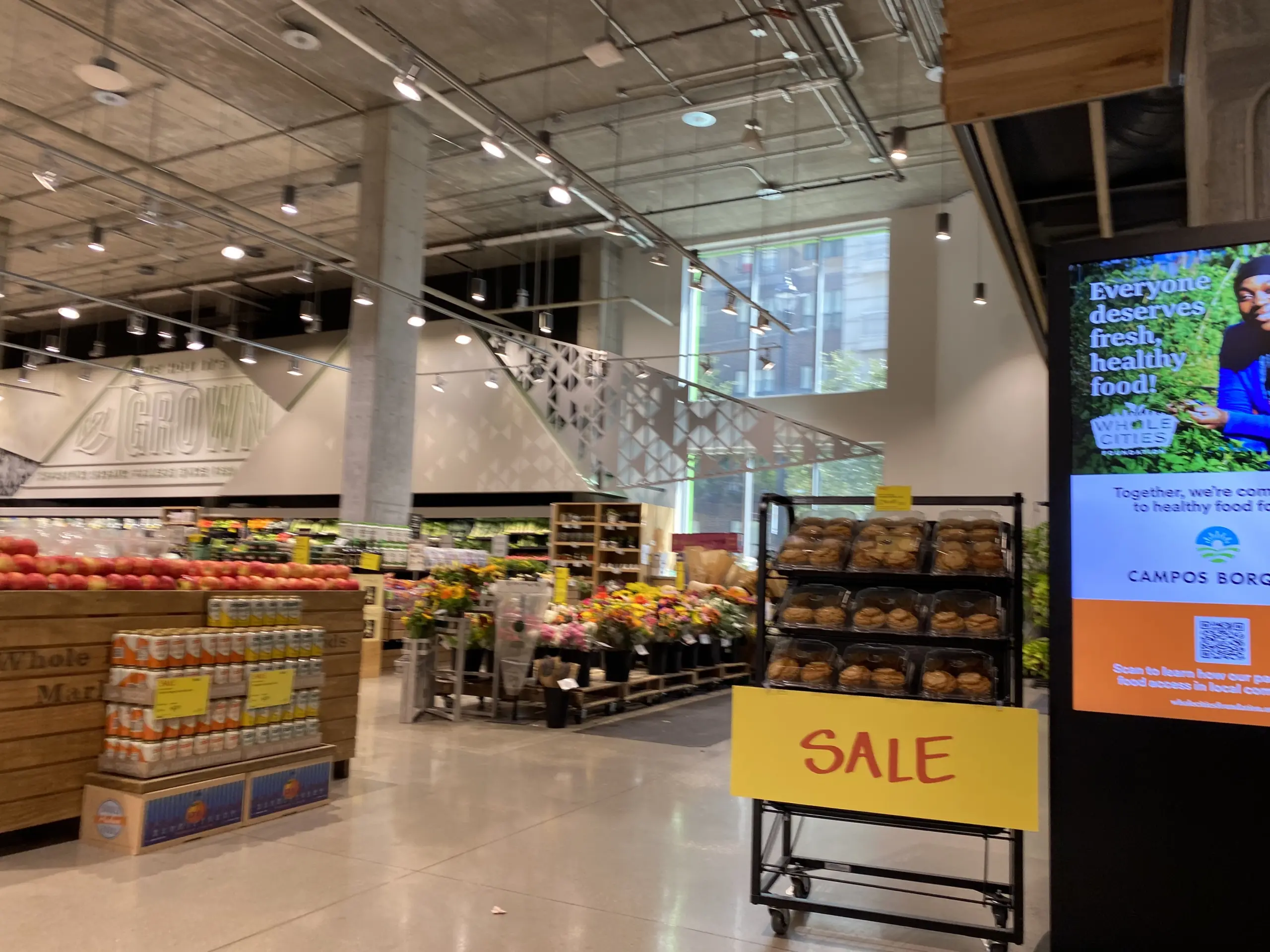
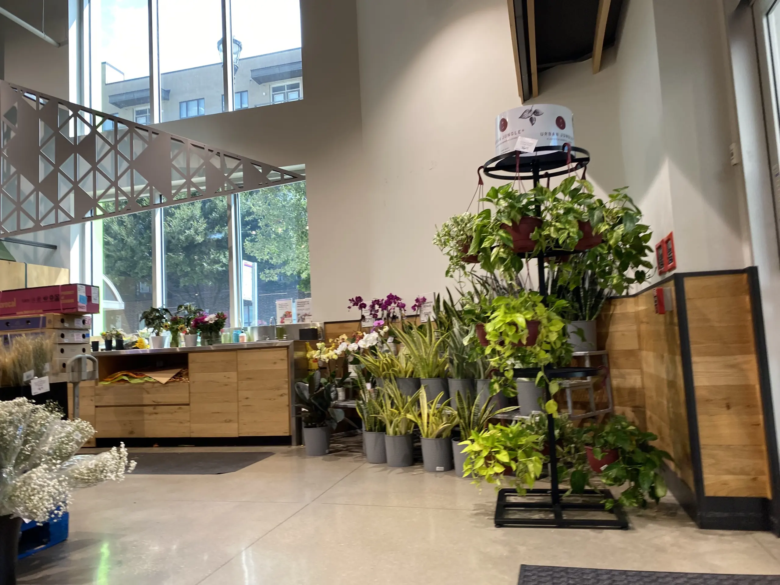

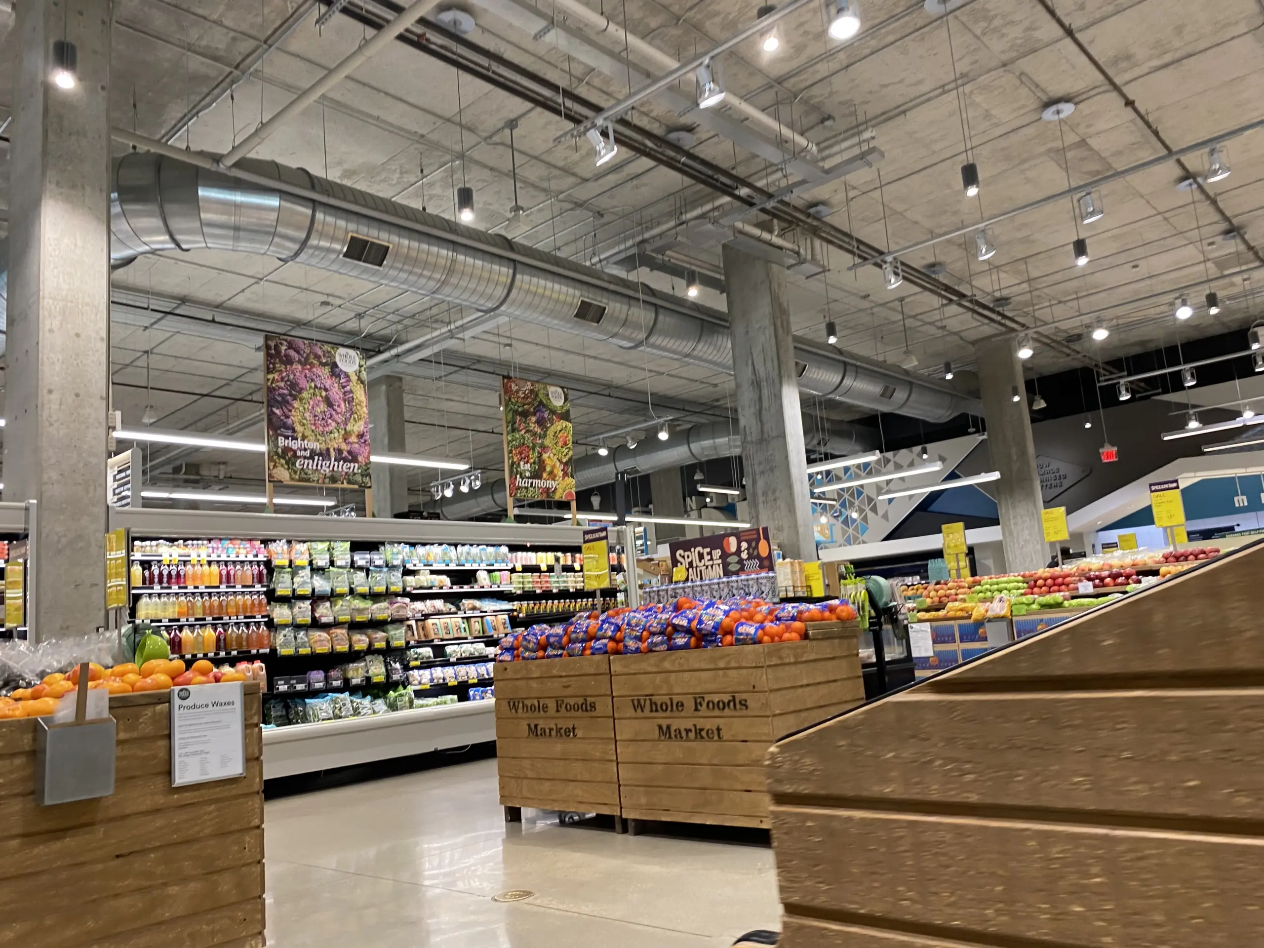
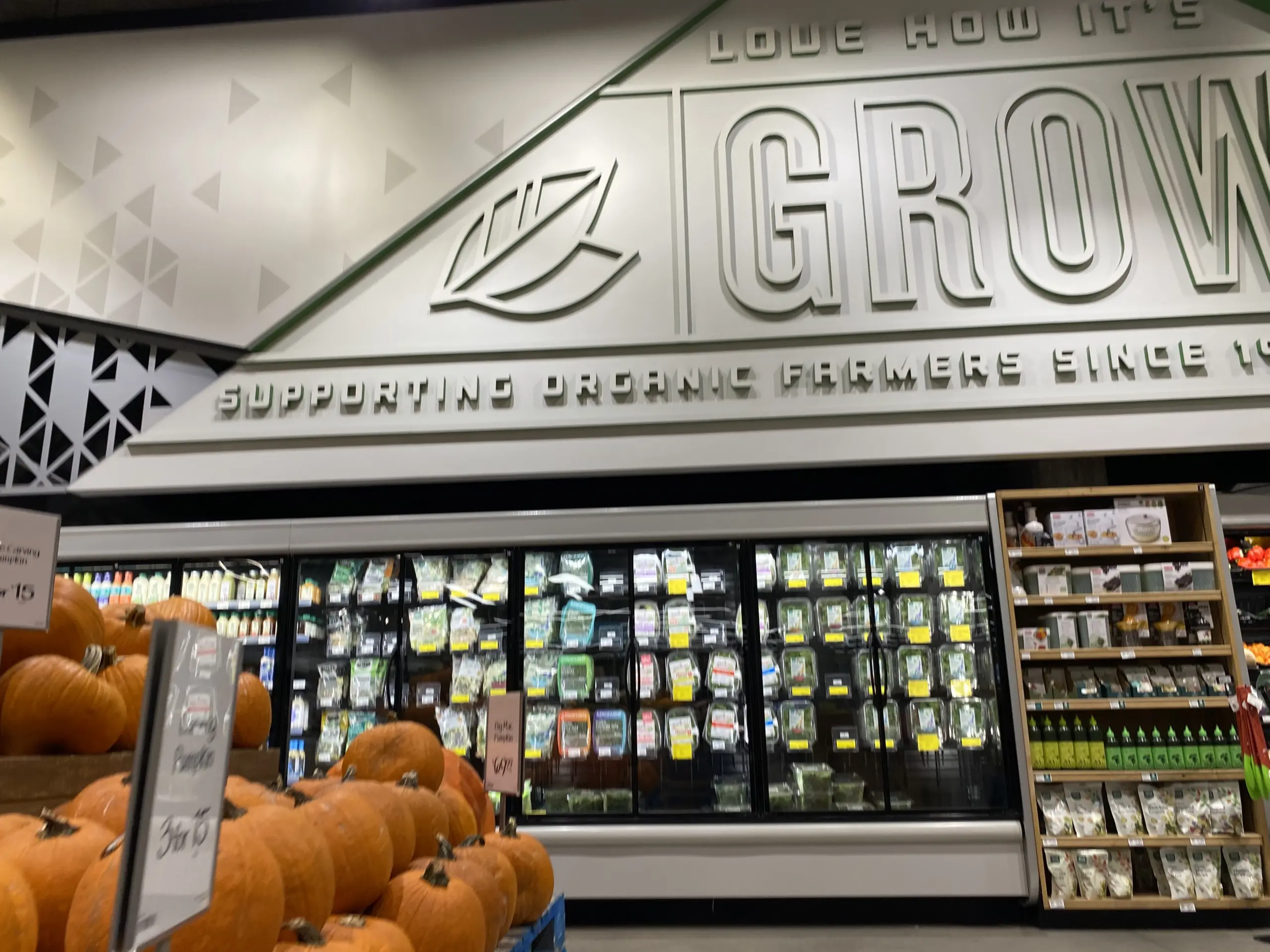
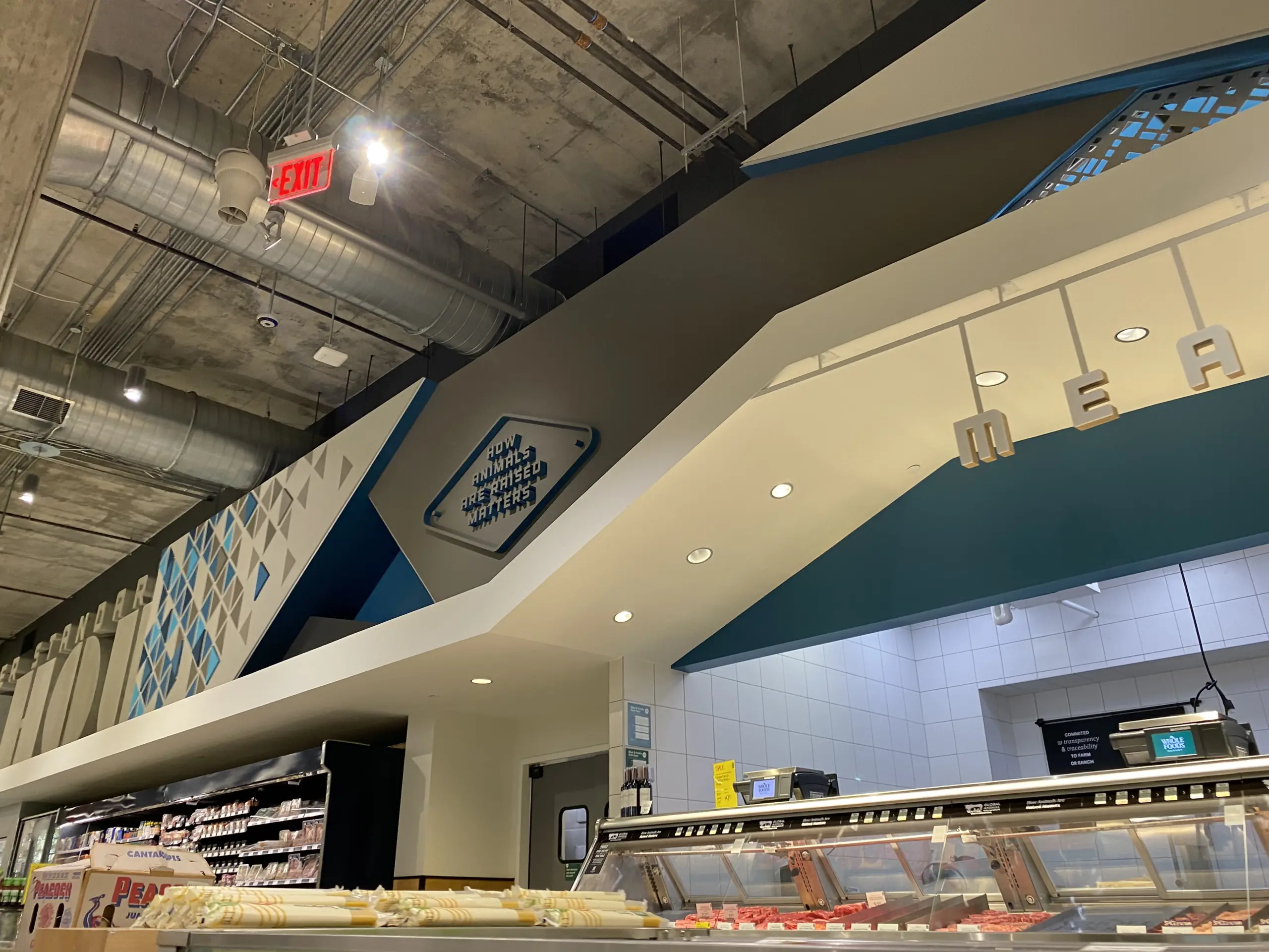
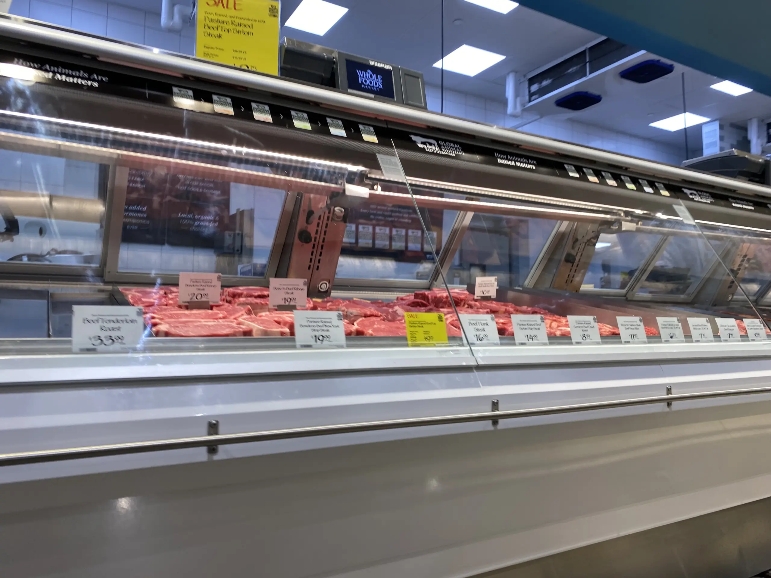
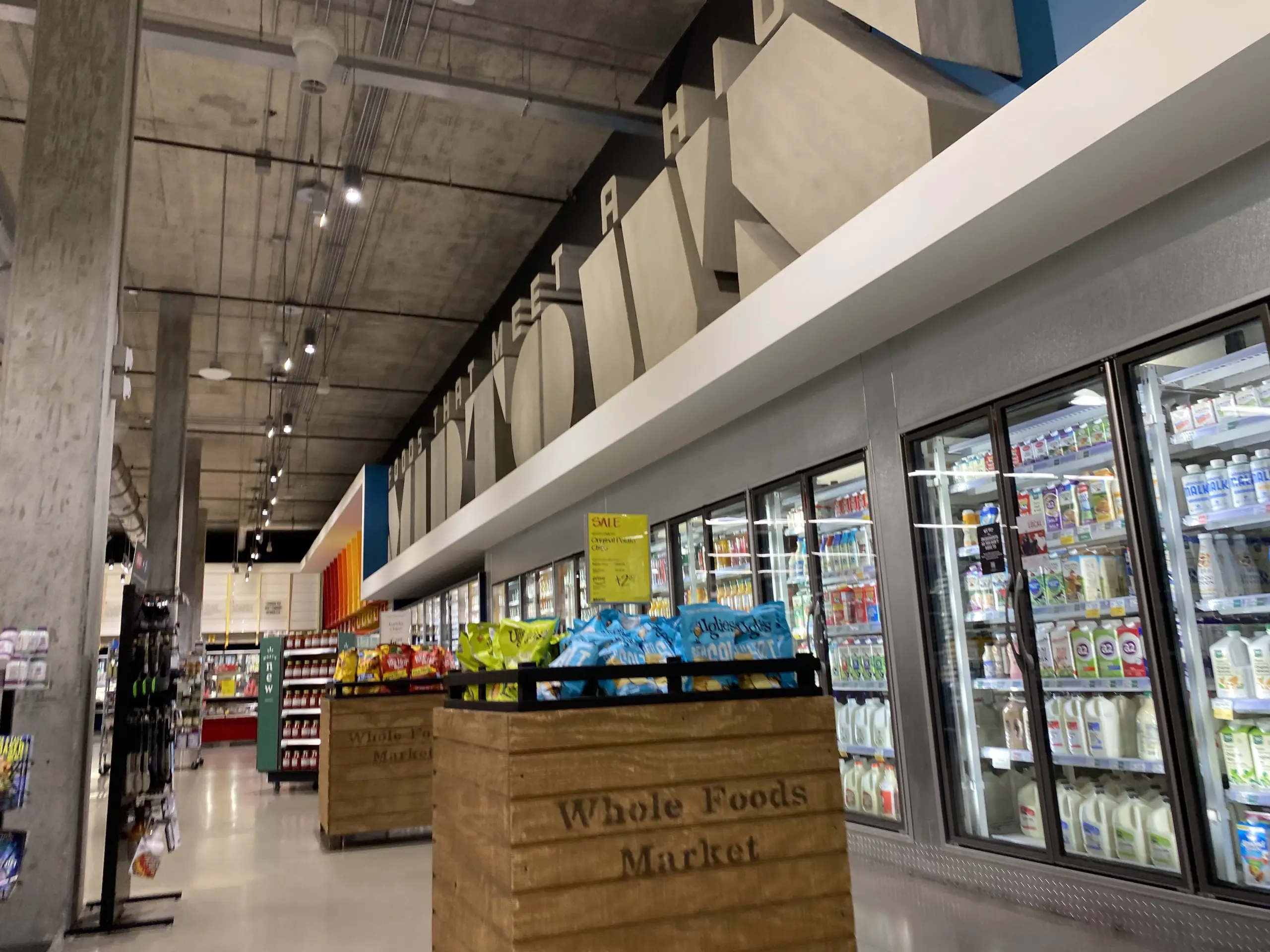
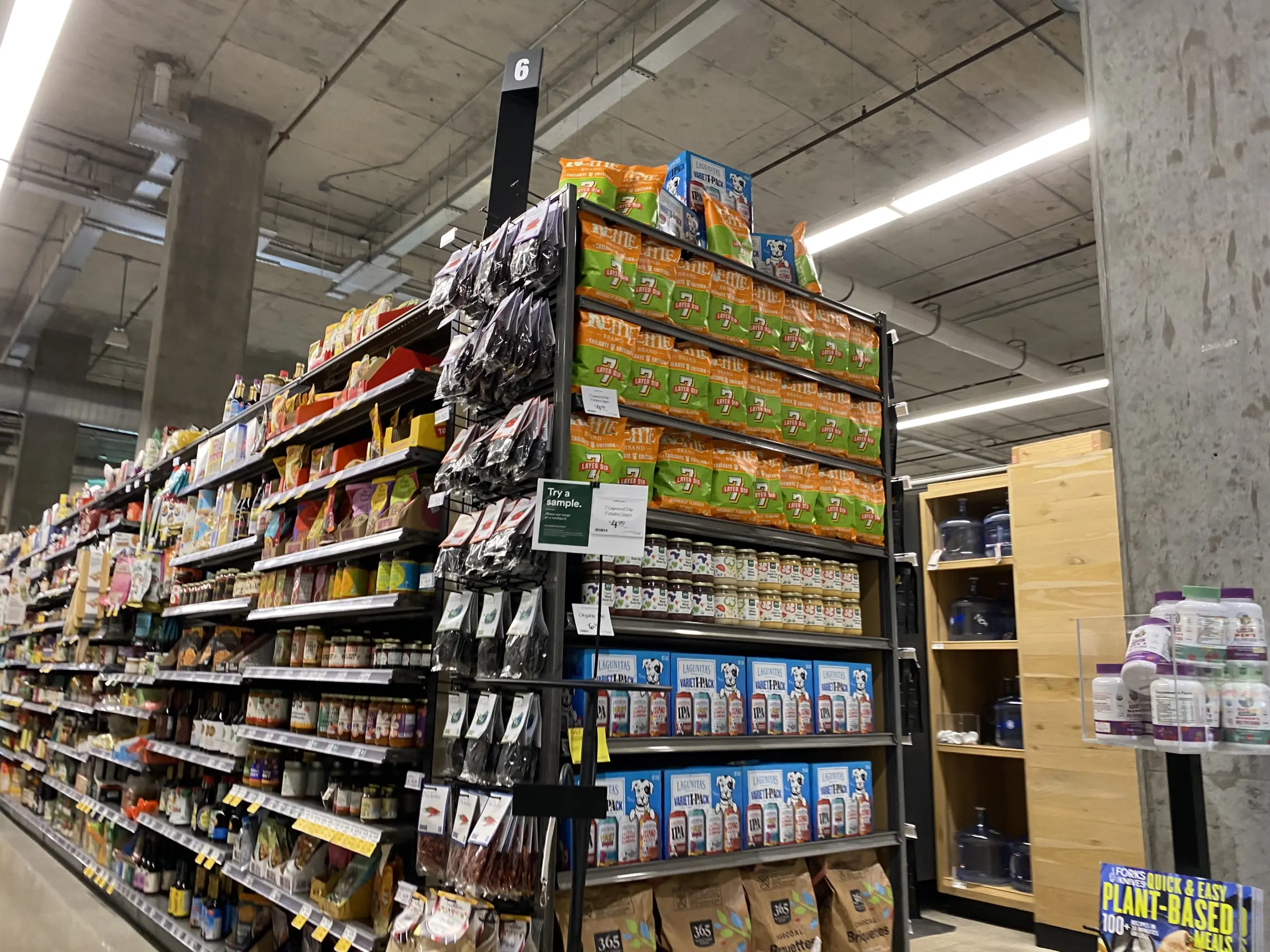
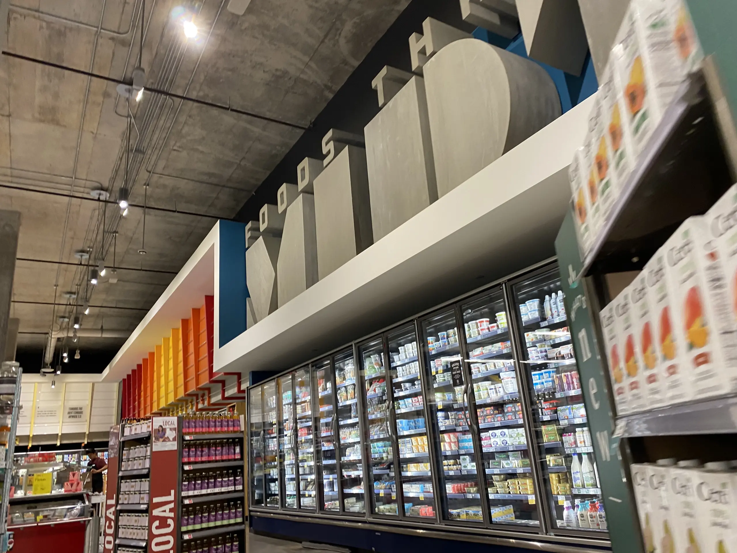

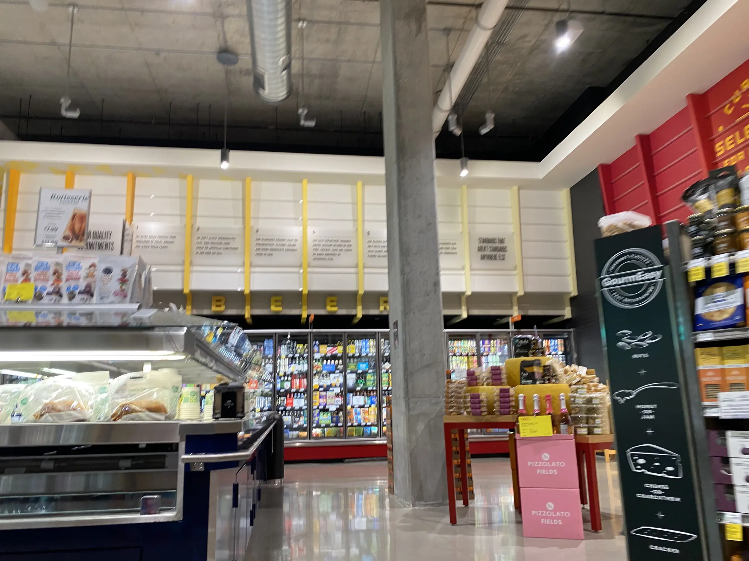
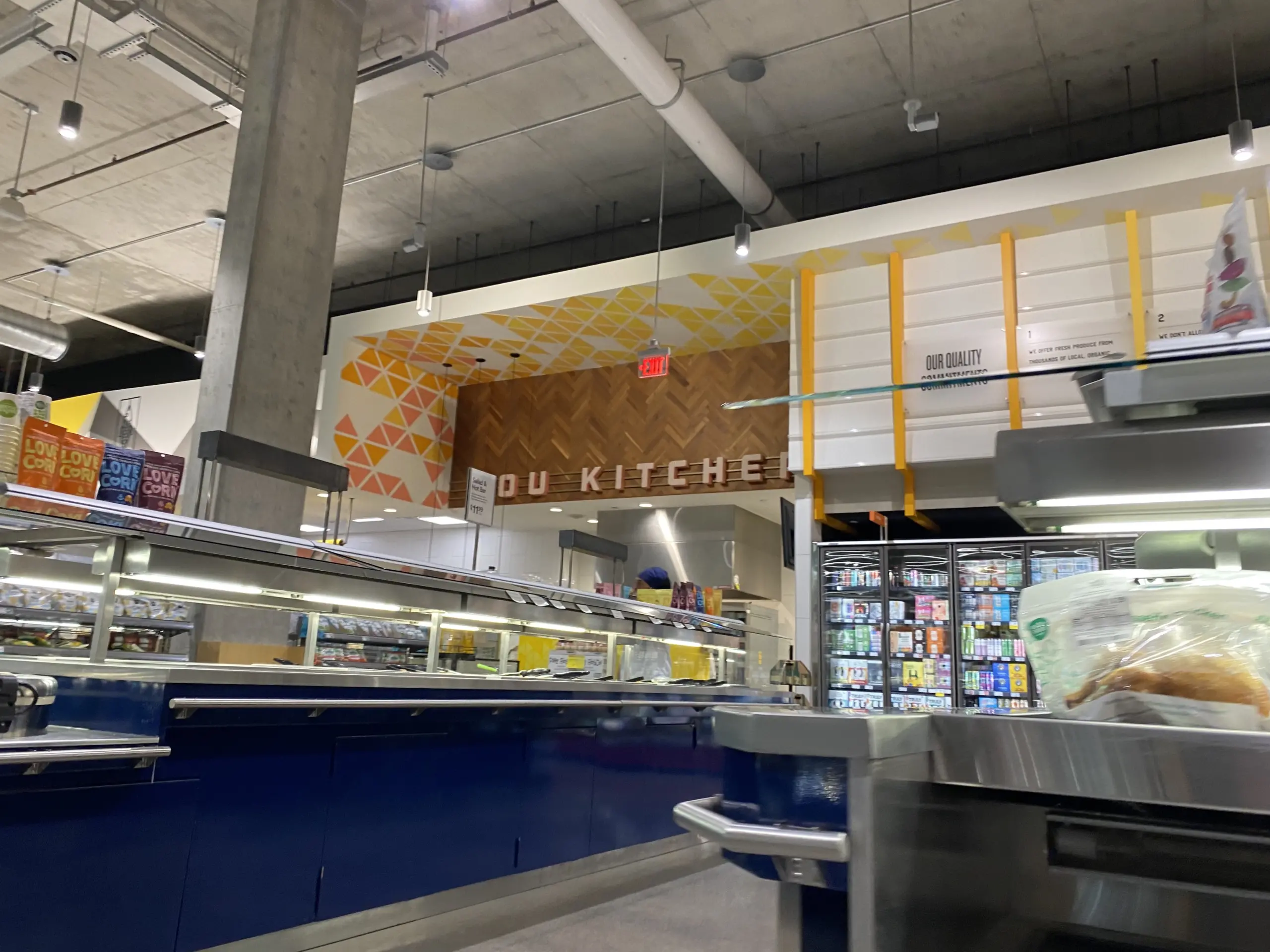
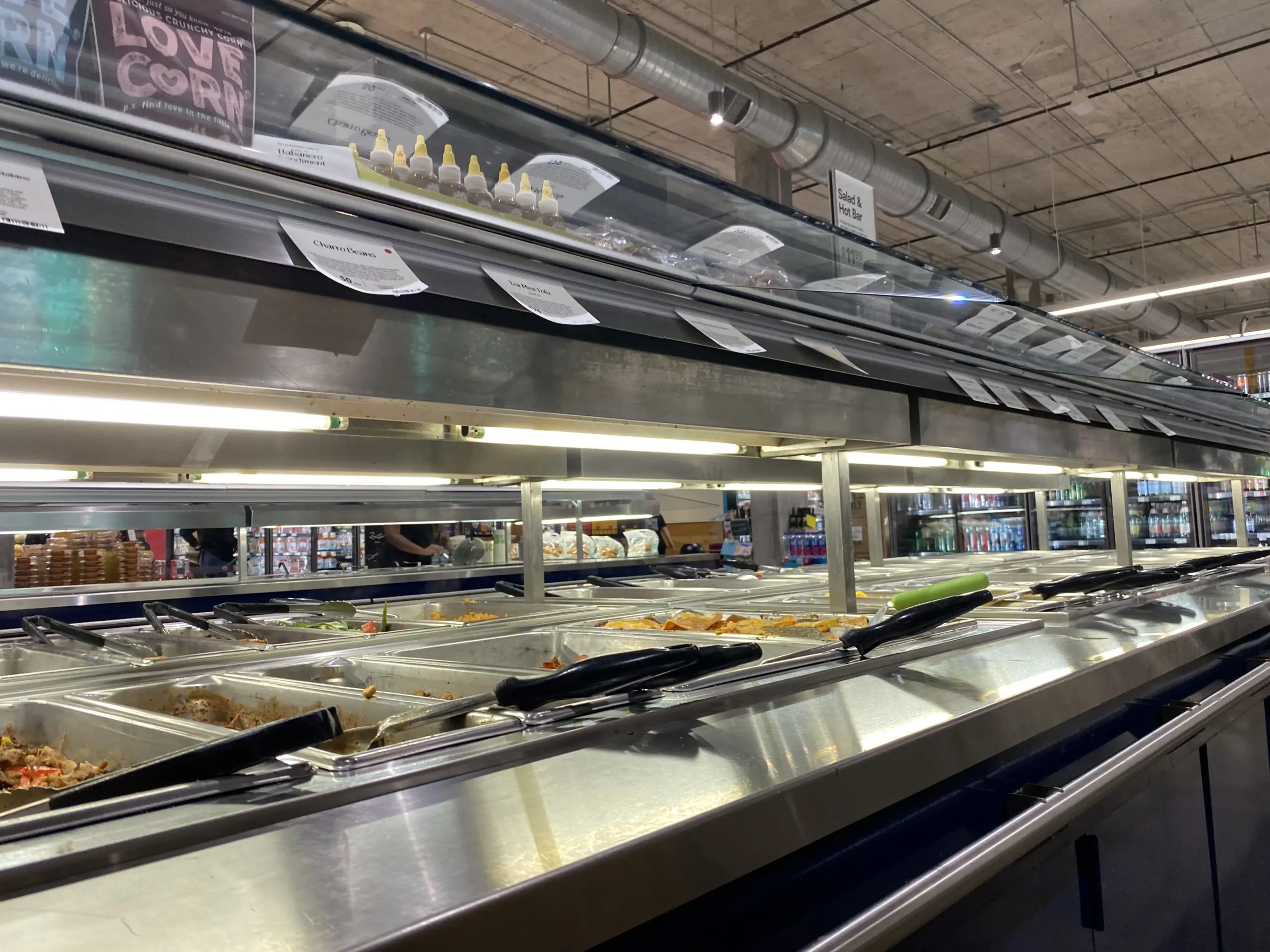

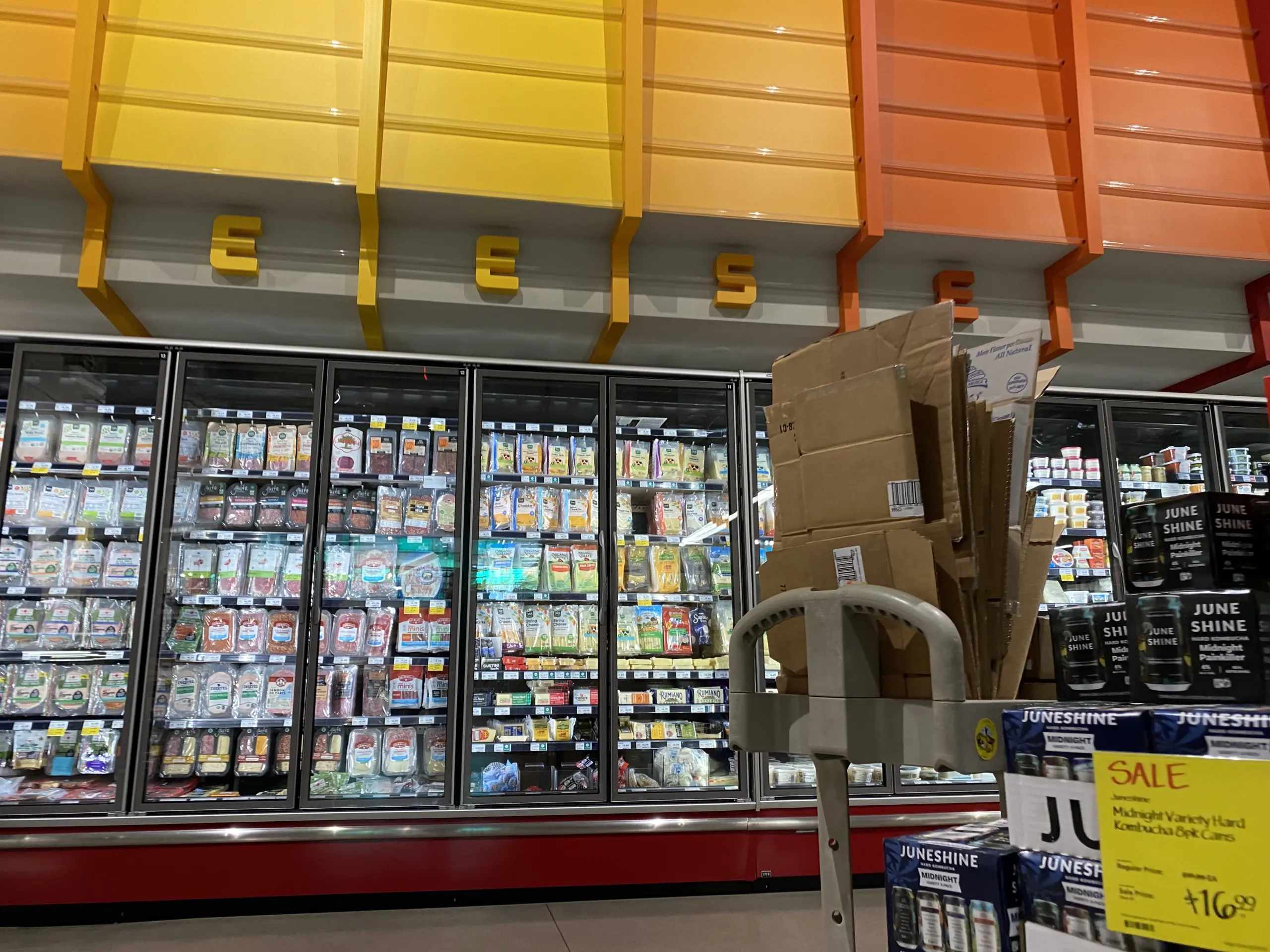
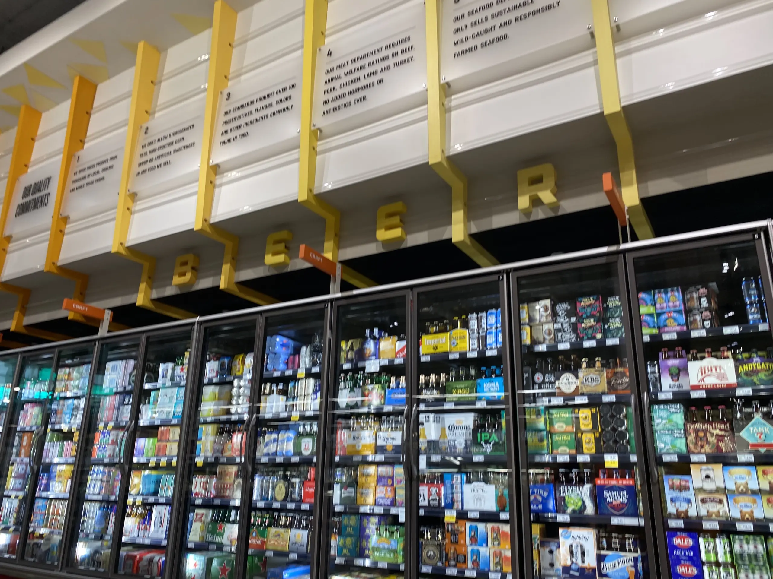
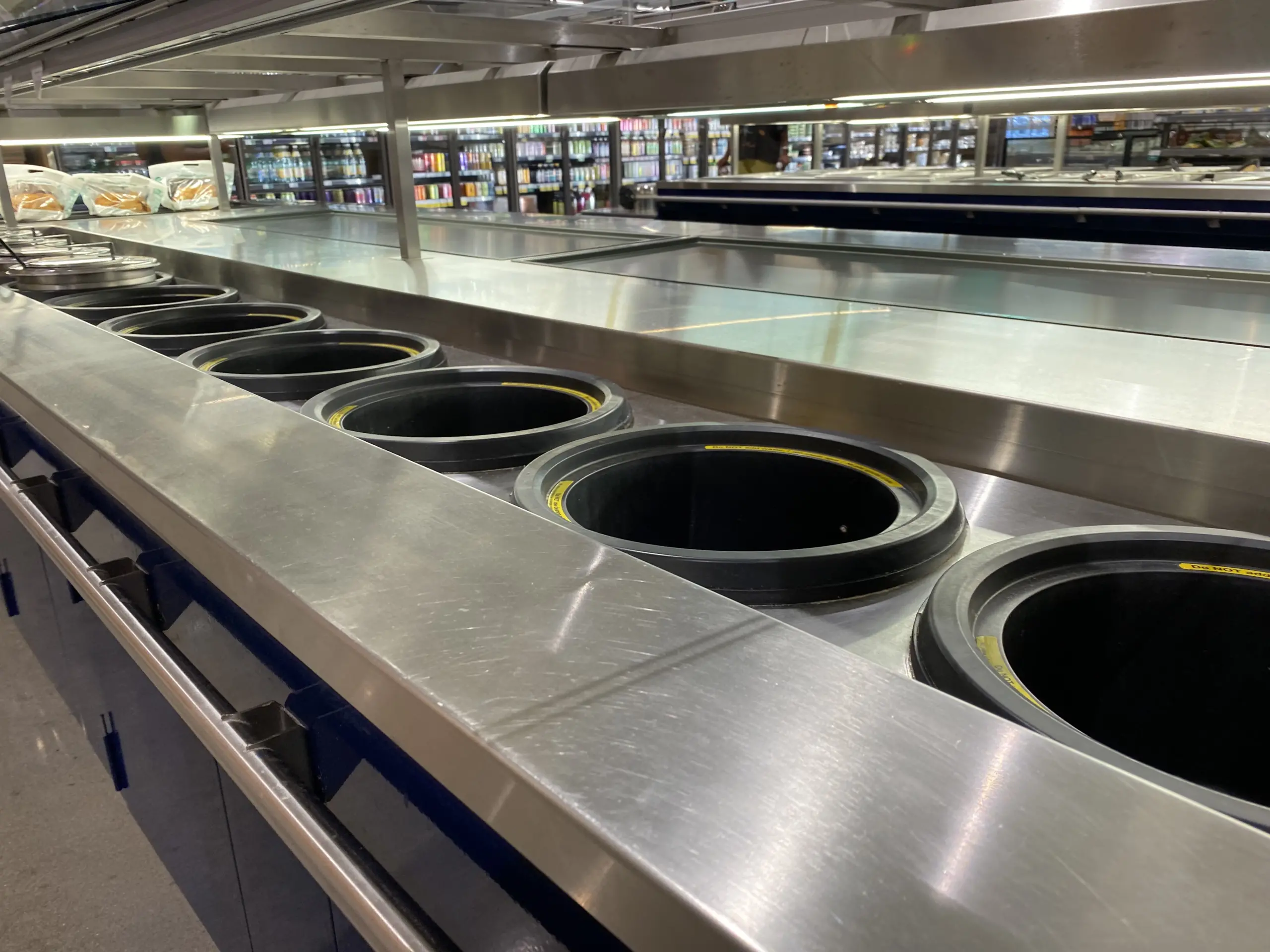
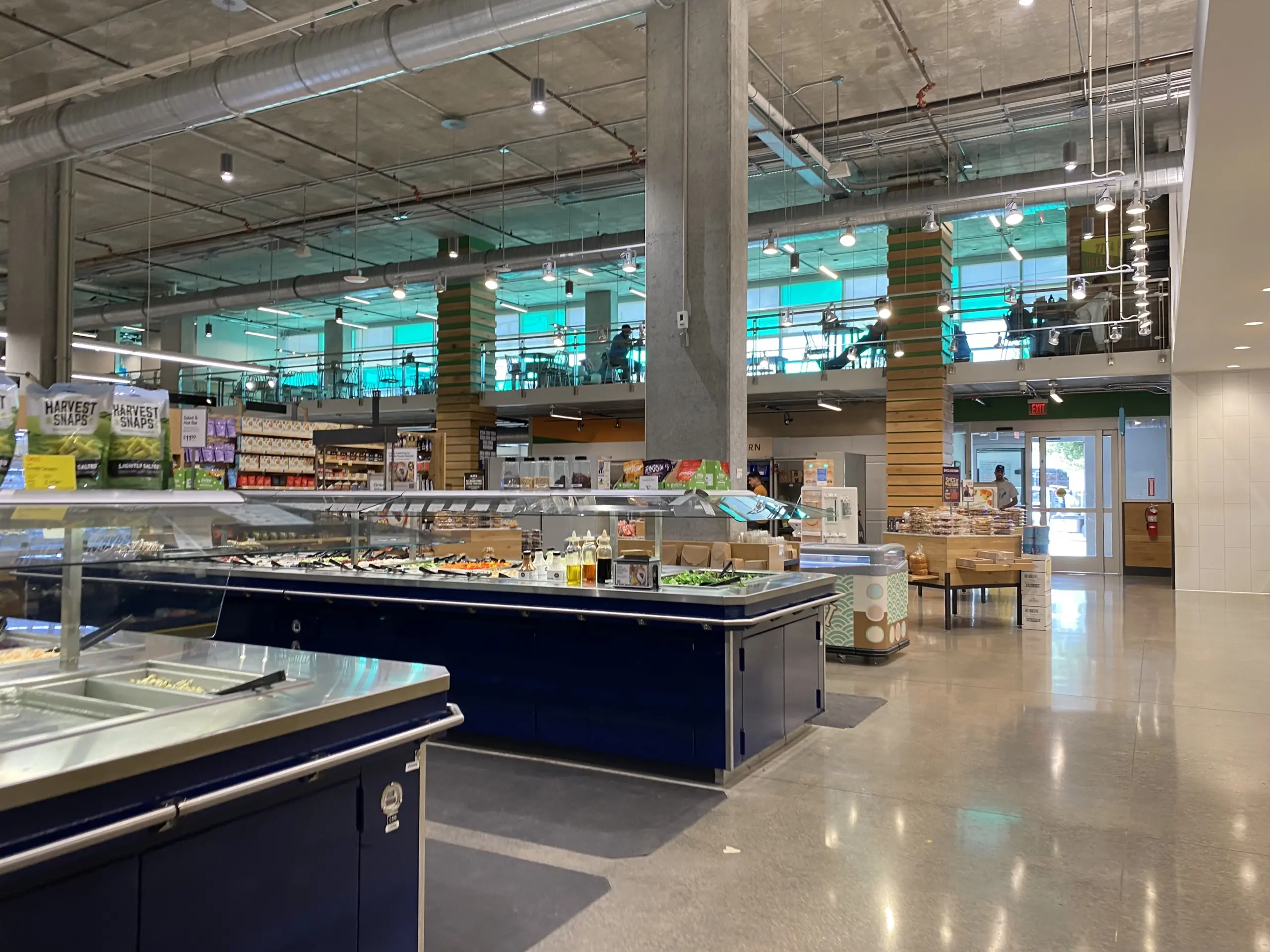
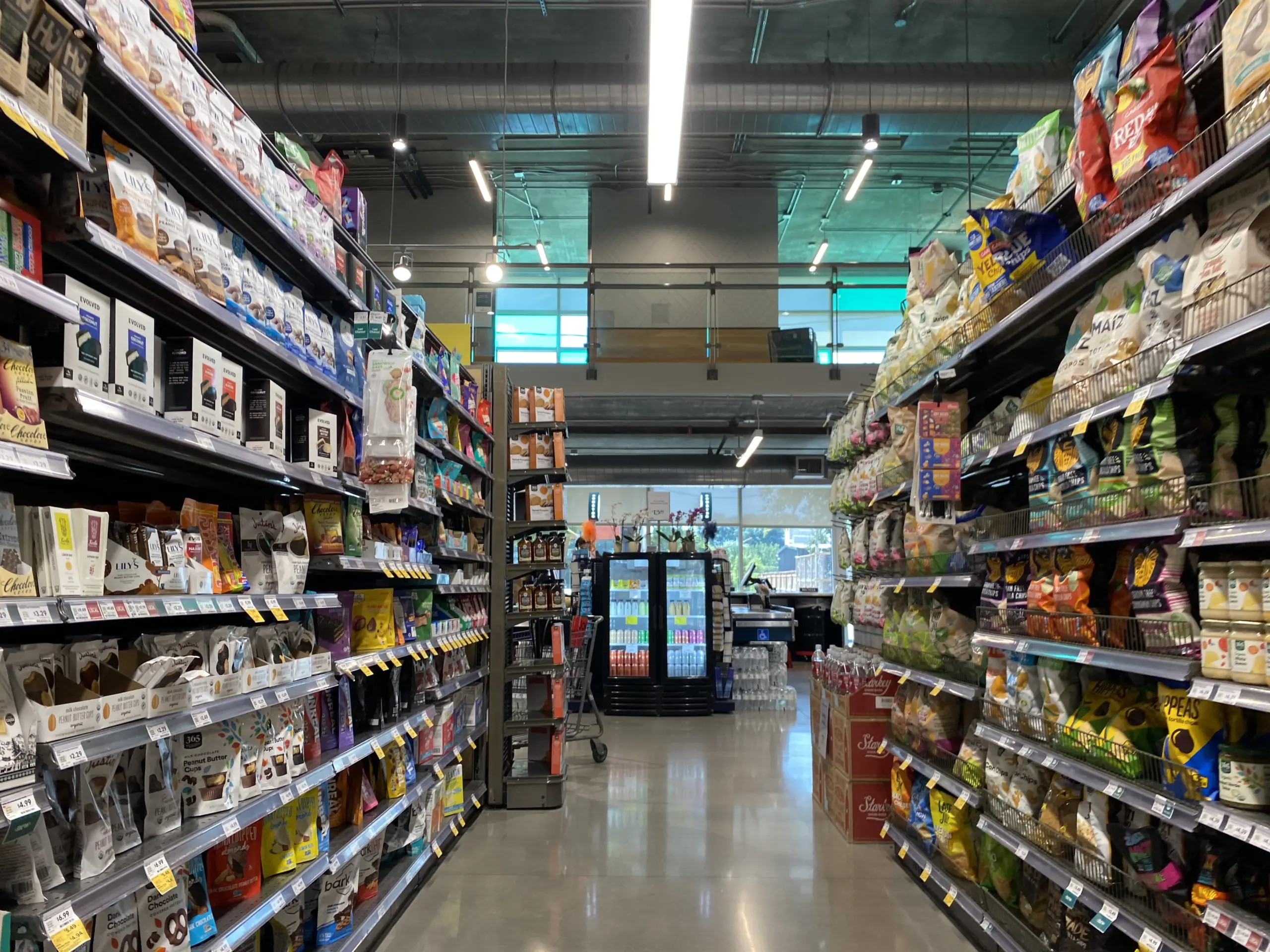
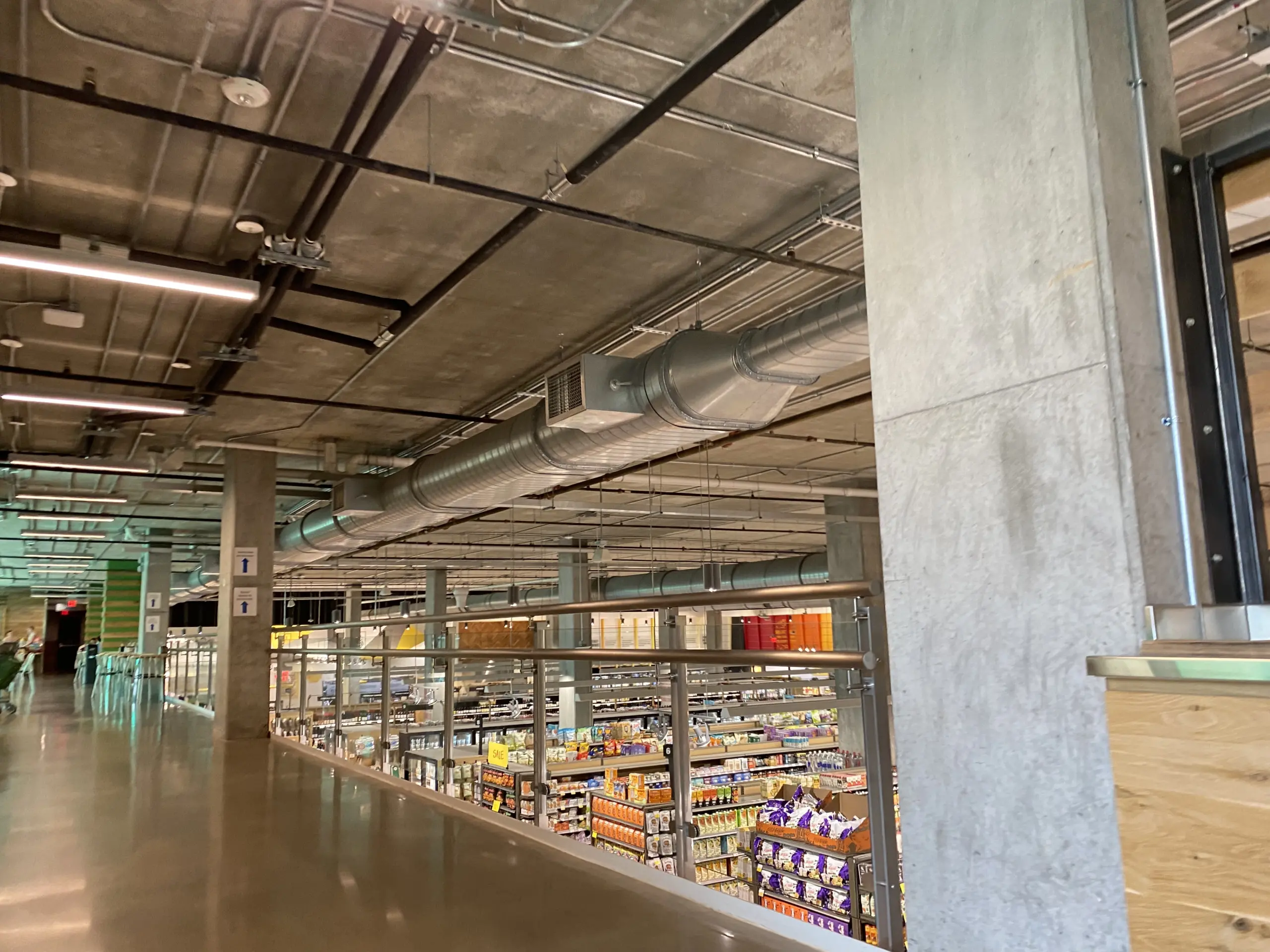
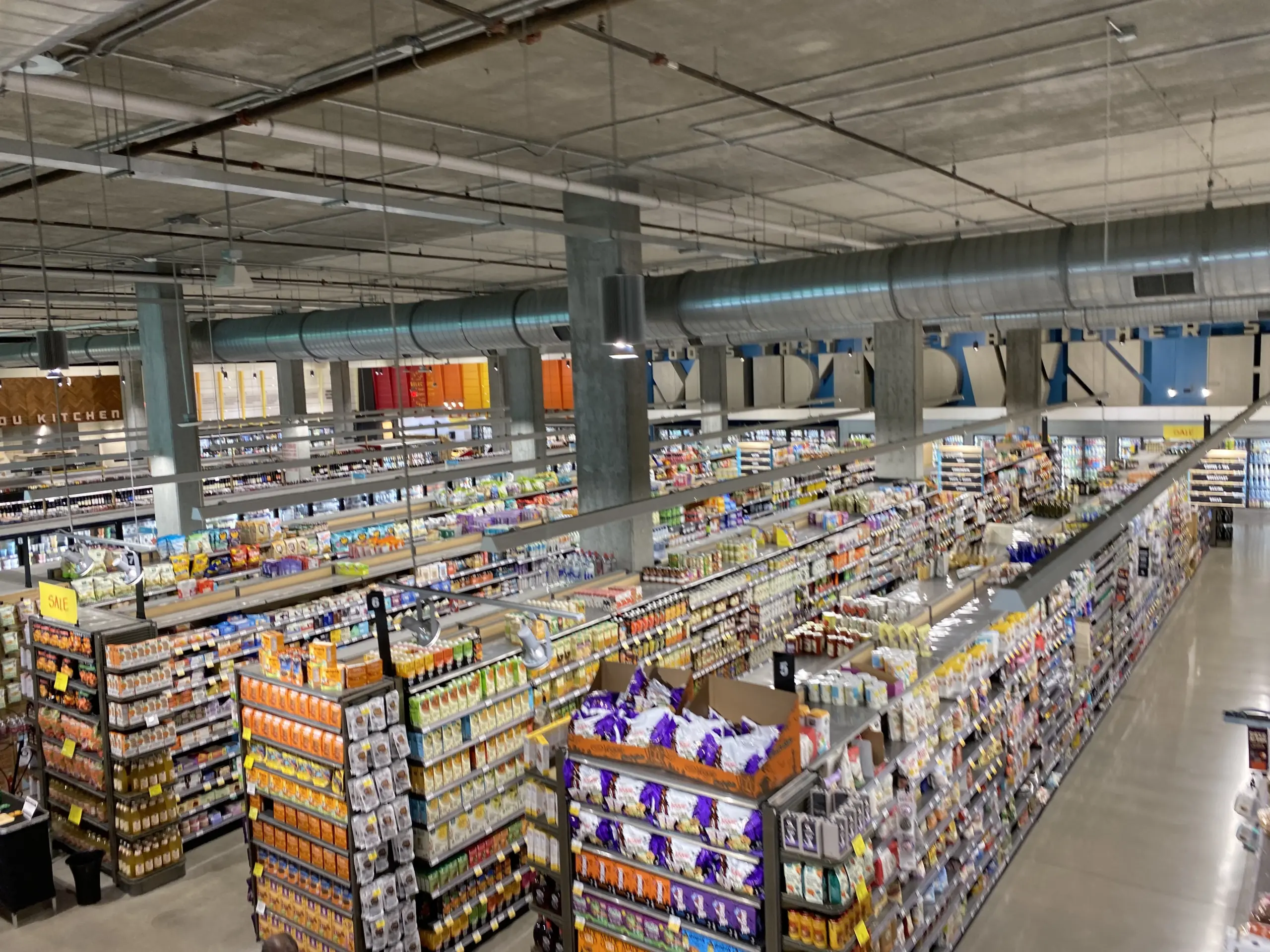
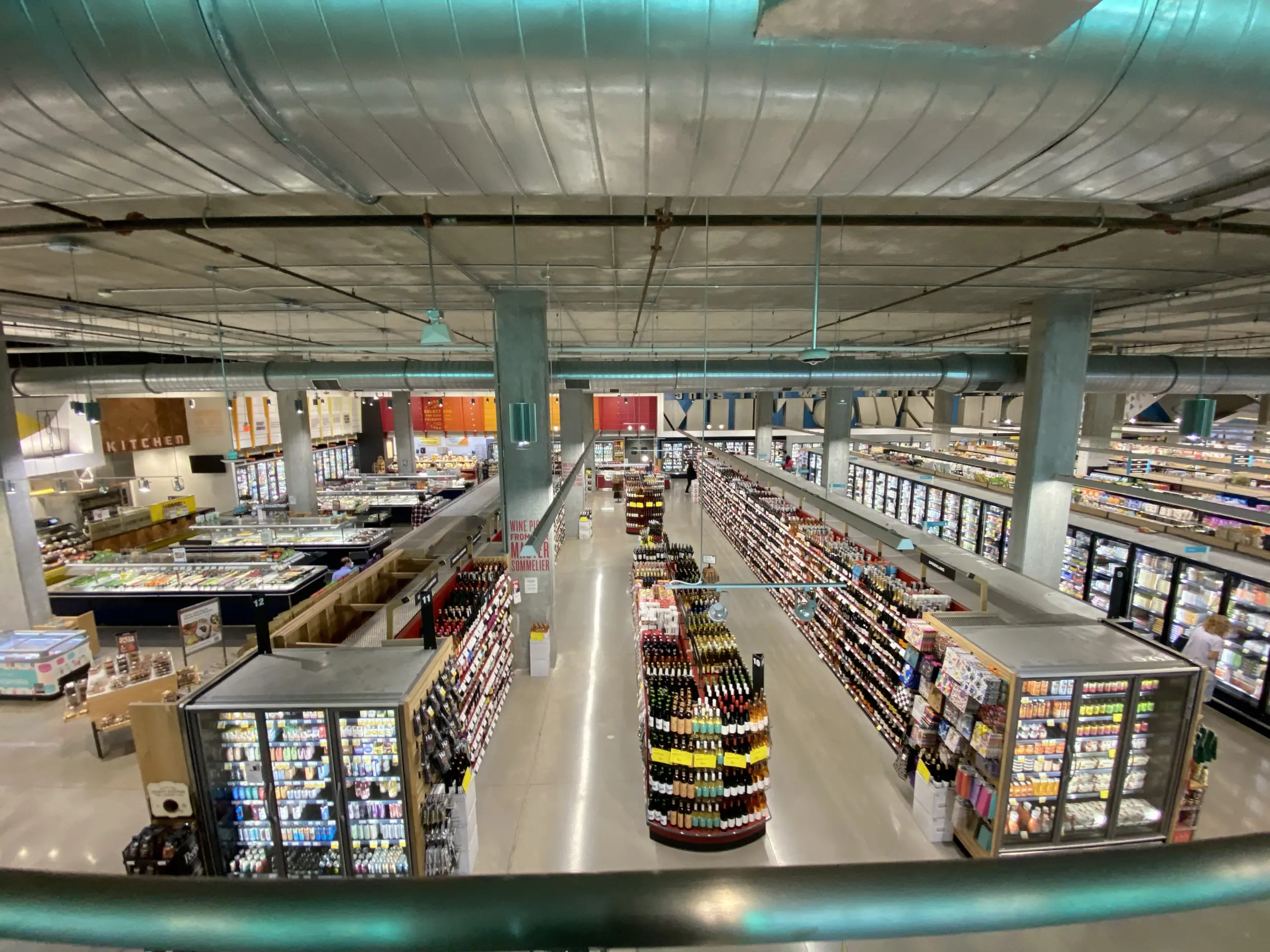
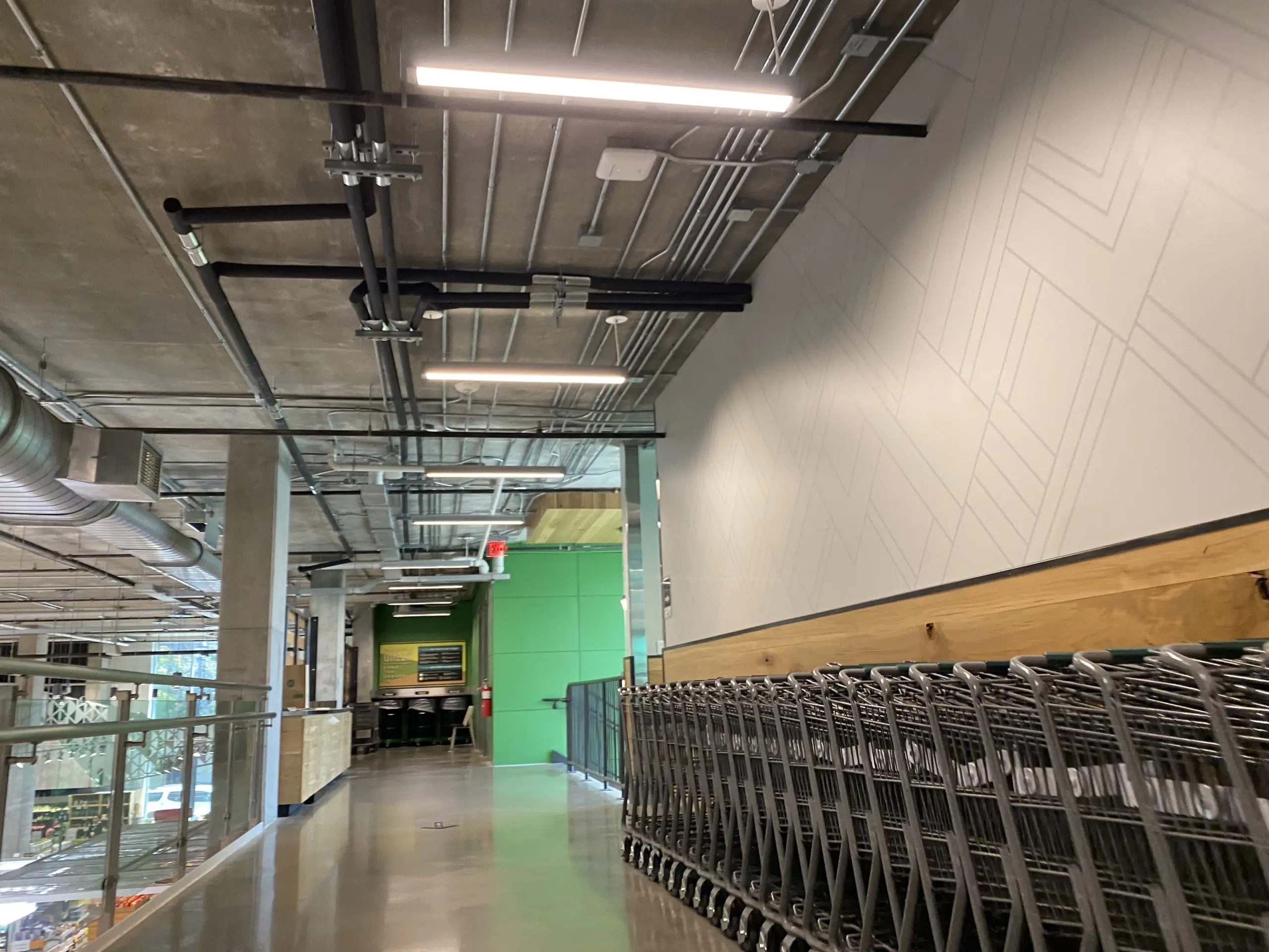
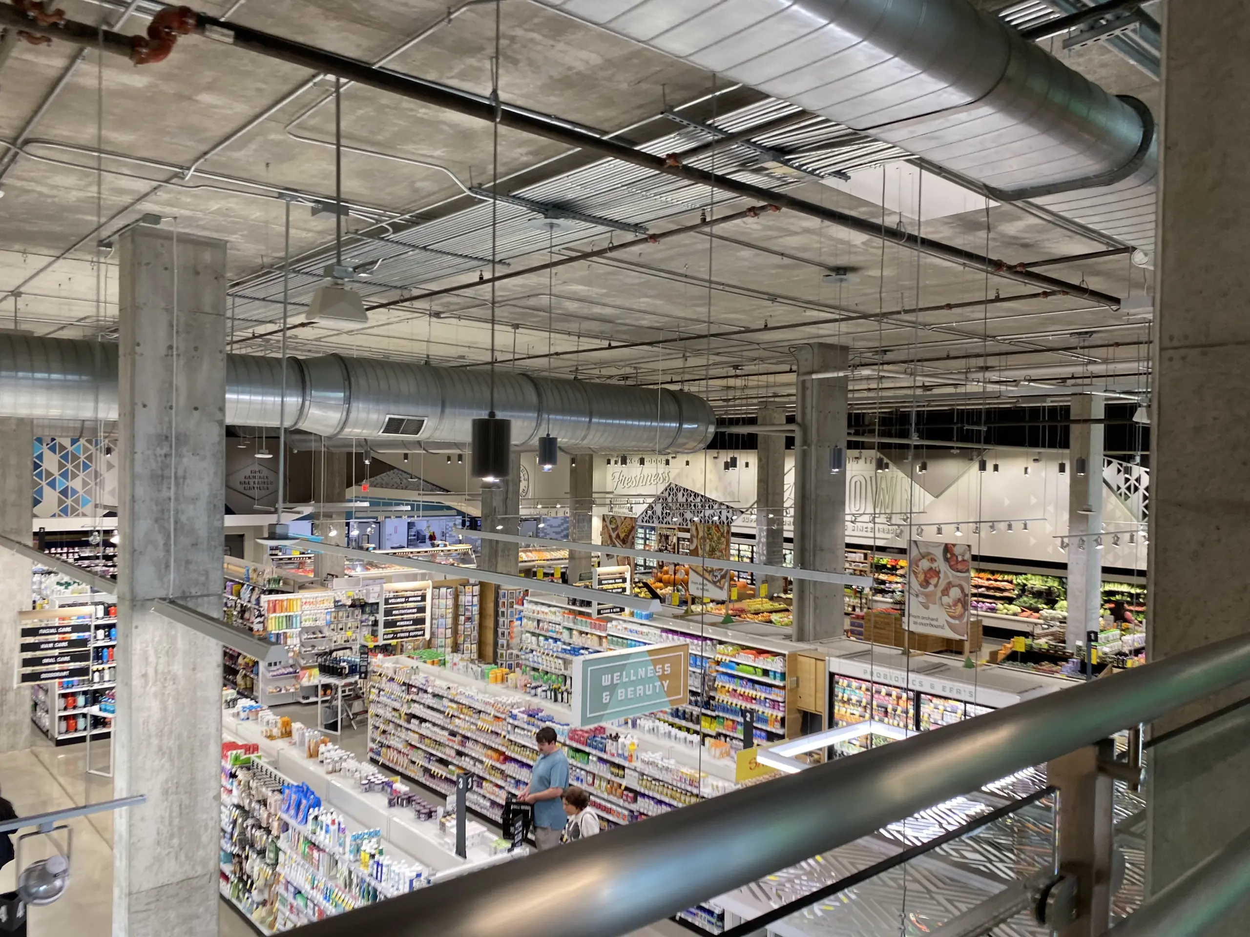
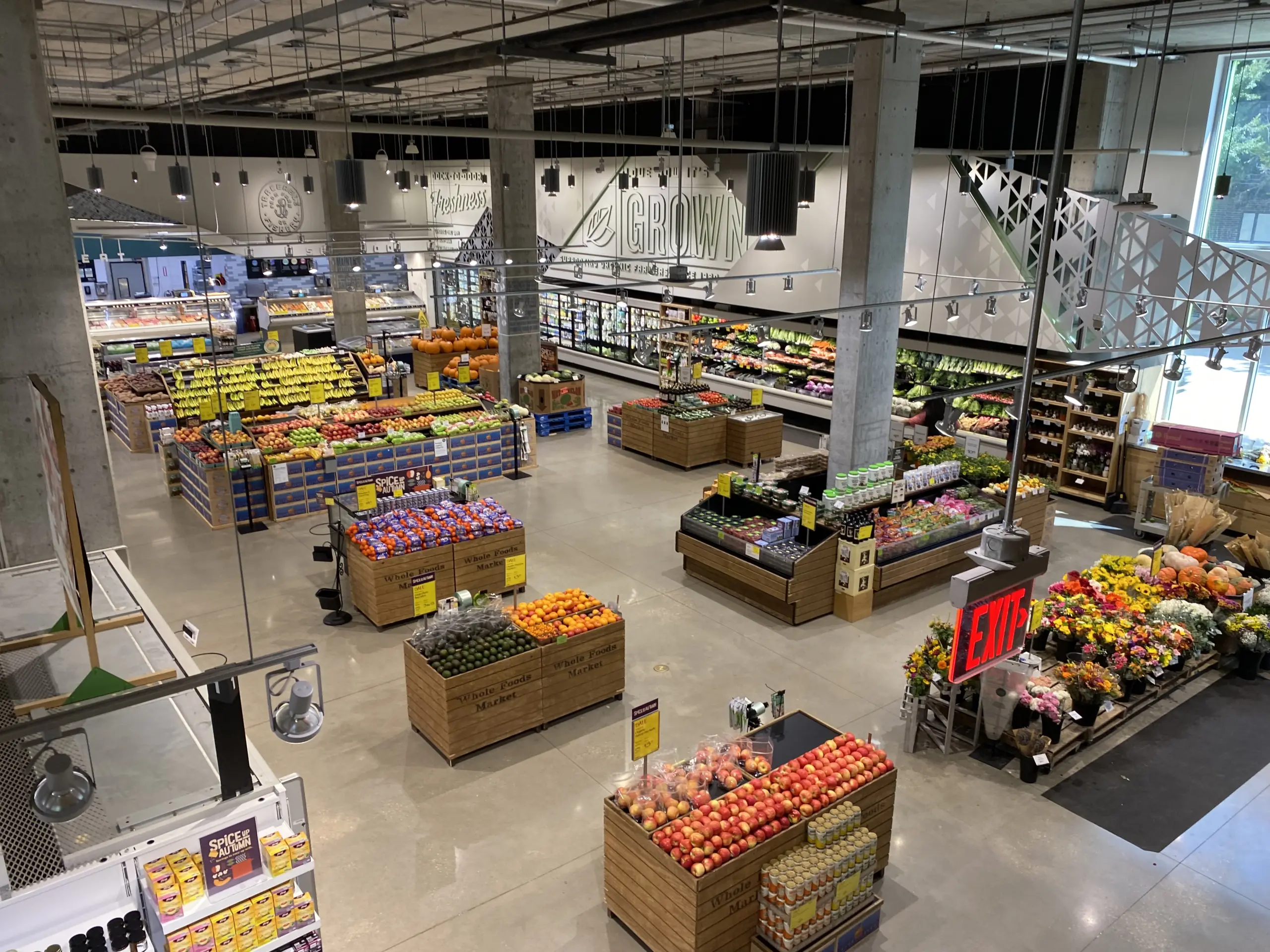
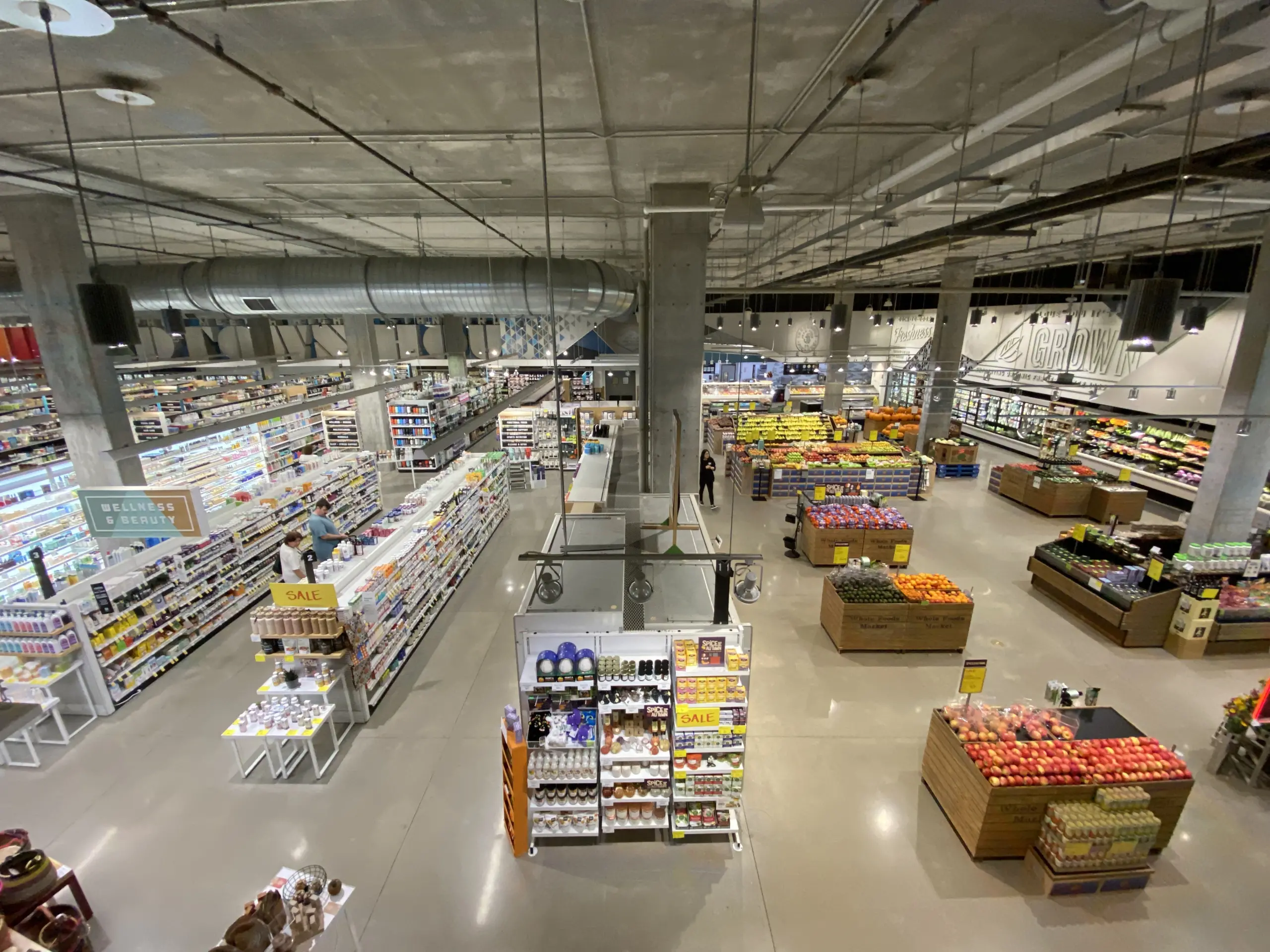
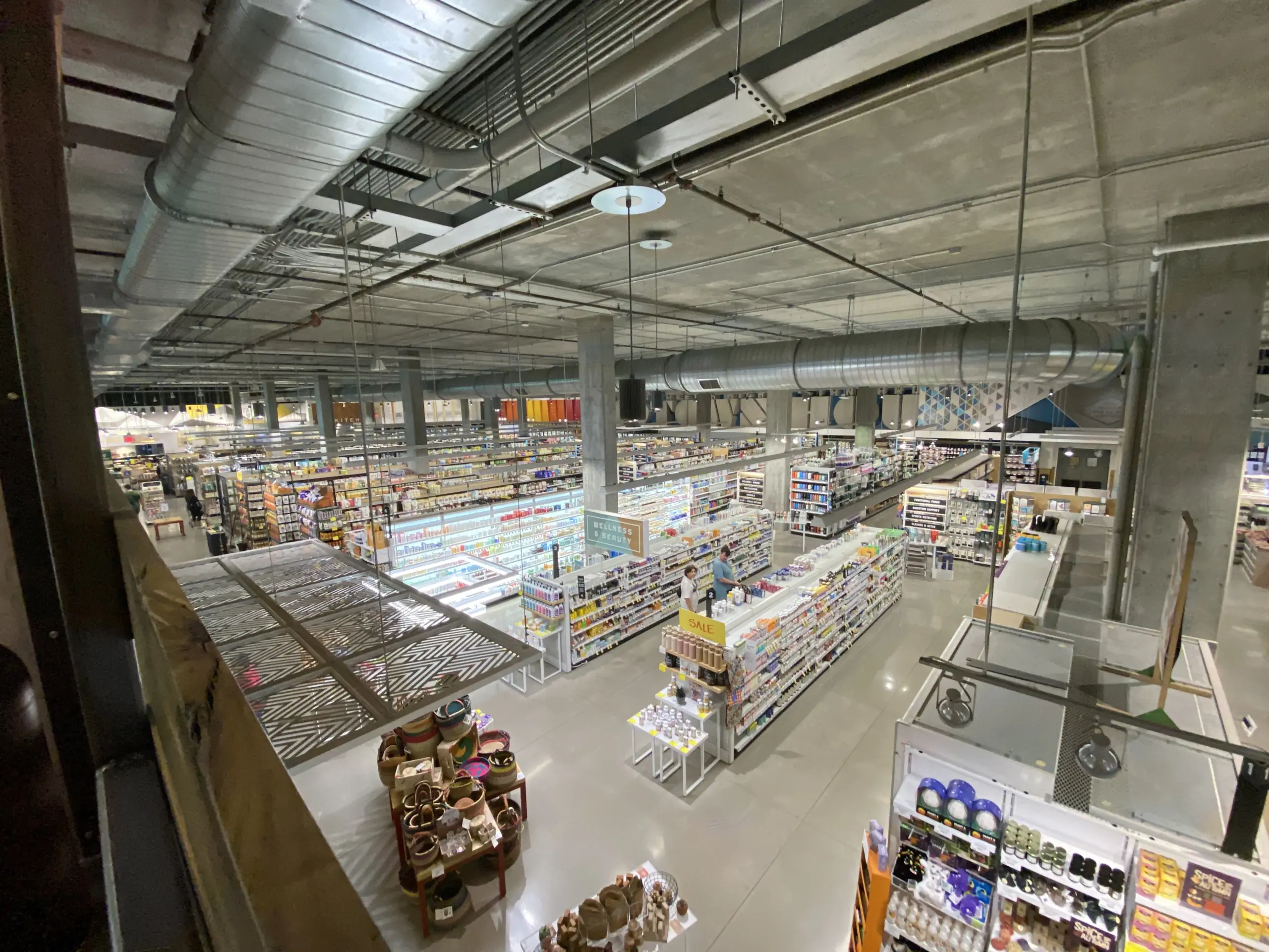
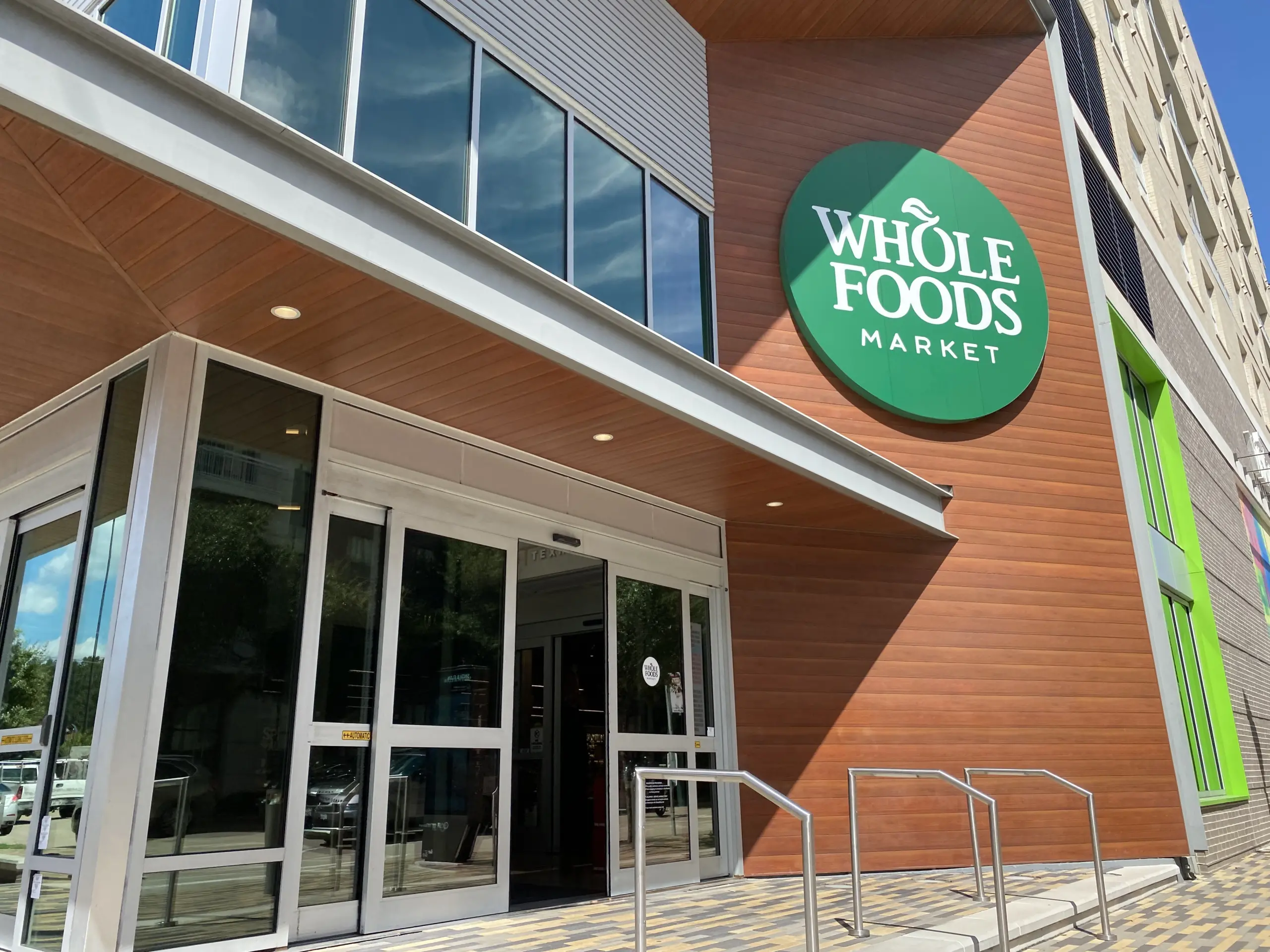
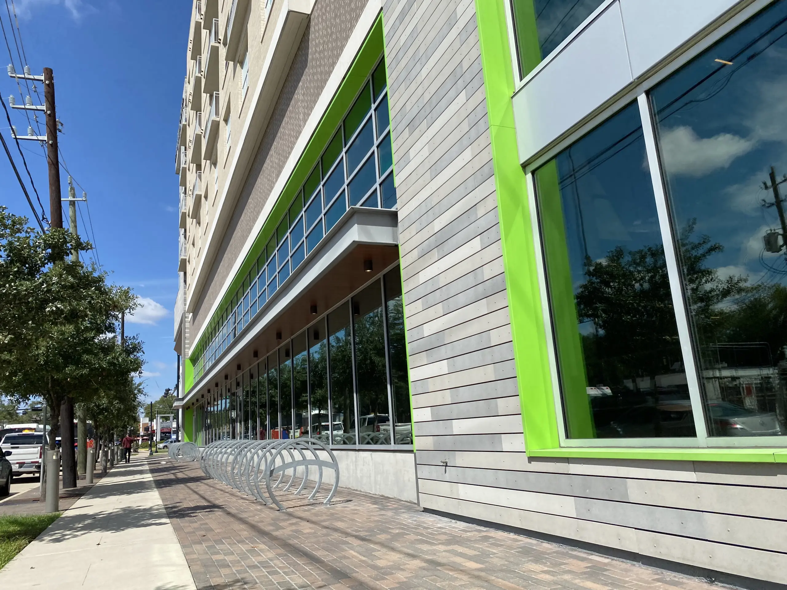
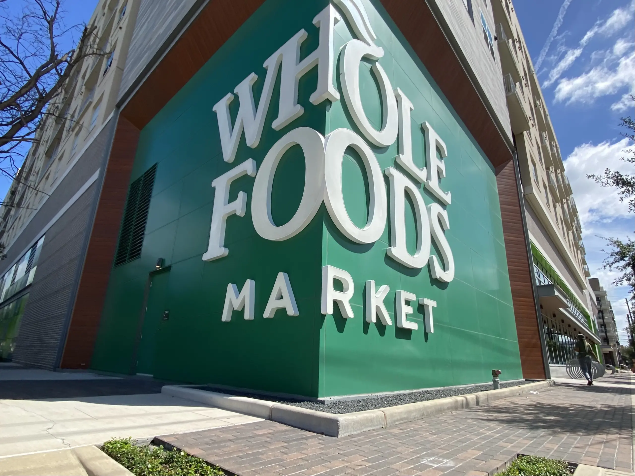
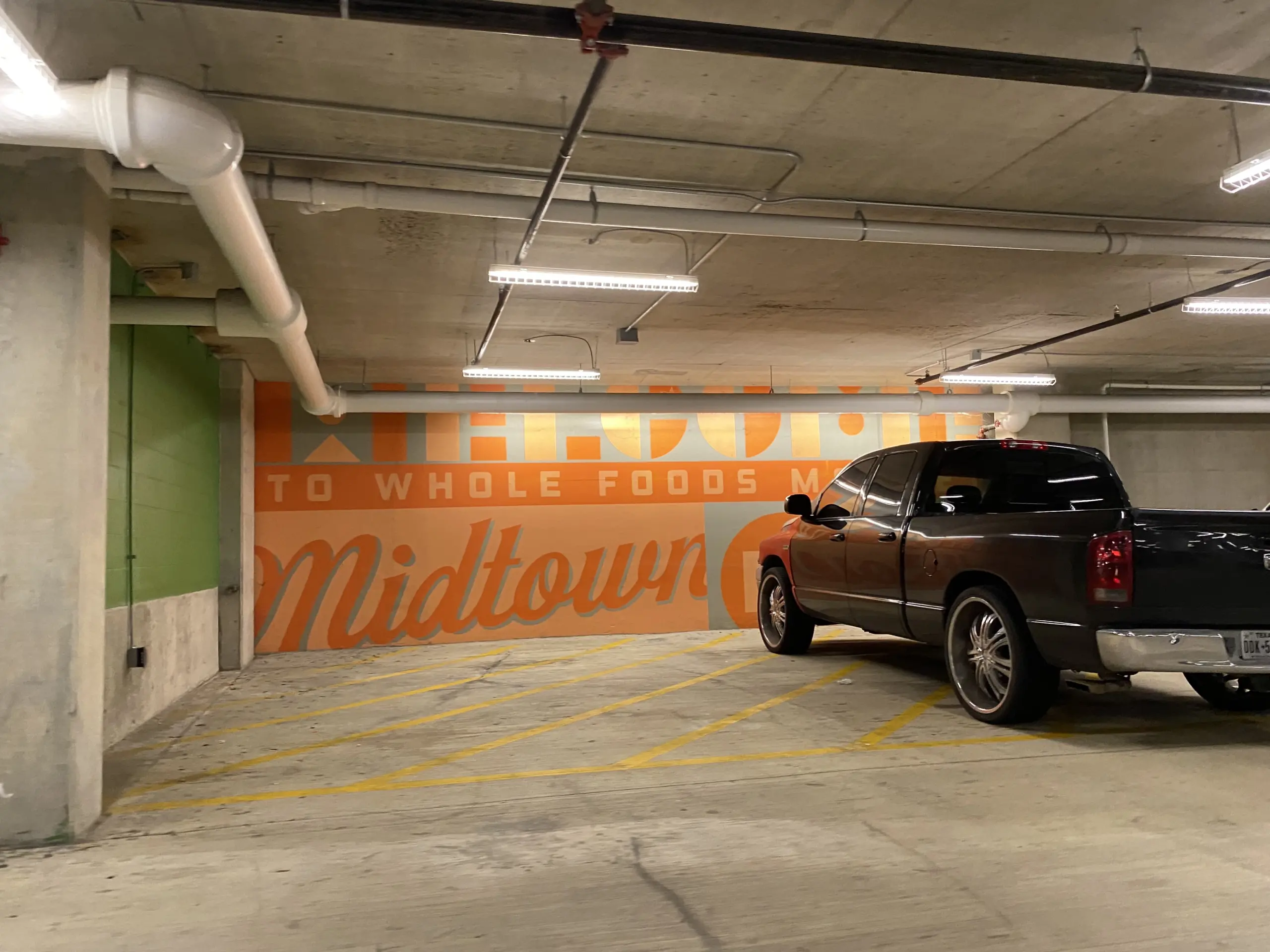
I’ll start off by saying I’m not a Whole Foods shopper. Beyond just not going in for grains and granola, the only thing I really enjoyed was their hot bar, which has taken a distracting downturn in quality since the Amazon buyout a few years back. I visited this store solely to get photos for the closing, but once I was inside, I found that it was easily the best-looking new grocery store in Houston built in the past 15 years. The gray tones and concrete aren’t gone, but everything has a splash of color. Towards the front of the store, this is less dramatic, as some of the color comes from green/blue tinting on the windows, but in areas where natural light doesn’t reach, WFM added painted features. I also really enjoyed the “vintage” fonts used in the department signage. This store is a far cry from the competent design strategies of, say, Randalls in the 1990s, but as far as new stores go, other chains could take a page out of the Whole Foods playbook. This store, which sits at the base of the Pearl Marketplace tower in Midtown, closed in 2023 and currently sits vacant. The property’s future is unknown, although Amazon is said to still have control over the lease.


Biggest missed opportunities to create a pleasant grocery shopping environment: HEB Bellaire and Meyerland.
While I think that the ceilings, columns, and floors should’ve had more ornamentation, the designers did do a good job of making the walls in this store look interesting. I wish more retailers would use pops of color like we see here! It’s a shame that this store closed and that Whole Foods seems to use a one-off approach with store interiors.