Editor’s Note: Today’s post is a guest submission from HHR’s good friend BillyTheSkink
Unassumingly
Stands a neighborhood pillar
The first Krogertsons
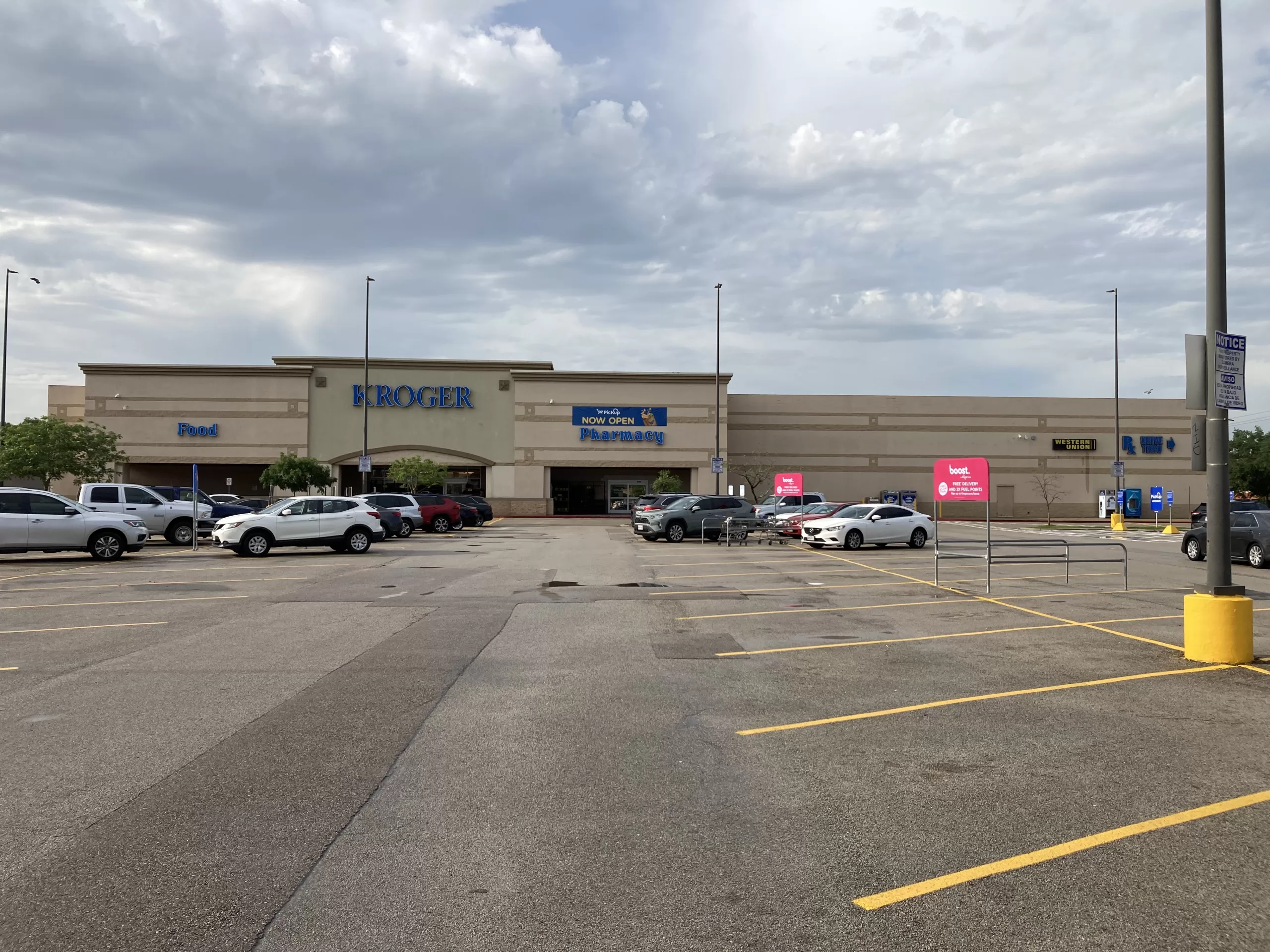
I did not think much of this store when I first moved to West Houston in the early 2010s. Kroger HO-735, perhaps better known as the Dairy Ashford and Briar Forest Kroger, sits about as quietly as a grocery store can in busy West Houston. While situated at a high traffic intersection, the store at 12555 Briar Forest Dr. is mostly surrounded by housing and some small, low traffic retail. It is located less than two miles away from two other Kroger stores (1520 Eldridge Pkwy and 14344 Memorial Dr.), one significantly larger and both arguably more prominently located, not to mention nearby competition from a who’s who of Houston grocers… Randalls, Fiesta (in a former Kroger!), Food Town, HEB, Target, Walmart, Whole Foods, Trader Joes, Phoenicia, Gordon, and (soon-to-be) 99 Ranch Market all have locations within 3 miles of this store. With the abundance of grocery options in the surrounding area and its relatively small size, the Dairy Ashford and Briar Forest Kroger is easy to overlook.
I once overlooked it as well, but I quickly learned to appreciate this Kroger. It proved not only convenient to where I lived, but also proved to provide a typically pleasant shopping experience, and it contains quite a wide selection of groceries and service departments despite its relatively small size (about 57,000 SF). It is the kind of neighborhood grocery store that just doesn’t get built anymore, and while there are plenty of other examples of such stores in Houston still, this is one of the best examples I have shopped. I have a great affection for this store and if someone did the math they may find that I spend more time inside of it than anywhere that isn’t my home or workplace. Much thanks to Houston Historic Retail for letting me write about it for The Year Of Kroger. I’m sure the fact that it was the first Albertsons in Houston, and a prime example of a Krogertsons, was only a small factor in that decision…
History
While Albertsons had stores near Houston (College Station, Lufkin, and Beaumont) and even in Greater Houston for several years prior (Lake Jackson, Texas City, and Conroe), this store was their first to be located in the city of Houston itself and the first of ten stores to open in 1995 as a part of Albertsons’ first real push into the Houston market. Opening as Albertsons #2703, the store operated as such from 1995 until the summer of 2002, when Albertsons exited the Houston market. Kroger agreed to purchase this store (despite being located in the middle of what was then 3 nearby locations!), along with 15 other Albertsons locations in Houston, in 2002 and has operated it uninterrupted ever since. Now, over 20 years later, 14 of these locations remain in operation as Kroger stores. Several other former Albertsons locations are also occupied by Food Town, HEB, and even Randalls and many more former locations continue to operate as grocery stores than not. For all of Albertsons’ missteps during their Houston venture, picking locations does not appear to have been one of them. Alas, they did so largely for the benefit of Kroger… who they are now attempting to merge with, so I guess it might all work out in the end. Let’s now take a look at the store as it is today.
Exterior
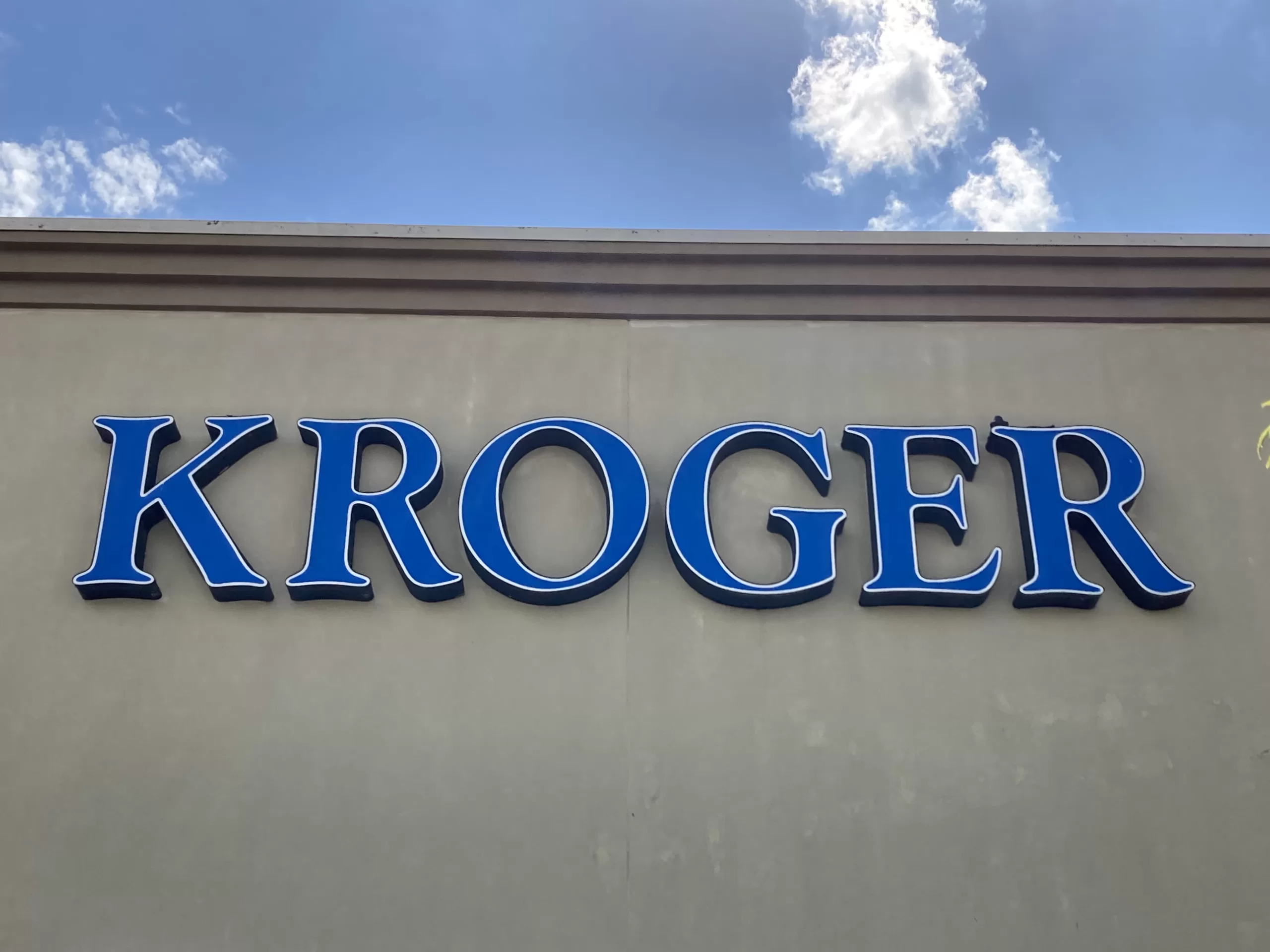
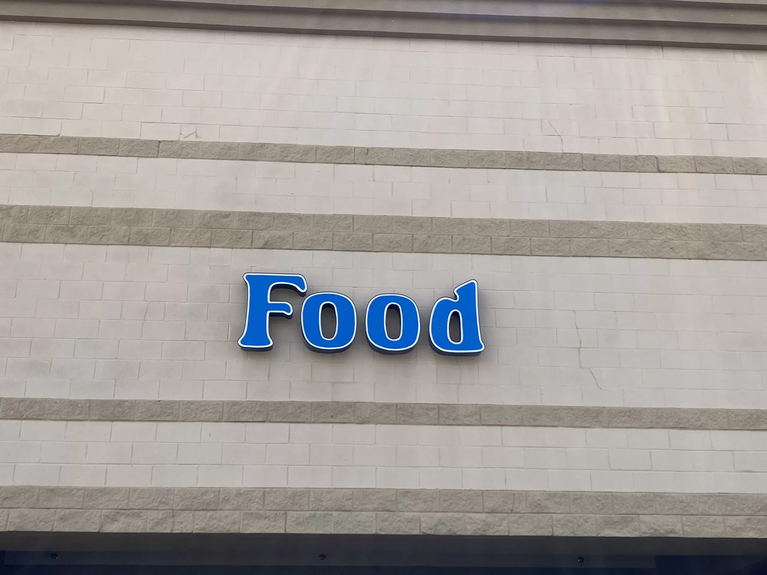
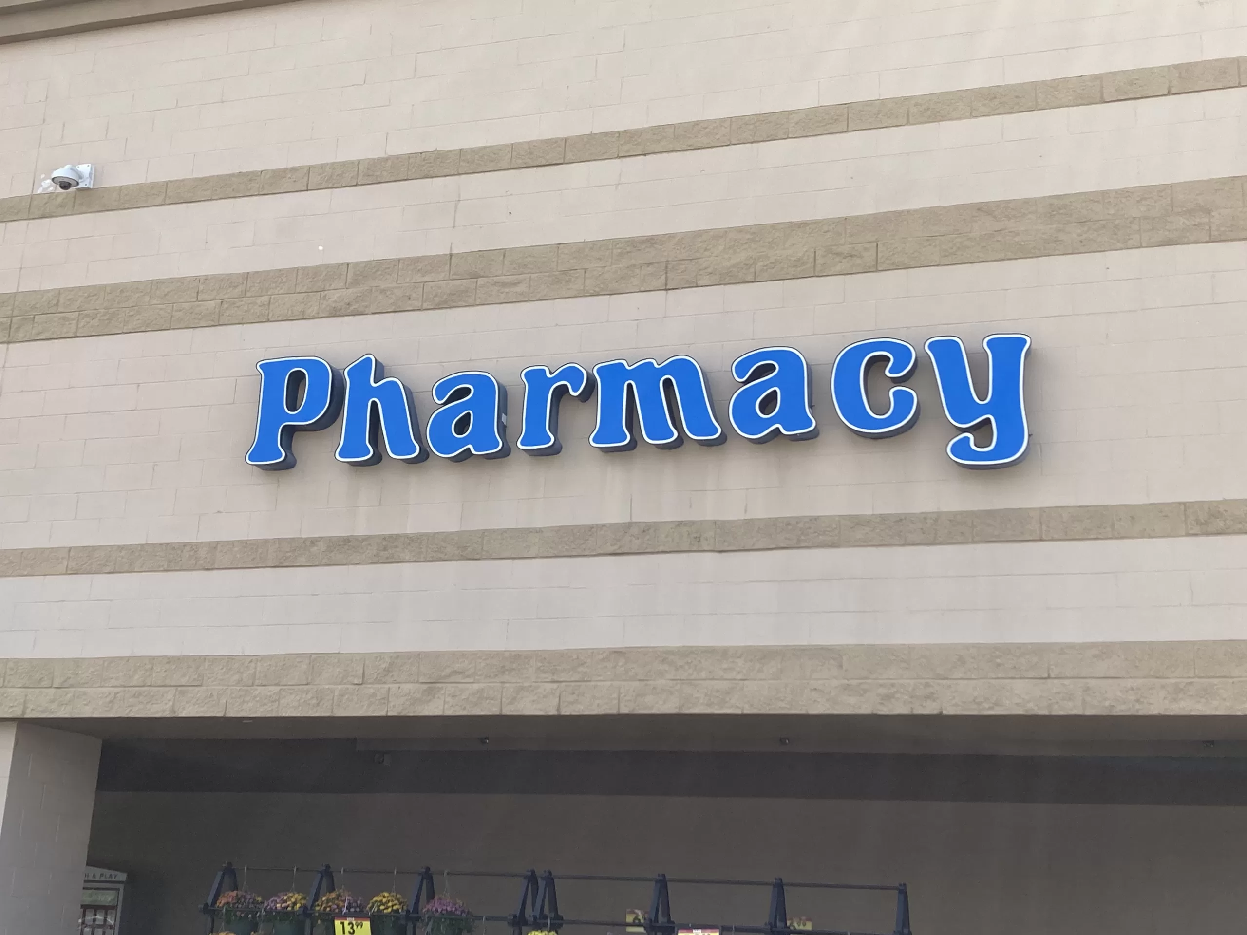
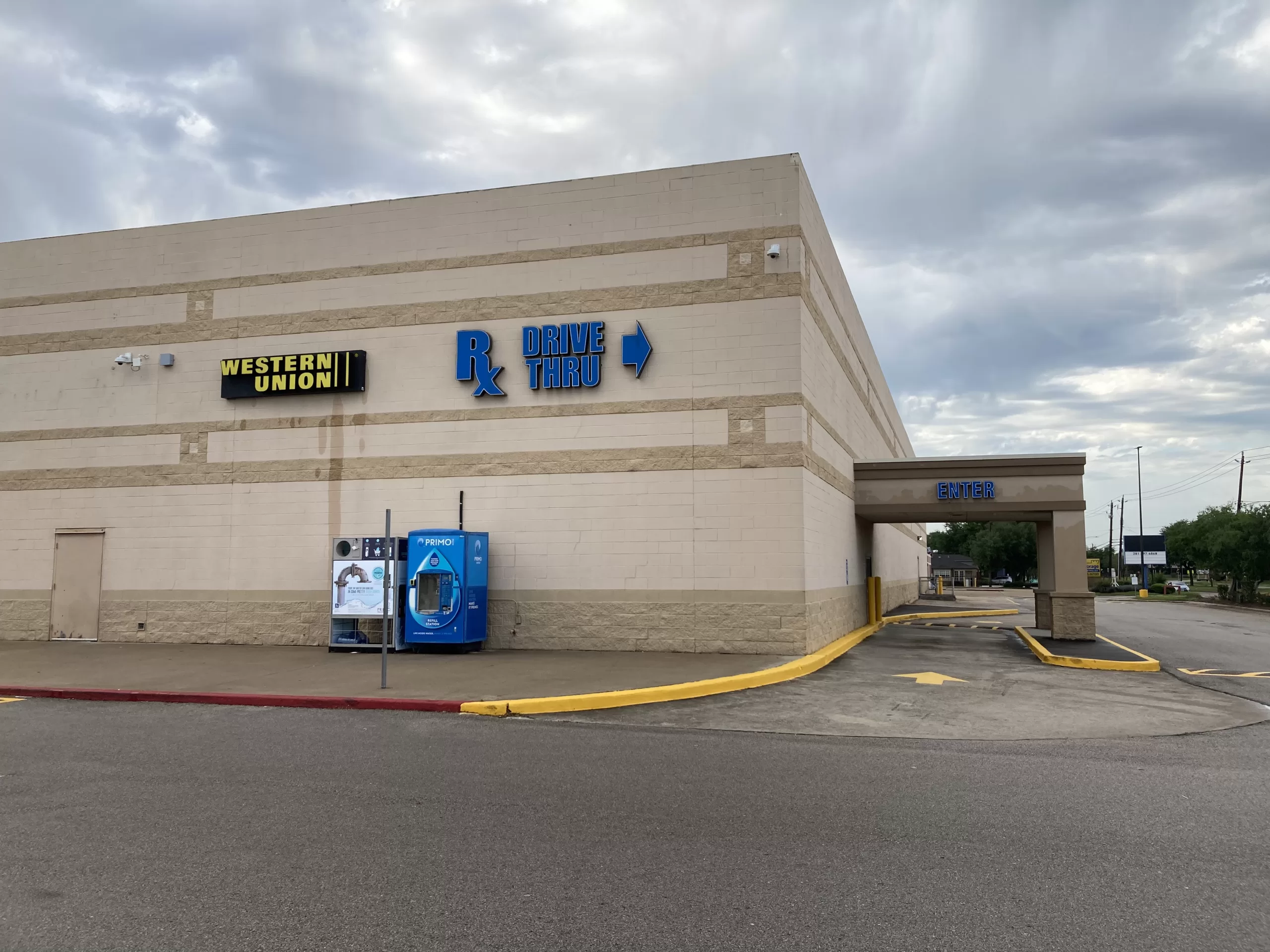
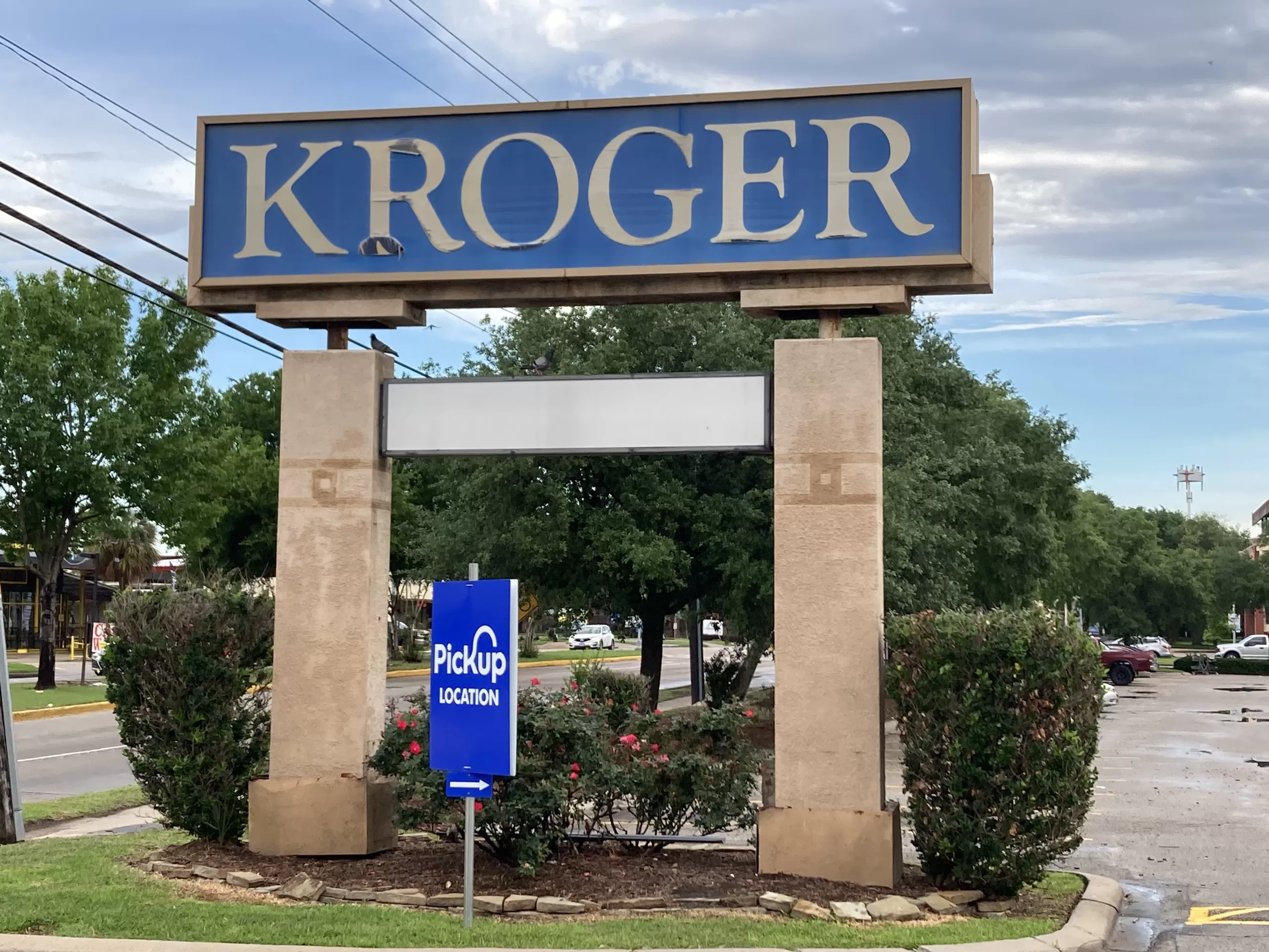
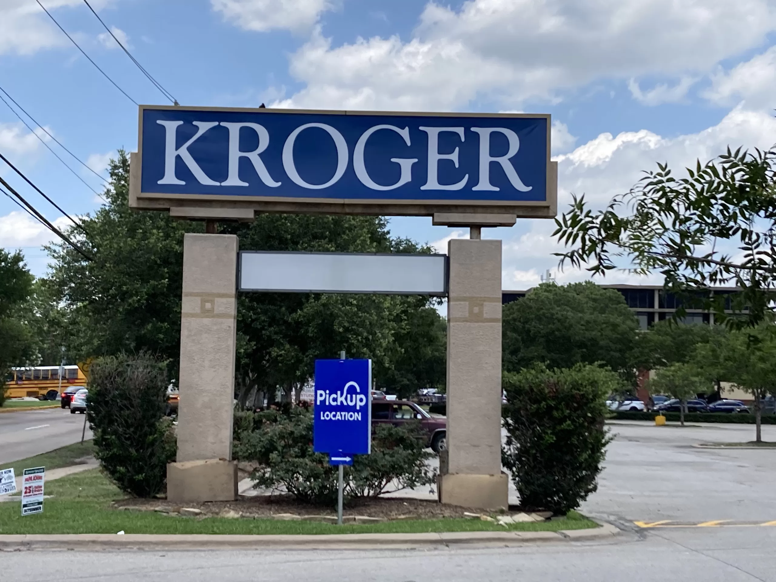
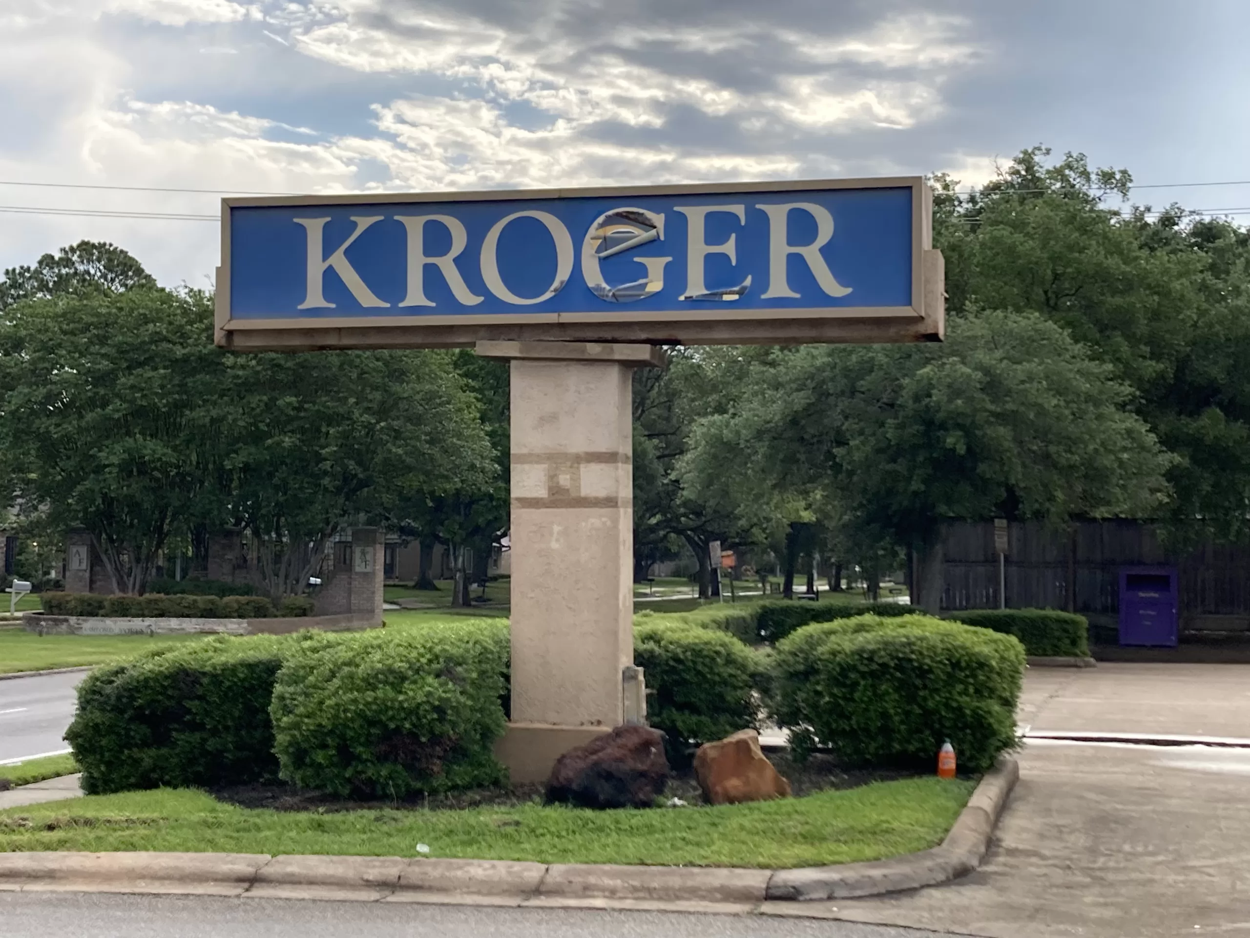
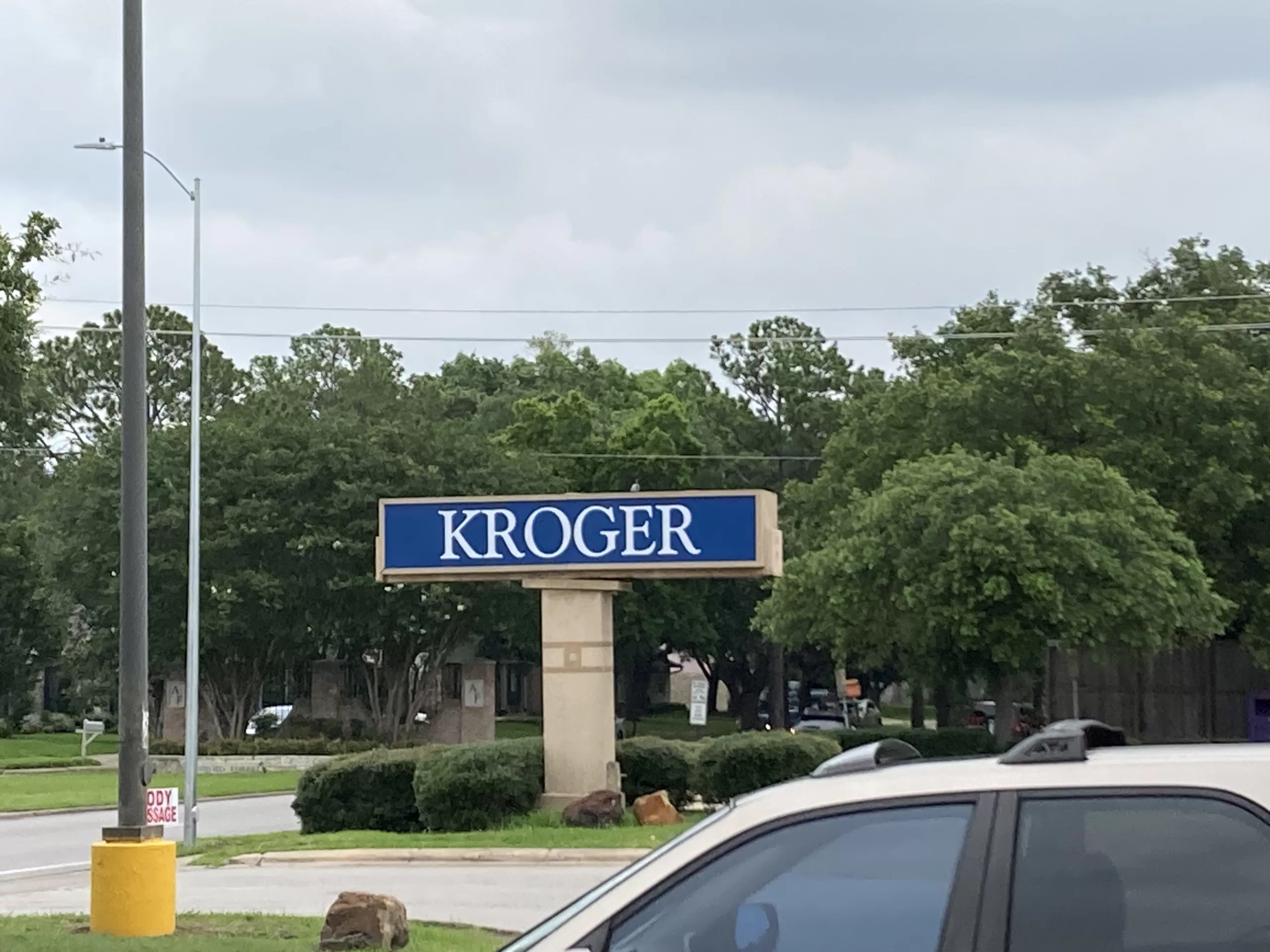
While the exterior has seen new paint from time-to-time (most notably when the “Signature” signage was removed in 2017), the store looks largely unchanged on the outside from its days as an Albertsons. Kroger even retained Albertsons’ “Food” and “Pharmacy” signs and borrowed their blue for their new Times New Roman “Kroger” sign.
By the way, see if you can keep track of all of the different fonts and logos used in signage outside of this Krogertsons. I’m not sure any font is used more than twice. These inconsistencies should be infuriating, but they somehow come out charming to me instead. There is no reason for such a menagerie of logos and typefaces to be used at this store and I am sure some folks at Kroger corporate would throw a fit if they ever saw it, but darned if it isn’t unique.

Street Signs
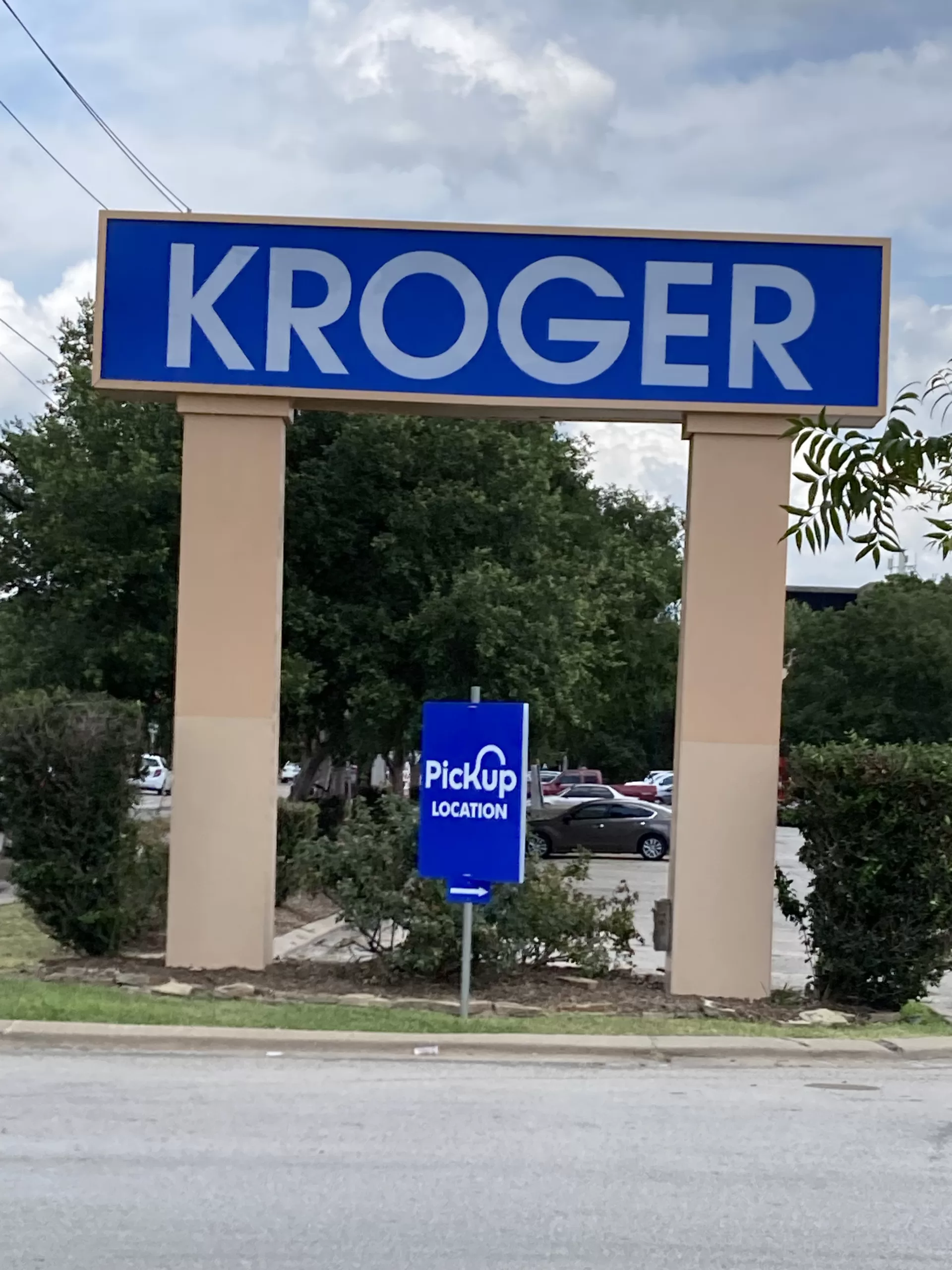
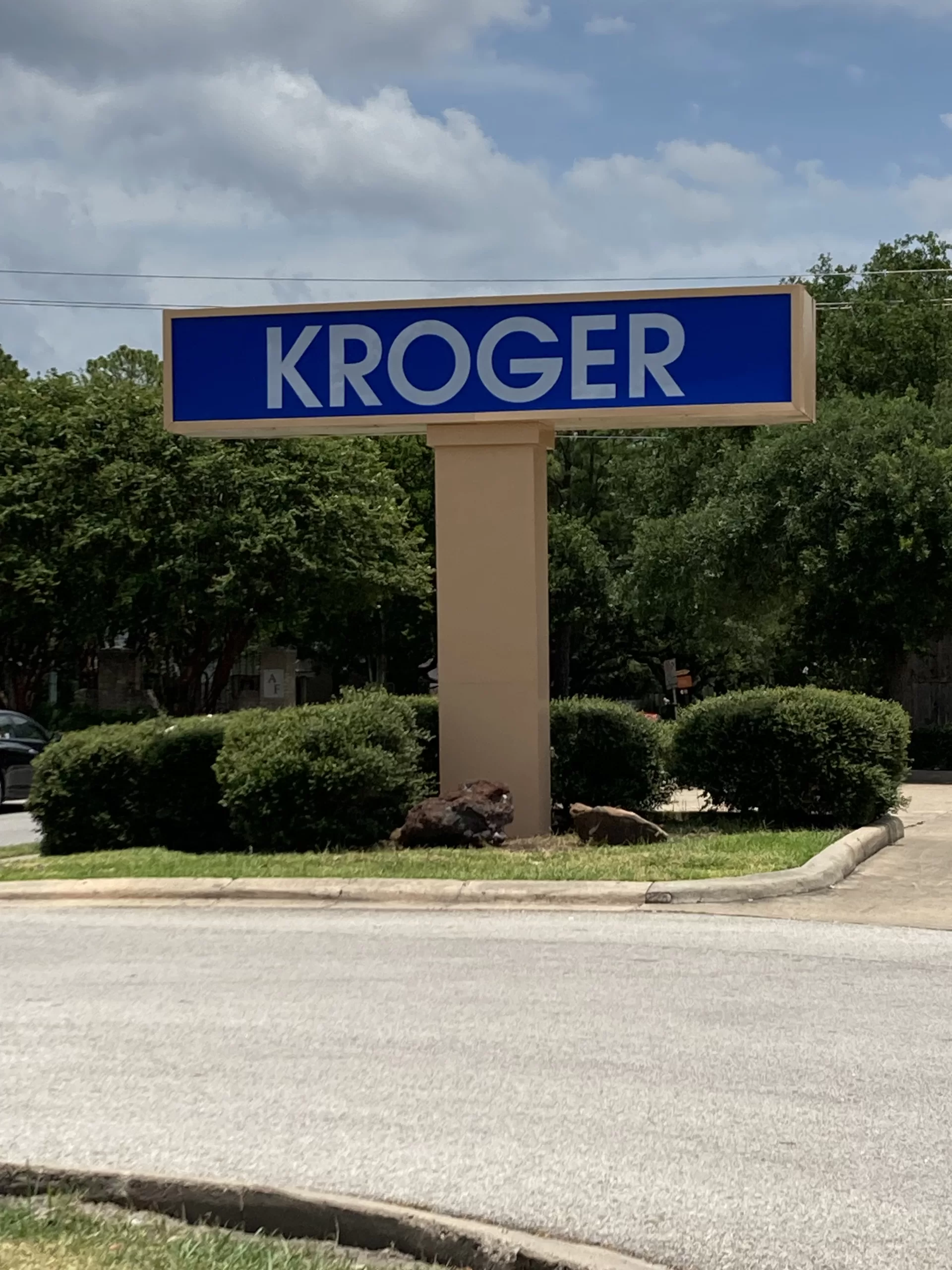
I am giving the street signs their own section as they were replaced while I was working on this post and I managed to capture before, during, and after photos of each sign. Before their recent renovation, the signs looked largely as they did when the store was an Albertsons, and the Kroger text inside the sign boxes was really showing its age. The larger of the two street signs, along Dairy Ashford, also had a small sub sign for the bank branch that was once located in the store as both Albertsons and Kroger. This was most recently a Bank of America branch, which left over a decade ago and was not replaced. After the recent refinishing of the sign structure, the former bank sign was also not replaced.
Decor and Departments
The store used Albertsons’ then-current decor package when it first opened, the Blue & Grey Market decor, and a layout similar to several other Albertsons that opened around the same time. The layout appears to have remained largely unchanged since the Albertsons days, though Kroger has updated the decor on a couple of occasions since. The store layout is quite similar to some other former Albertsons in the Houston area, and might also be recognized by shoppers browsing the aisles at former Albertsons as far away as Mississippi and Florida.
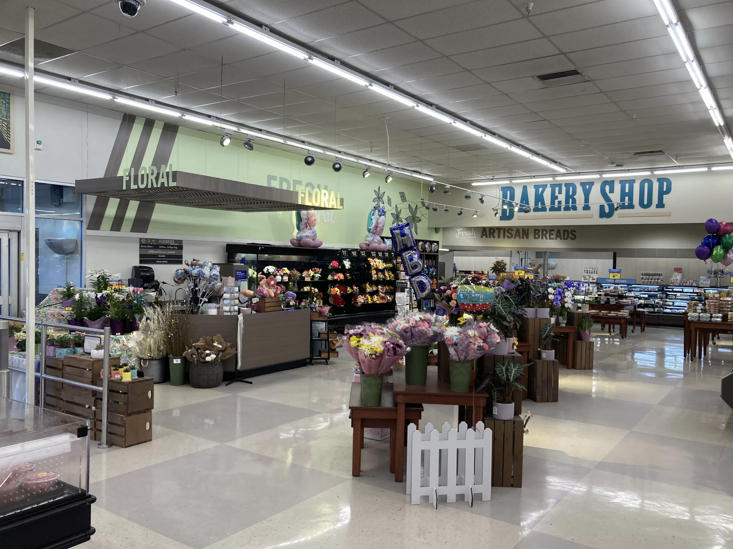
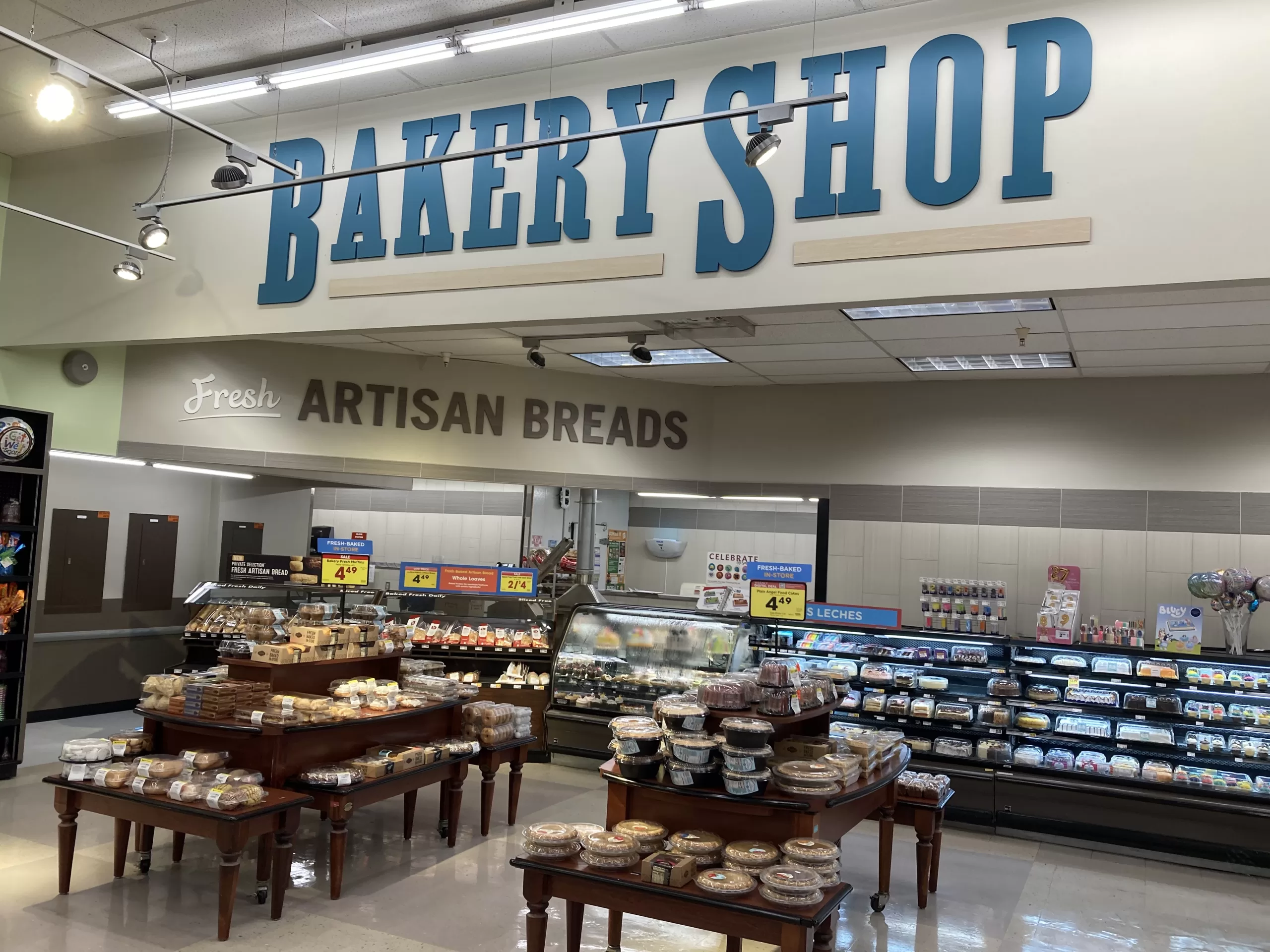
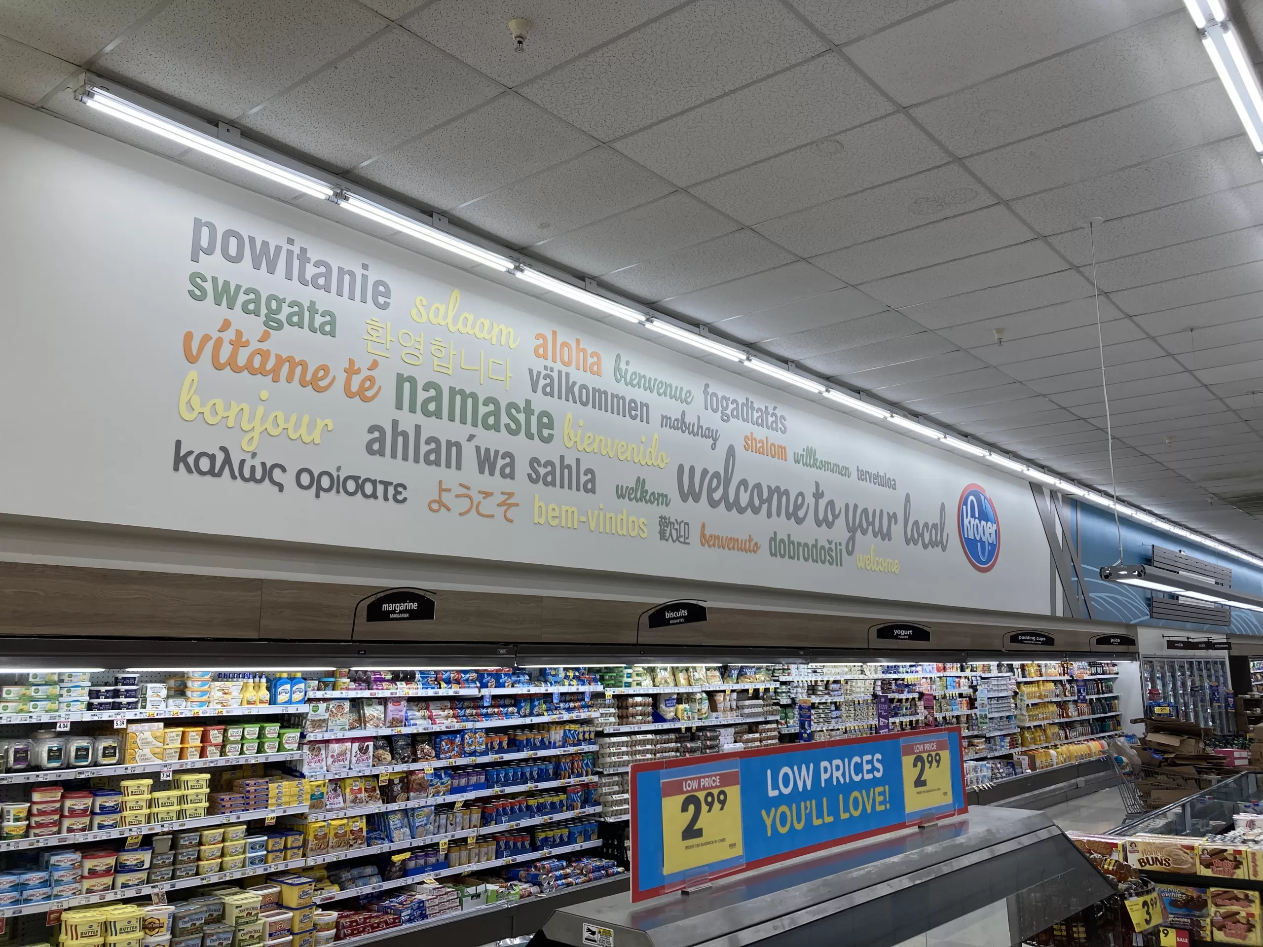
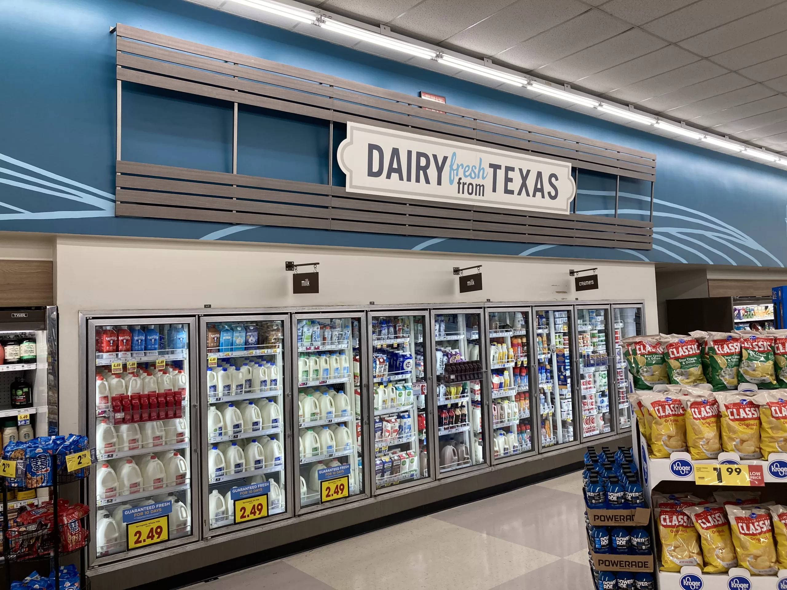
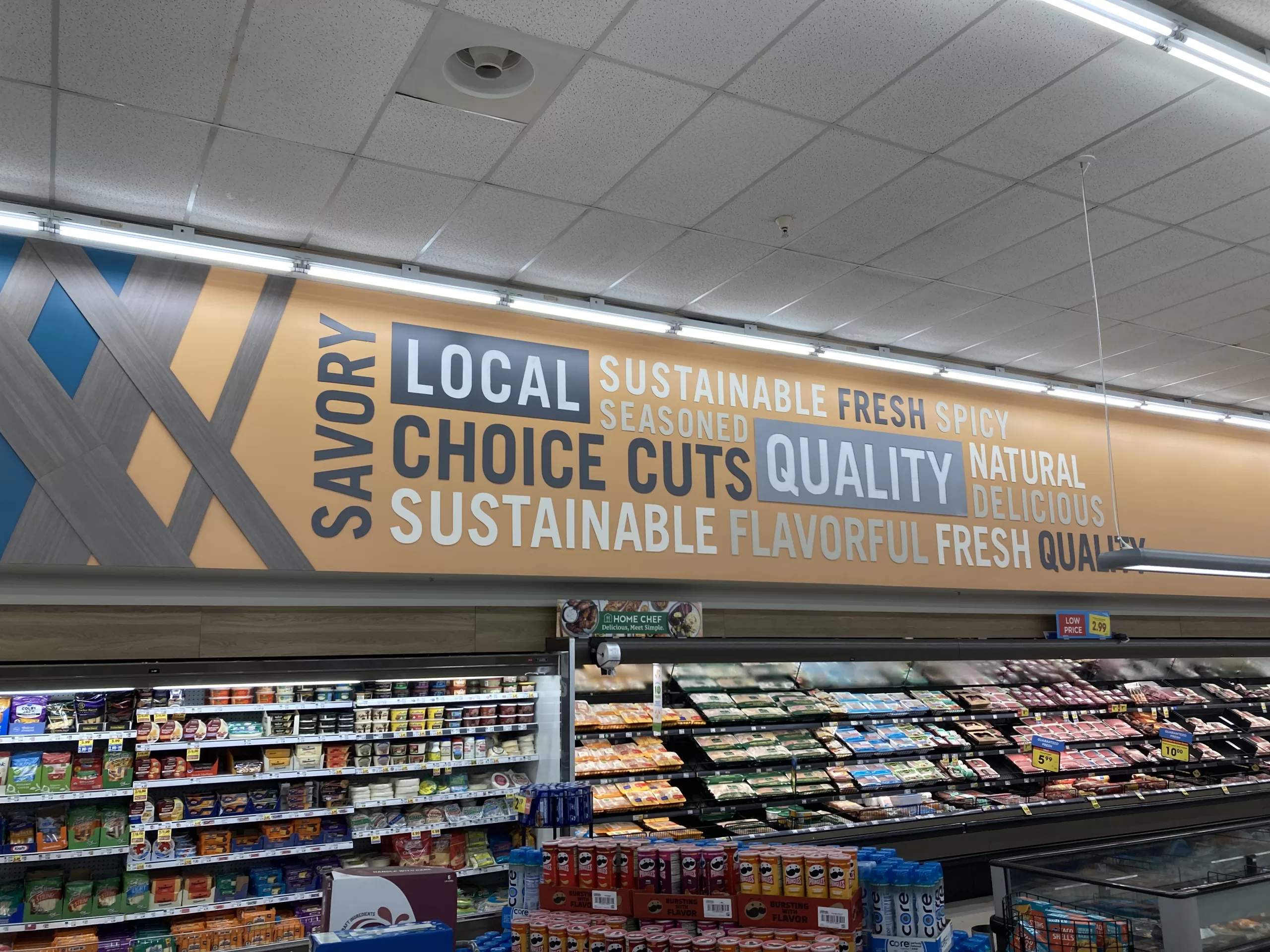
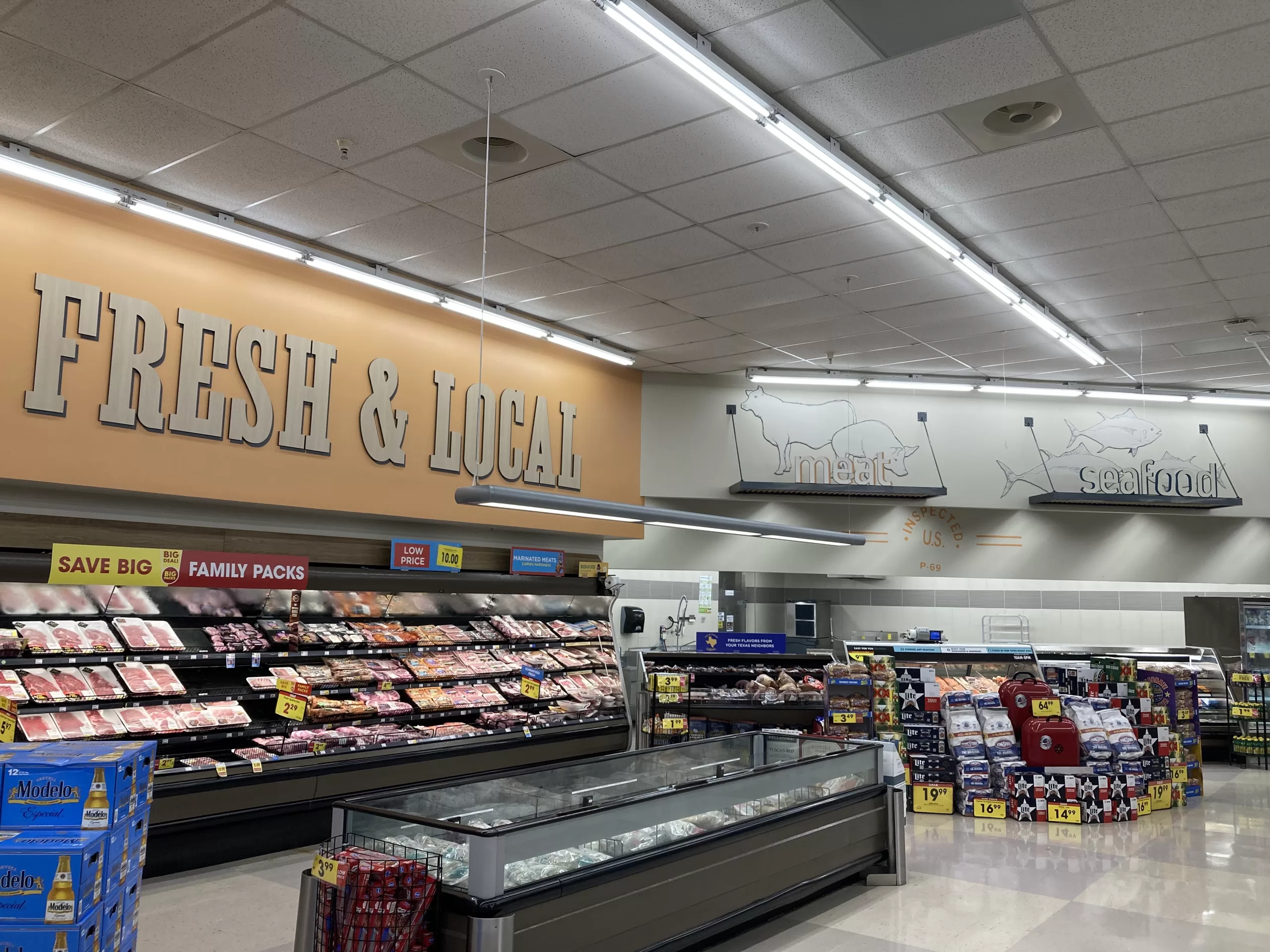
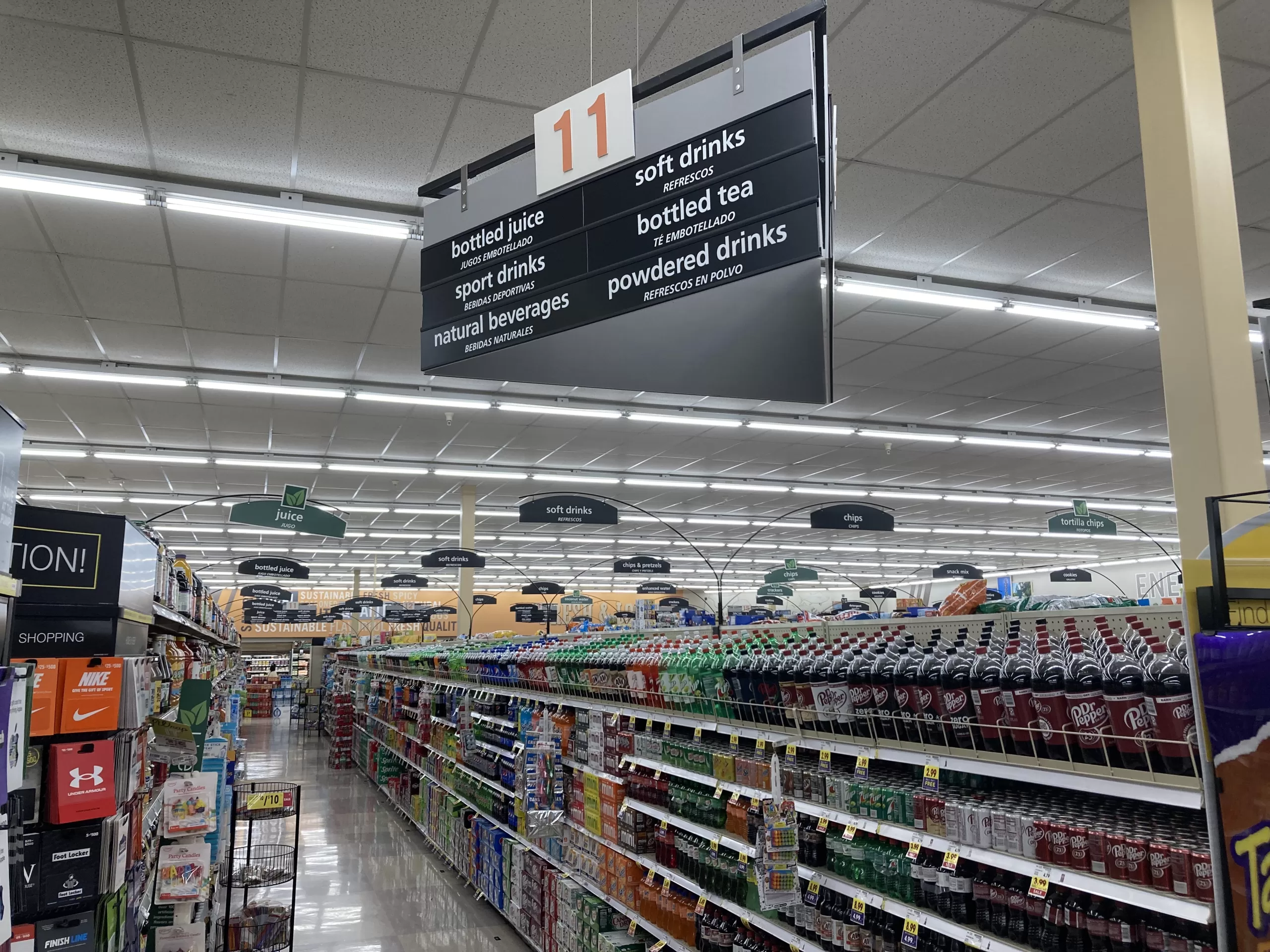
The store’s current decor appears to be a bit of a mix of Kroger styles used in the past 10-15 years (after looking at all those fonts outside, what else could you expect?), but it is largely rooted in Kroger’s “Fresh & Local”/”Neighborhood” decor package. Light colors, bright lighting, large all-caps serif lettering on most signs, and a scattering of local flair distinguish this Krogertsons from many Kroger stores in the Houston area, which were updated in the early 2010s and carry the more spartan “Bountiful” decor package, which is actually a few years older now than Neighborhood. Alas, if you are an Albertsons enthusiast, very little of the interior remains from the Albertsons days.
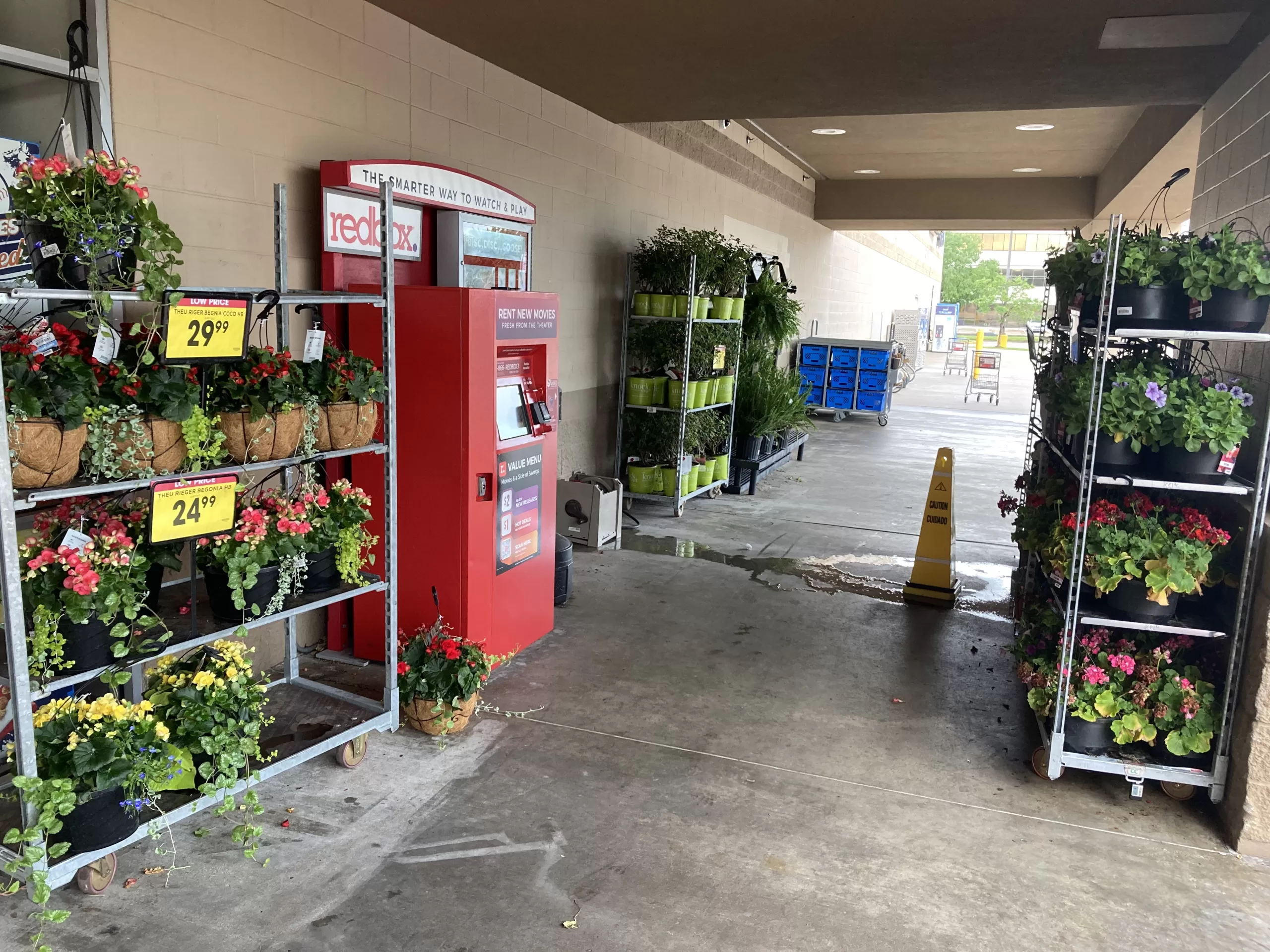
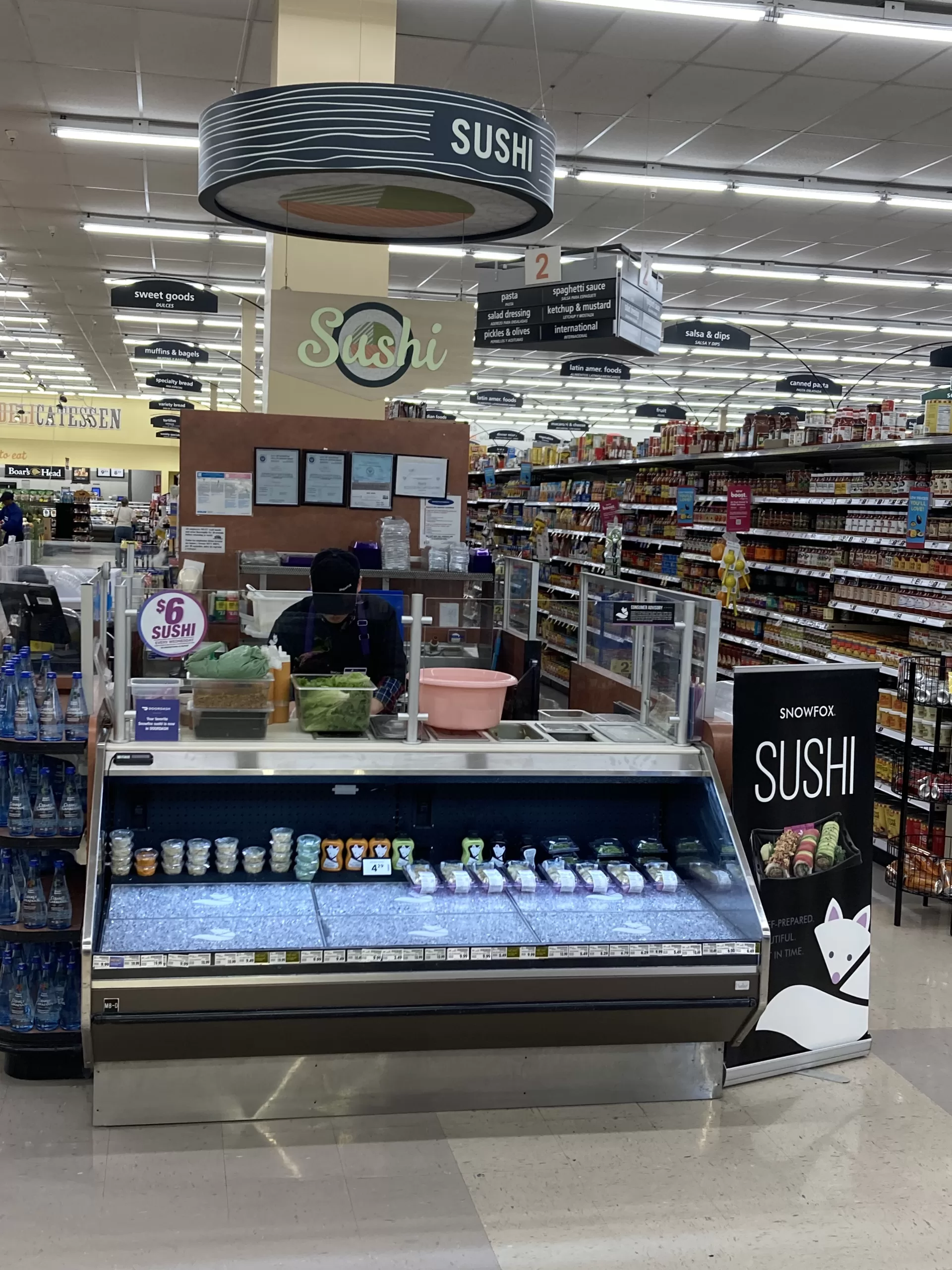
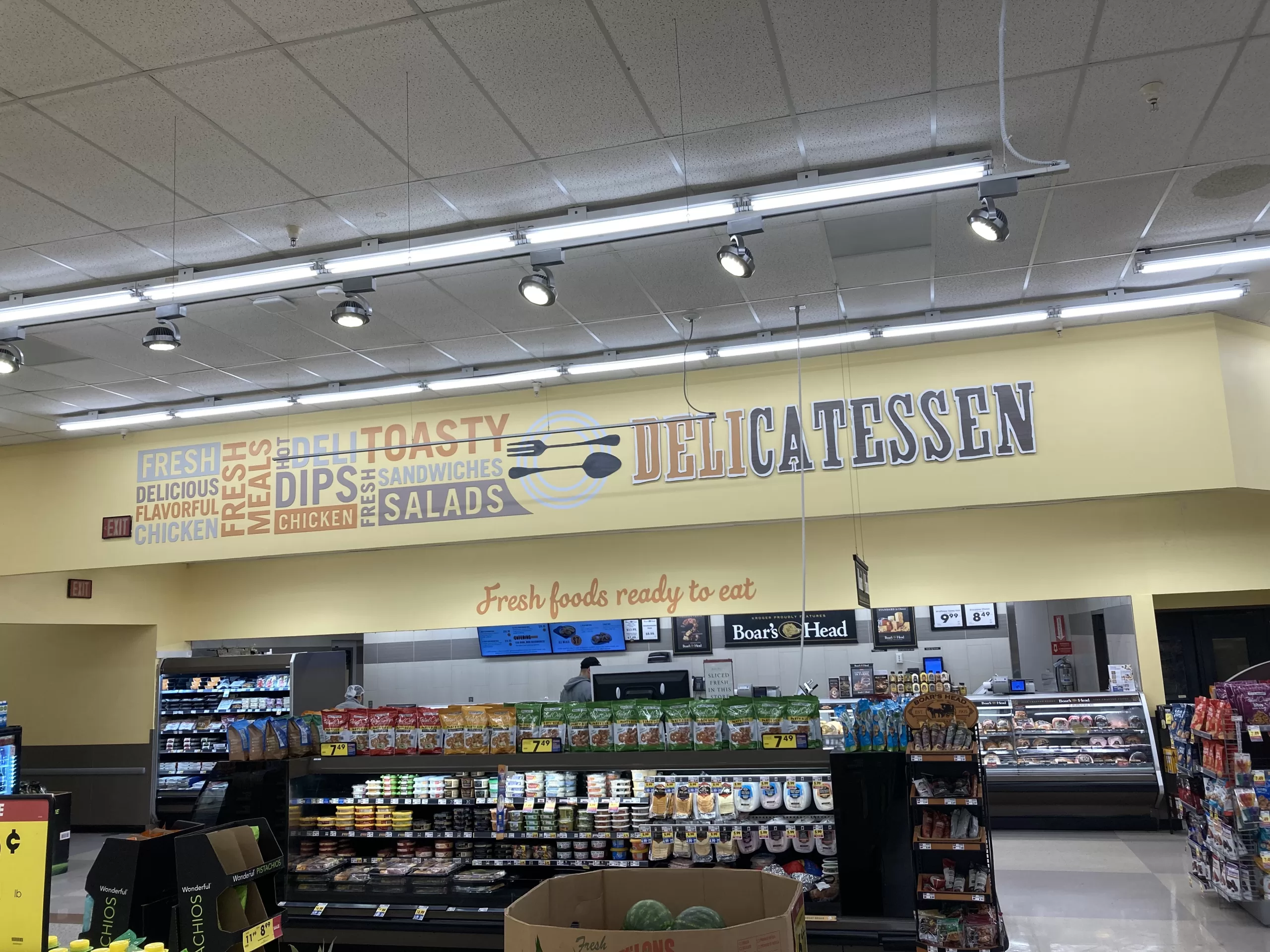
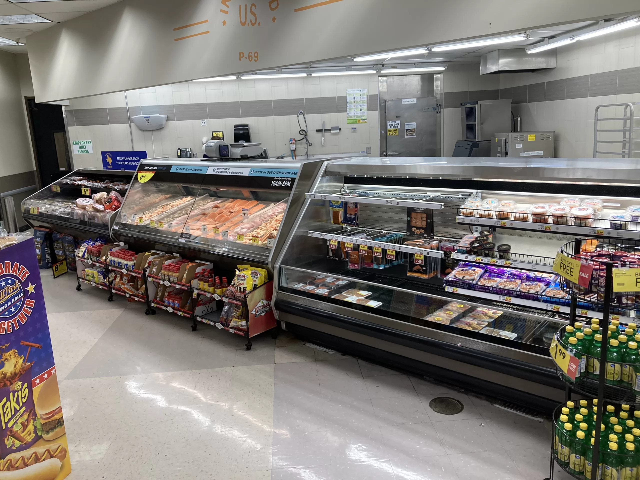
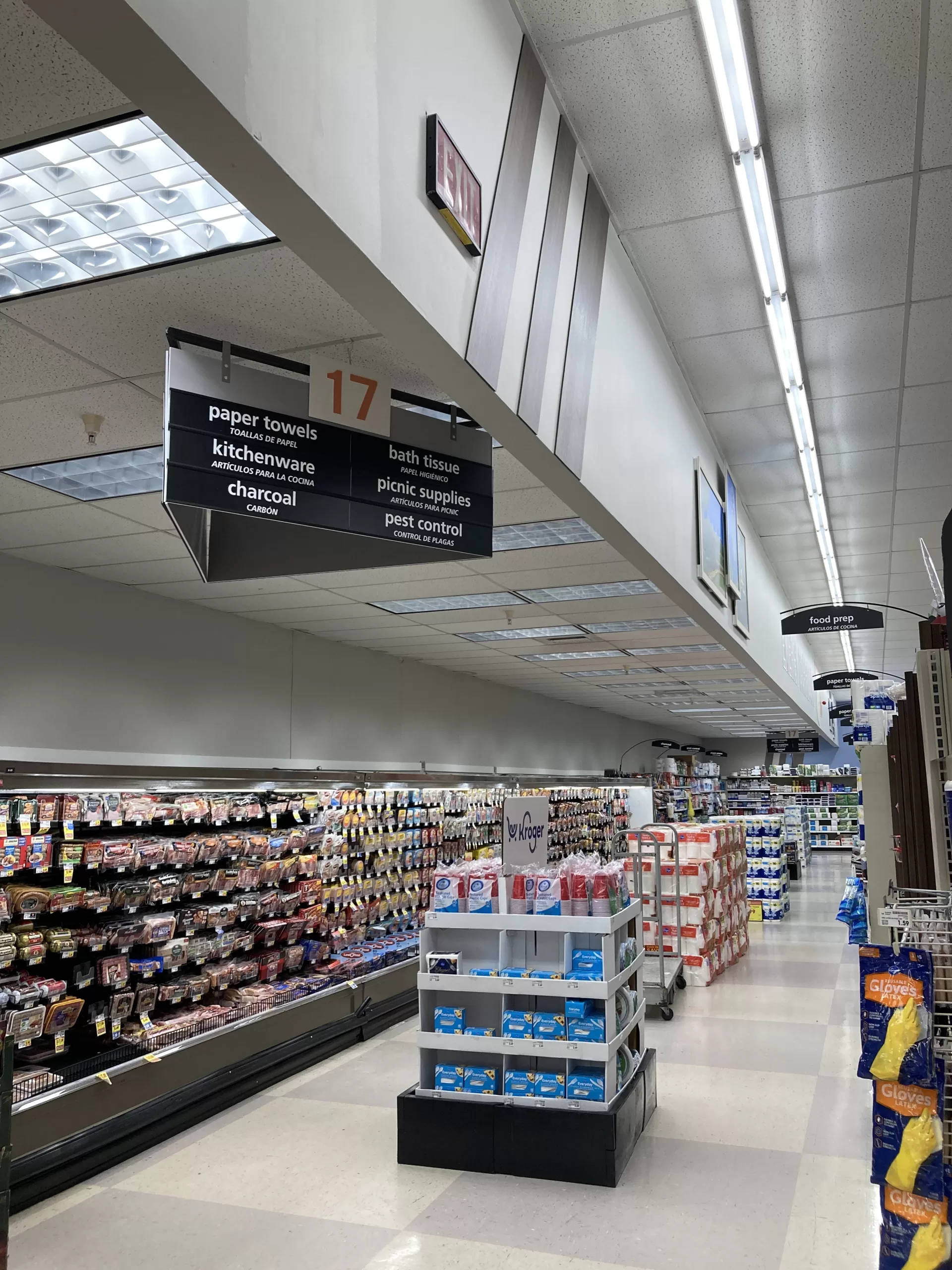
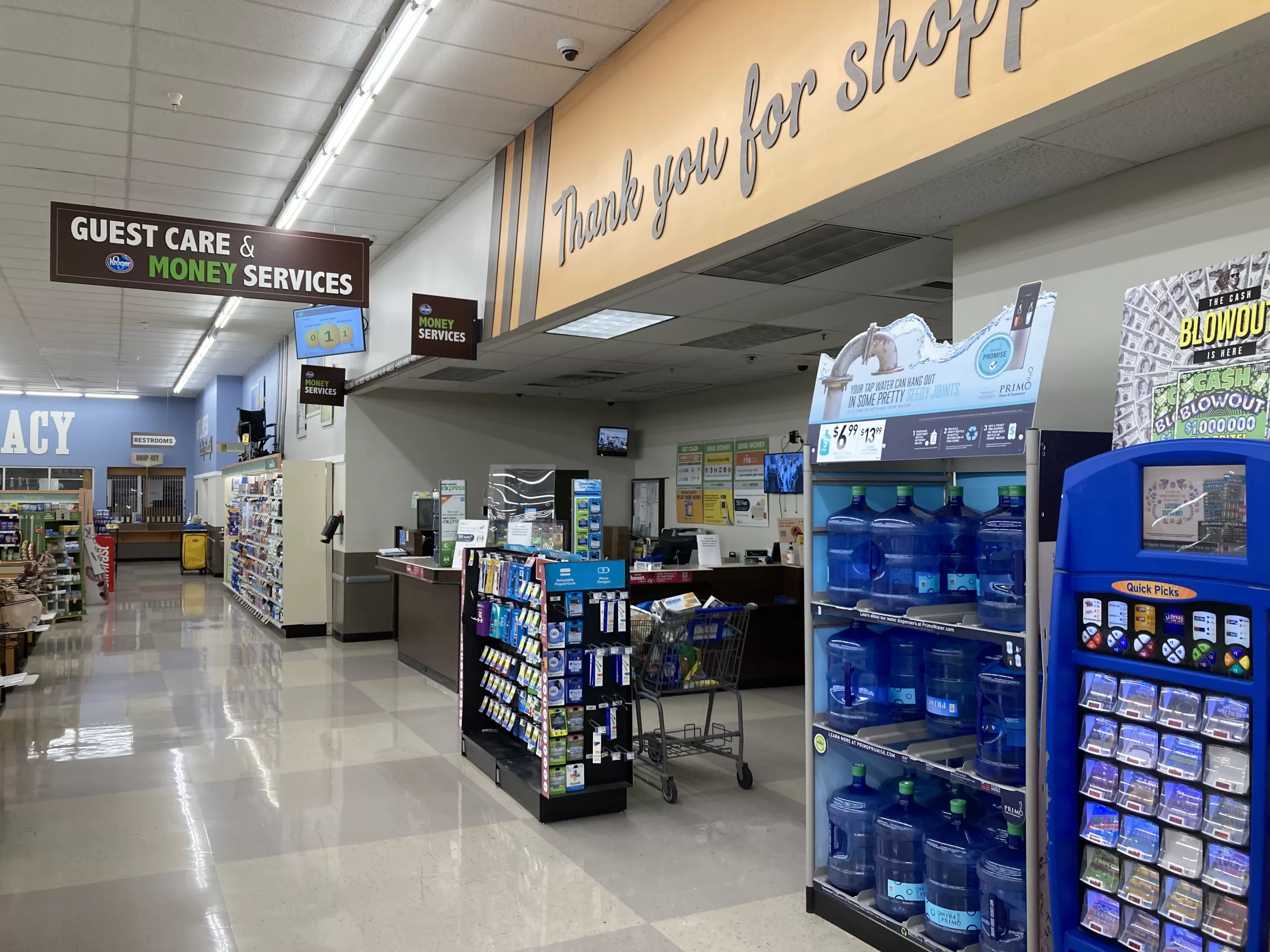
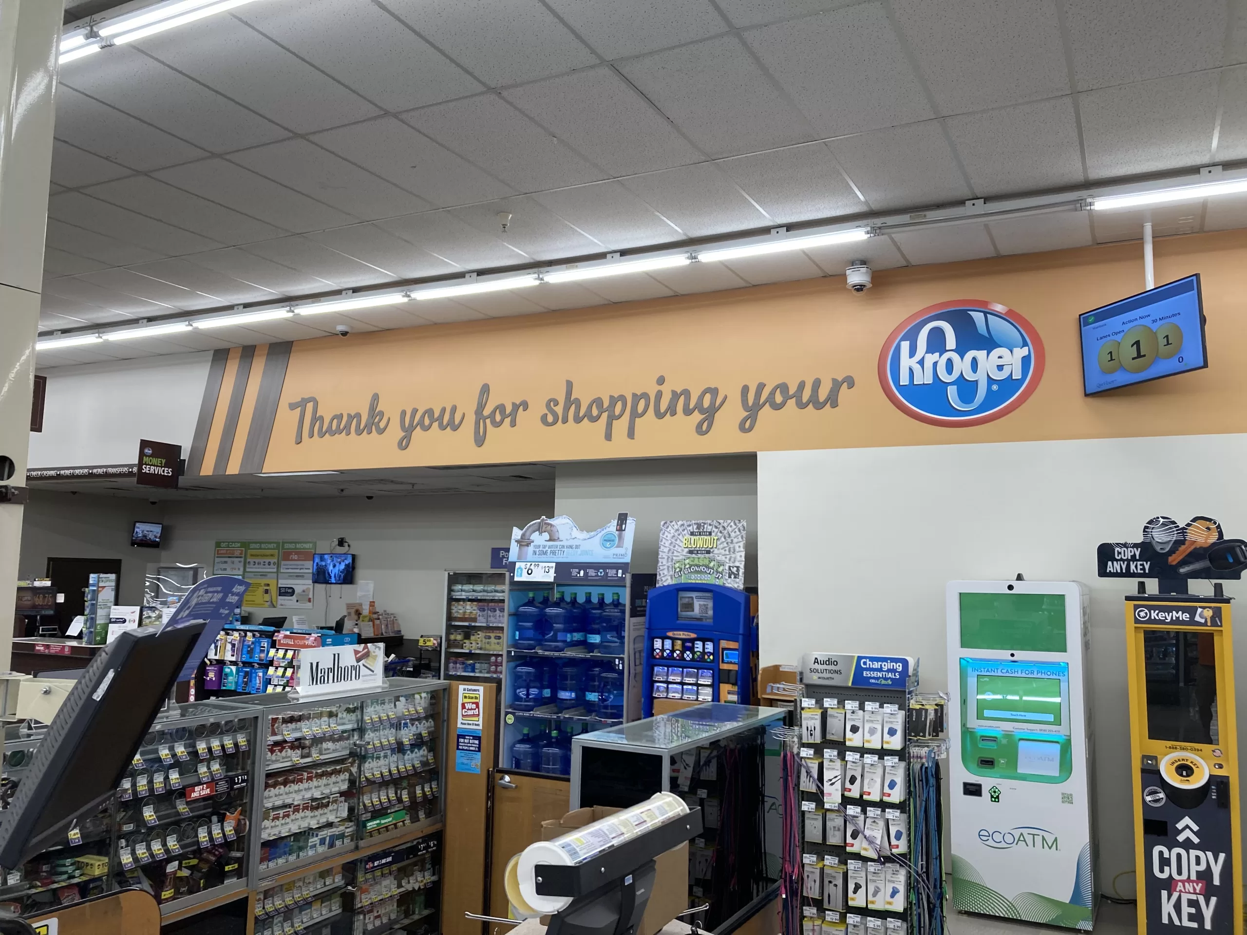
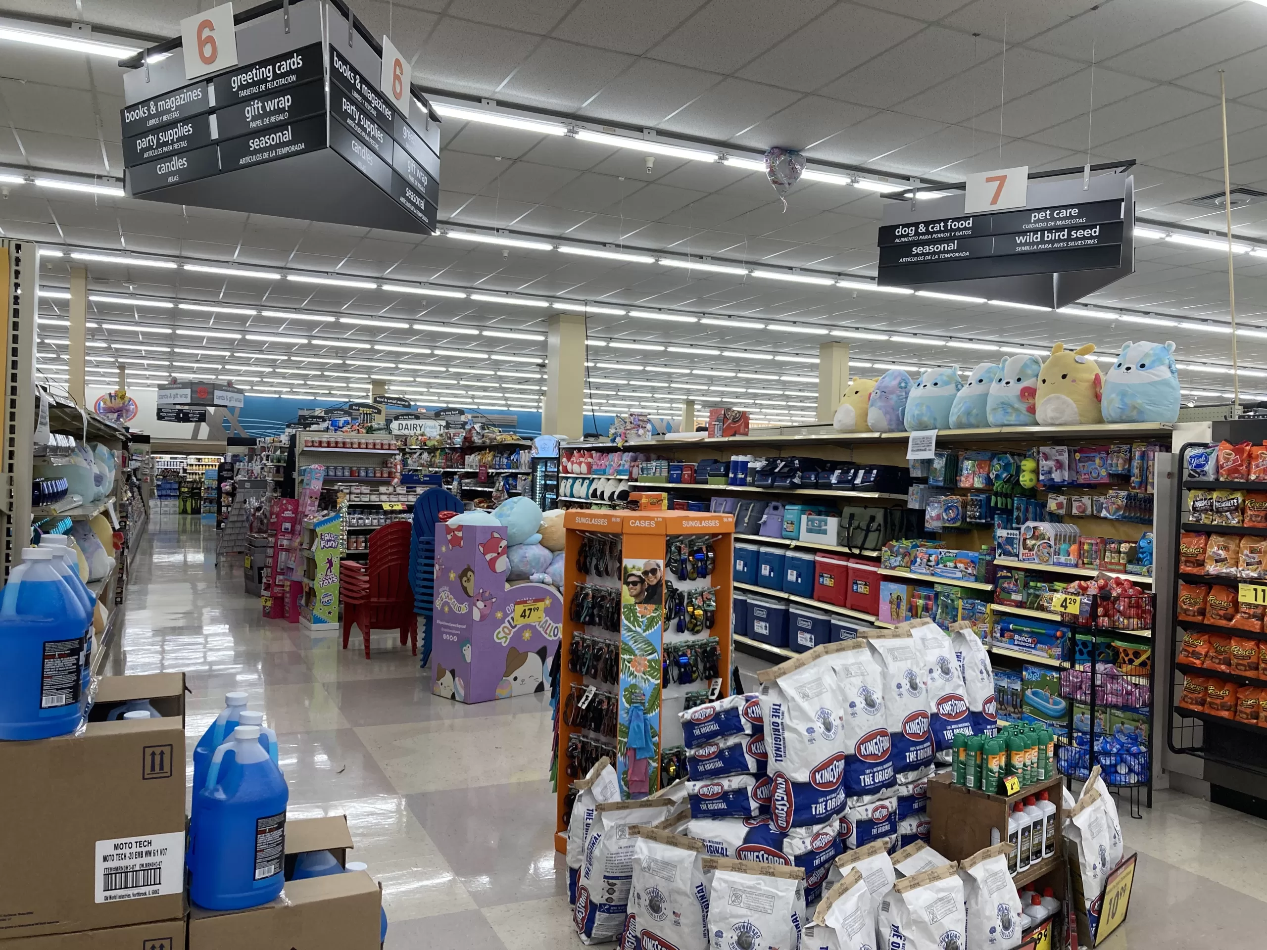
The store contains several service departments: floral, bakery, sushi, delicatessen, meat, seafood, pharmacy, and a courtesy booth. All in less than 60,000 SF, how about that! Granted, some of these departments are scaled down a bit compared to what you might find at a larger store (meat and seafood, notably), Kroger or otherwise, but I find that I give up very little when shopping here. While my familiarity with the store makes me a bit biased, I consider this Krogertsons to be a very effectively laid-out store. It flows well between its departments and the grocery shelves. There are no dead ends and few bottlenecks. It isn’t large enough for anything to really be inconveniently located, either. Despite its compact layout, the store rarely feels small or cramped, and that is not for lack of customers.
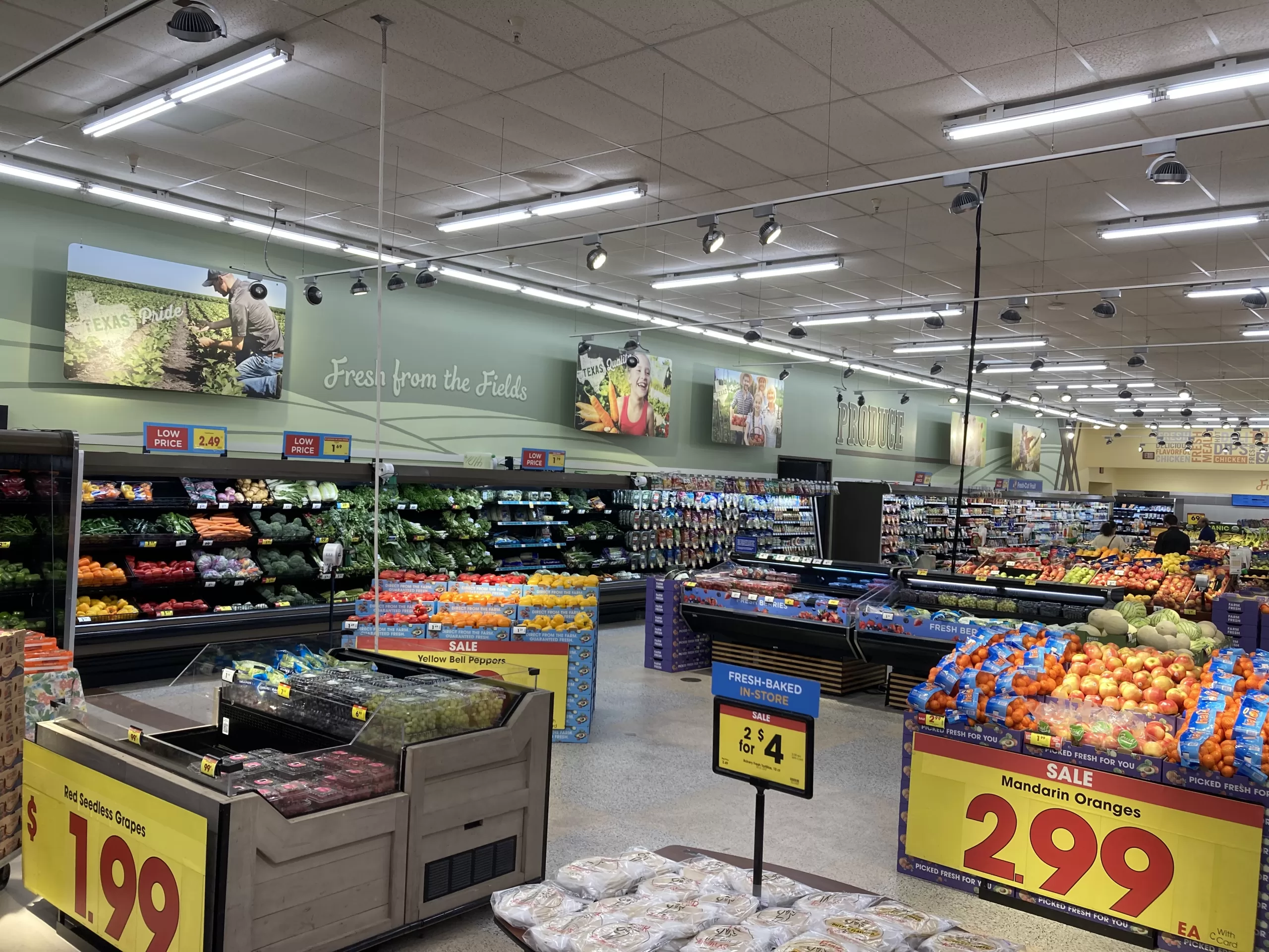
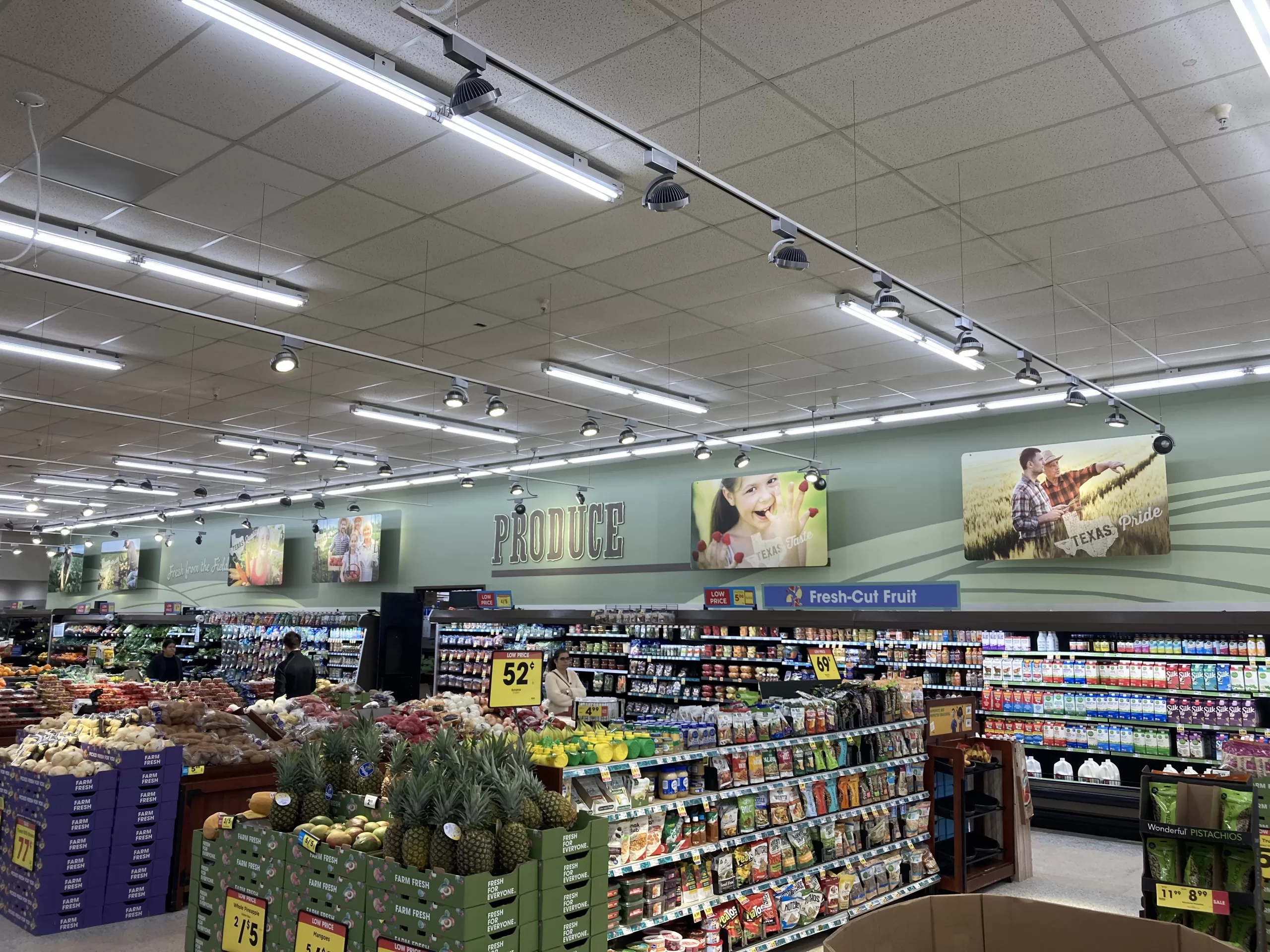
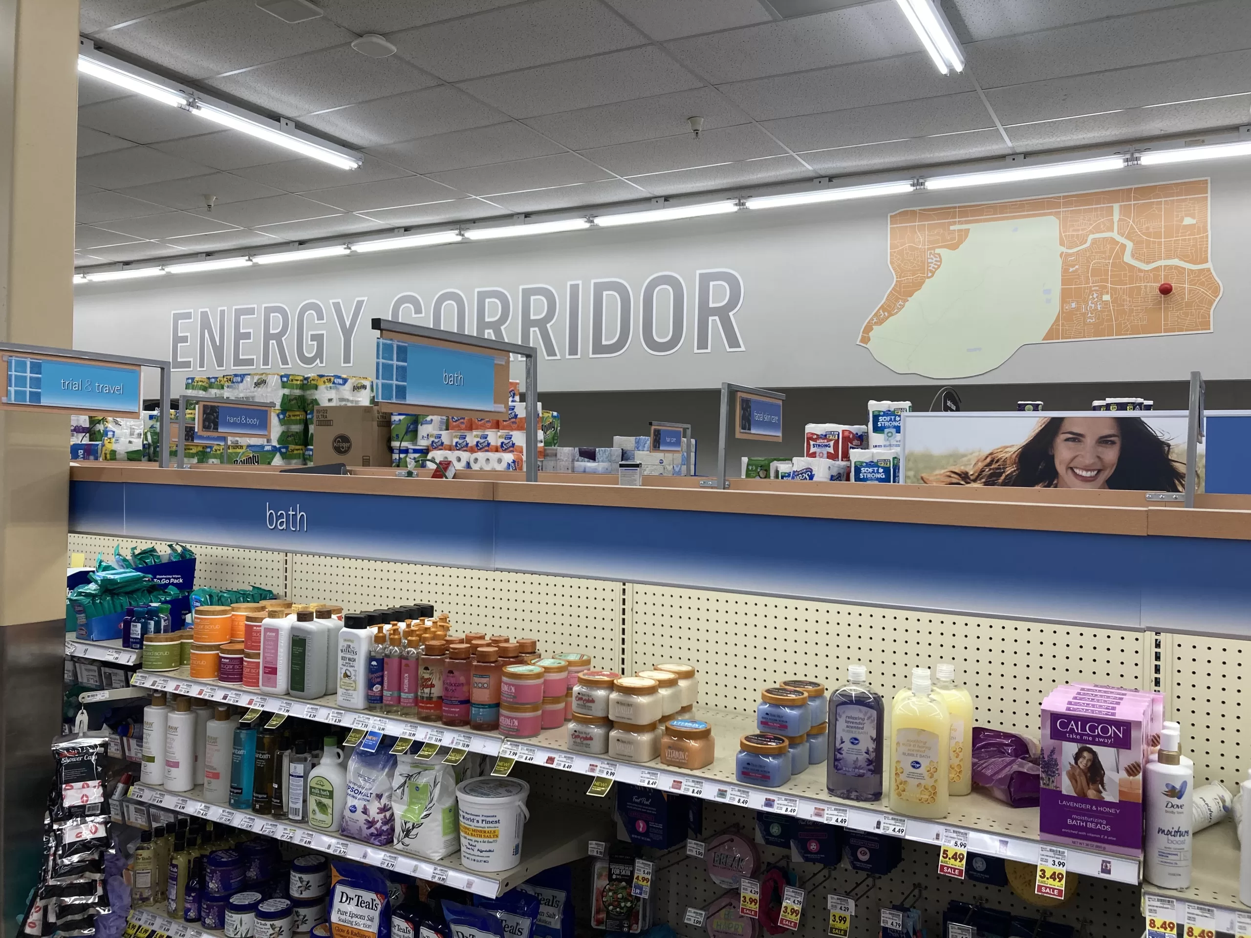
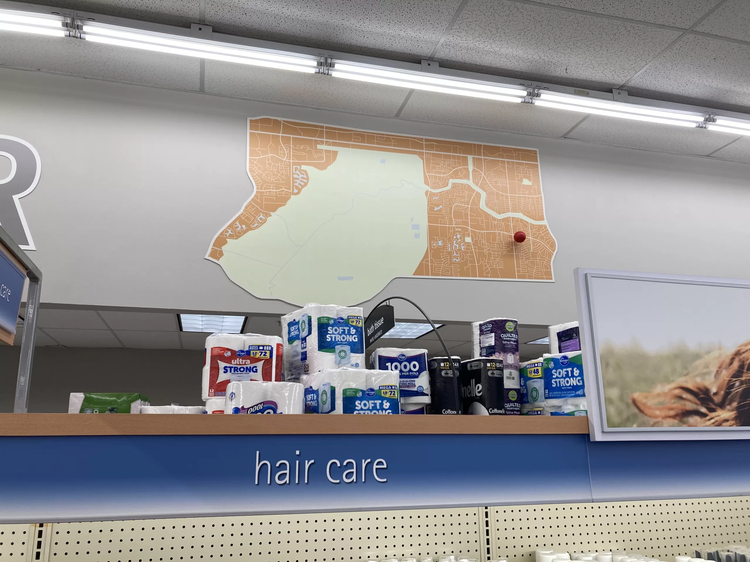
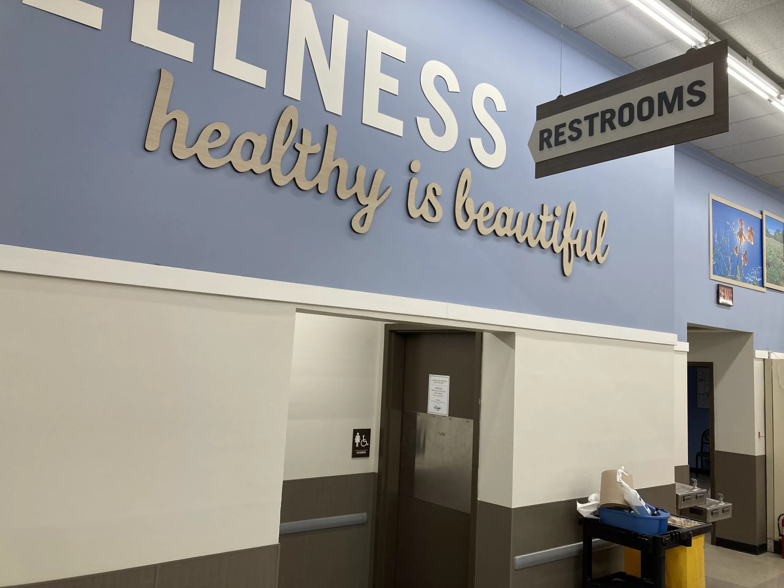
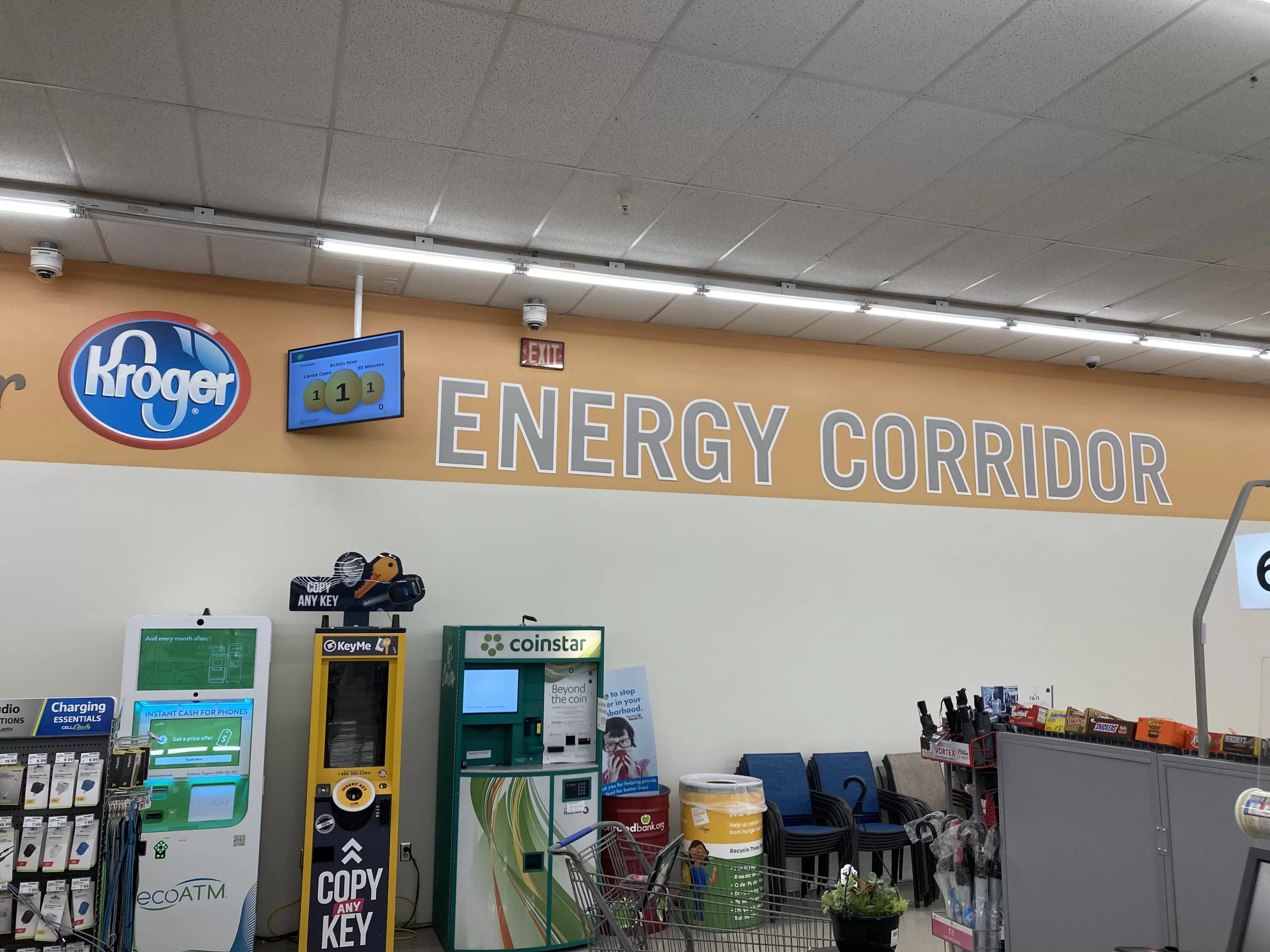
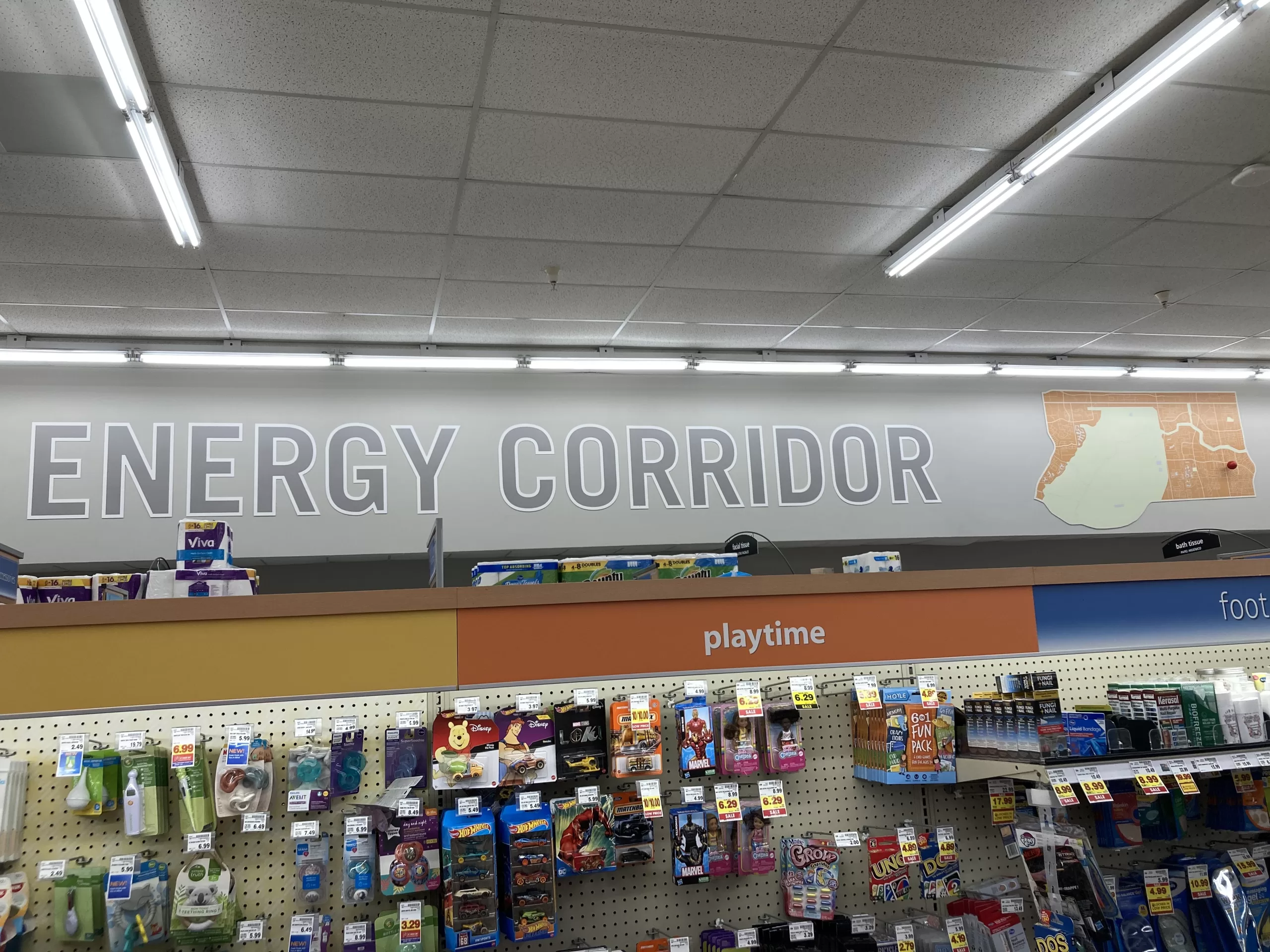
It is interesting to me that this store has been branded as “Kroger Energy Corridor”. The name is not necessarily inappropriate, folks who live in this part of West Houston will generally accept most anything located between Kirkwood, Westheimer, State Highway 6, and the Addicks Dam (much of what is represented in the decorative map inside the store) as being located in “The Energy Corridor”. However, this area also contains two other Kroger stores and one of those is actually located within the boundaries of the Energy Corridor District (a state legislature-created management district). That store, the Eldridge and Briar Forest Kroger located one block west of this store, does not reference the Energy Corridor in its decor at all. This Krogertsons isn’t even located within the larger area beyond the management district boundaries that is considered to be The Energy Corridor by the District itself (and, perhaps more importantly, by Google Maps). I’m not complaining, mind you, I’m just a geography nerd.
The Shopping Experience
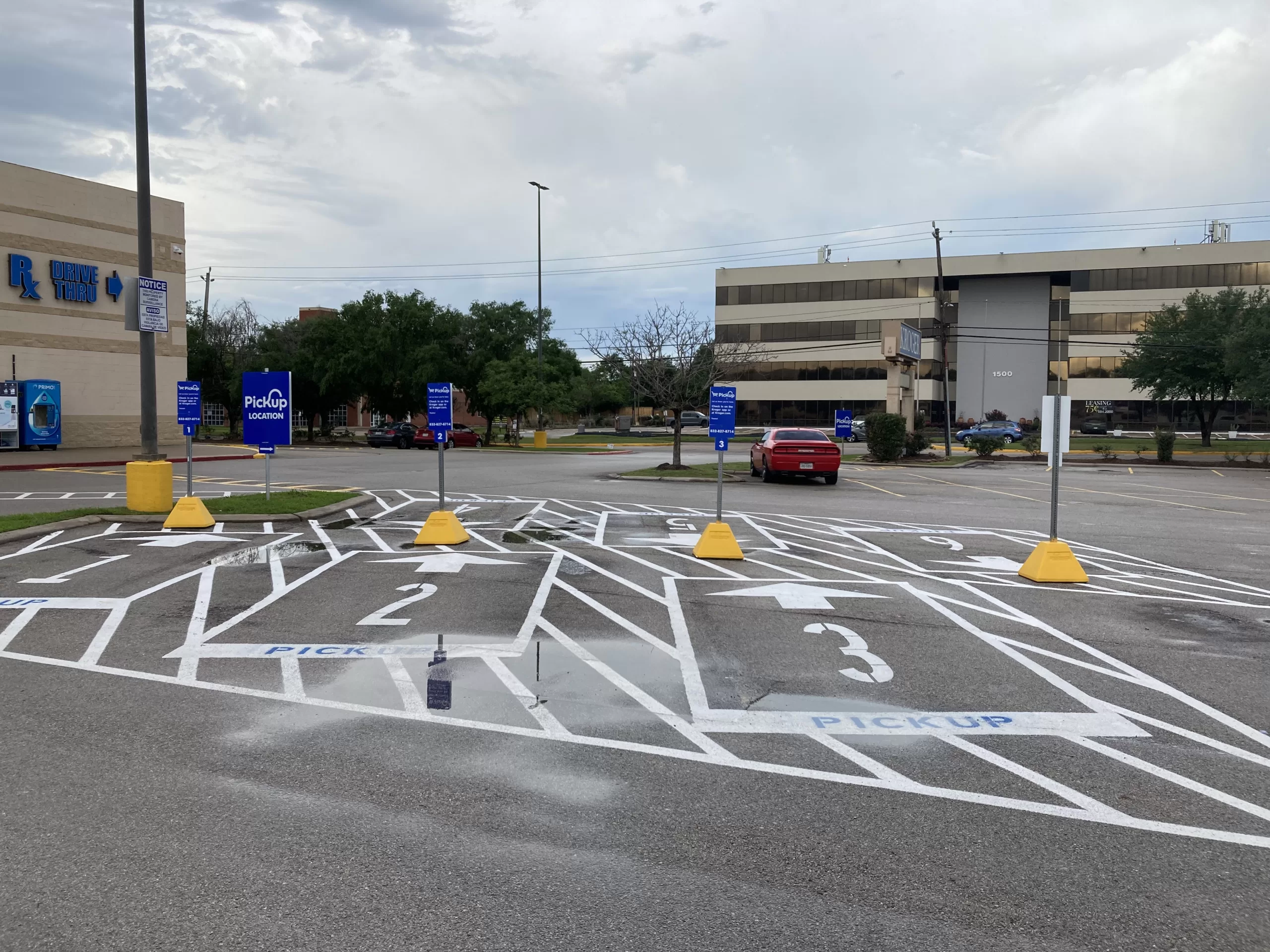
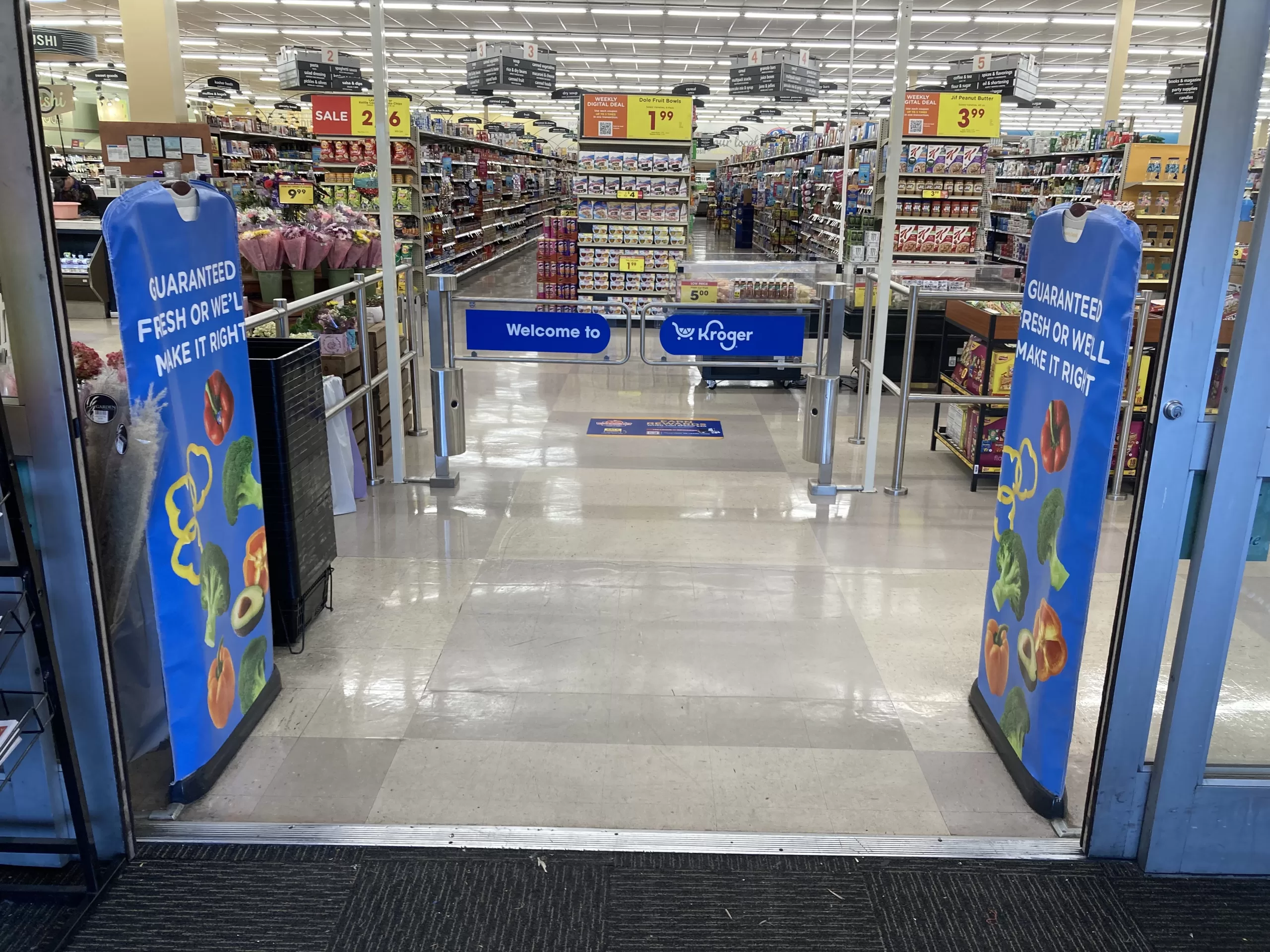
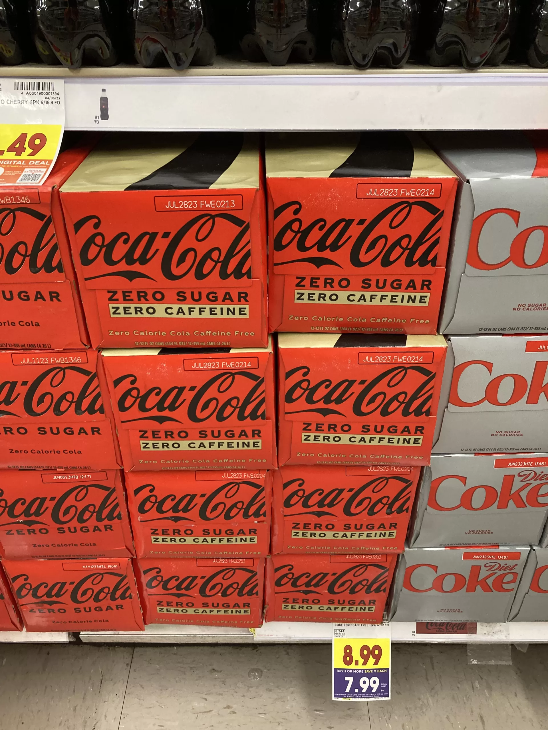
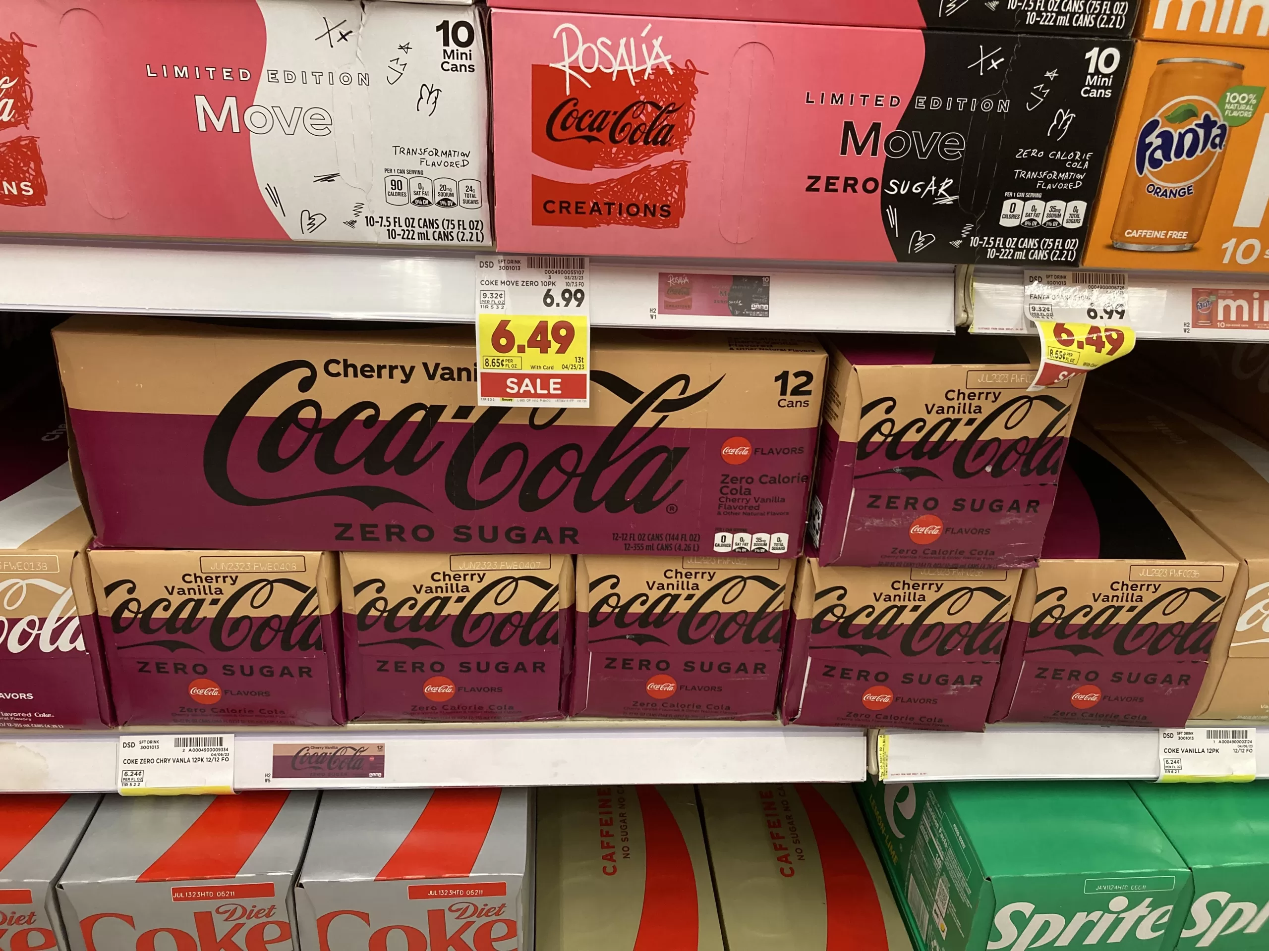
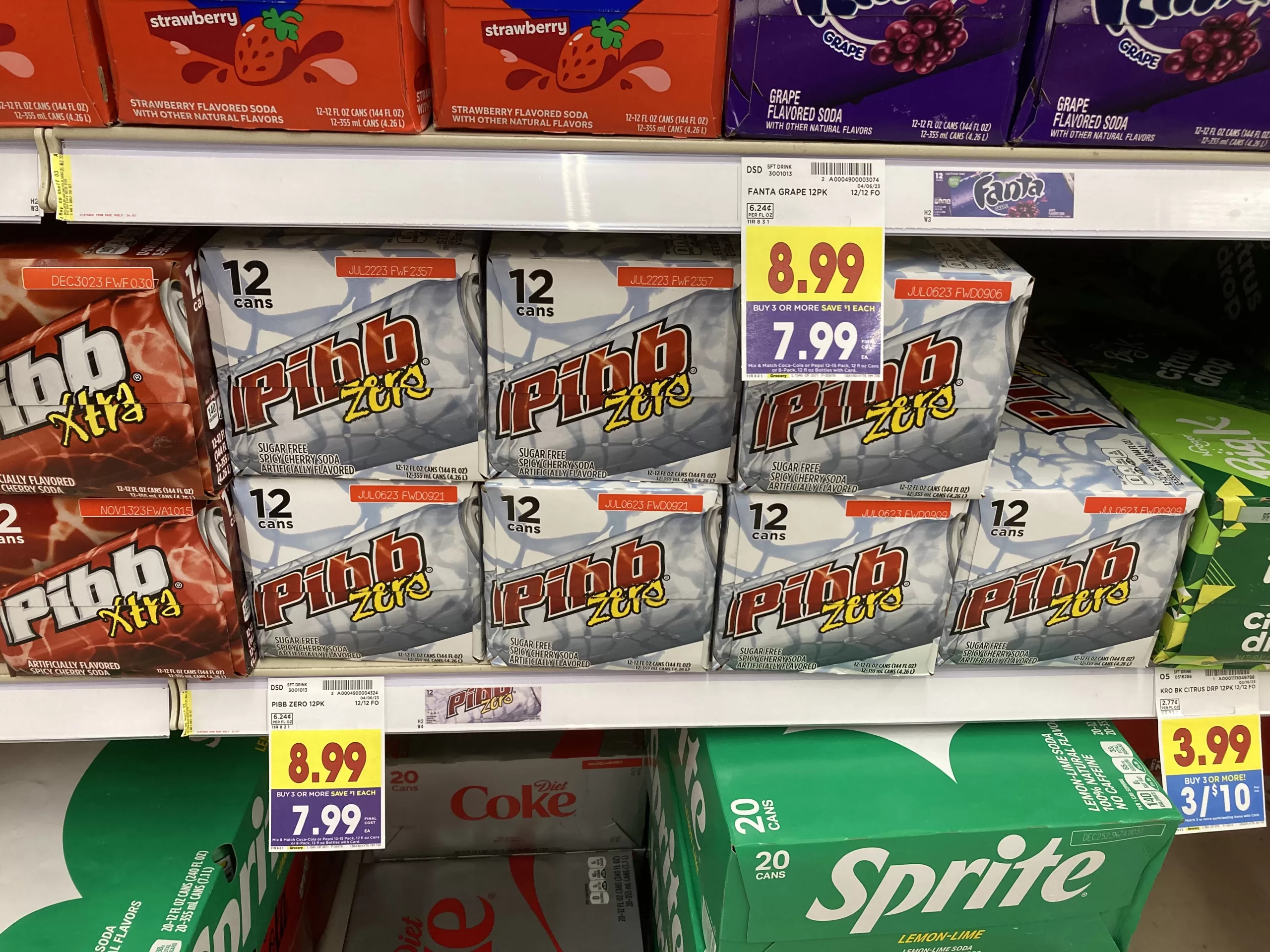
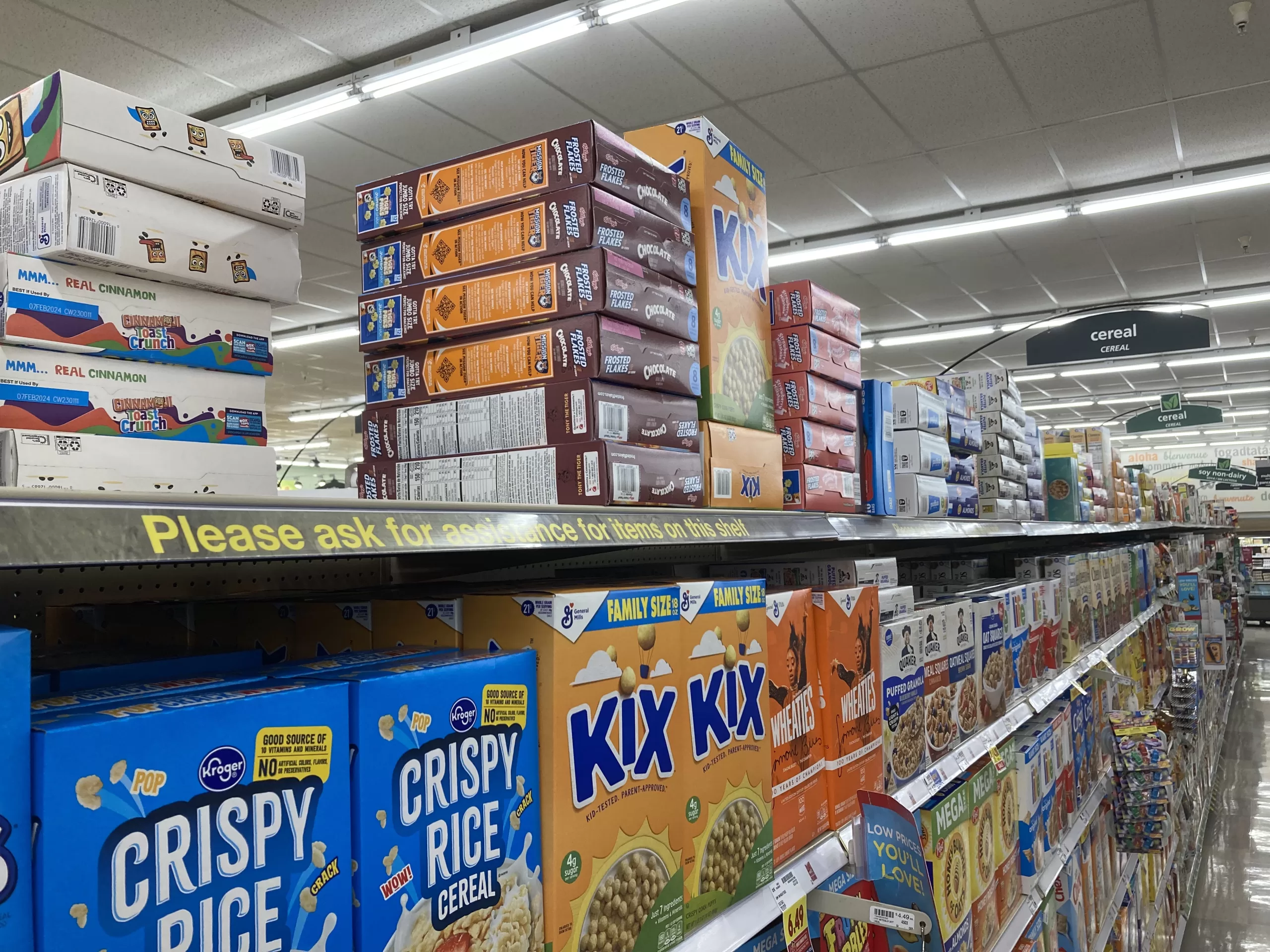
We’re not going to go aisle-by-aisle here, but here are some things I have not yet covered that I find interesting about shopping at this Krogertsons. I will climb up on my soapbox (purchased on aisle 14, of course) about one recent development at this store and at other Kroger stores in the area, the addition in the past year of “please ask for assistance” shelves on top of most of the aisle shelves. These new shelves appear to function primarily as storage for additional units of products already on the primary shelves, they do not offer or appear to enable additional selection. While they do not make shopping unpleasant, the store feels less open and a bit cluttered since their installation. On the plus side, you’ve got to see the diet soda selection here!
Gas Station
One thing this Krogertsons has that the other two nearby Kroger stores do not is a “fuel center”. While Kroger is no stranger to building and operating gas stations, the fuel center here came with the store when it was acquired from Albertsons. Albertsons did not, however, initially build this store with the fuel center. The gas station would open in the summer of 2000, nearly 5 years after the store opened and only about 2 years before Kroger would acquire it. Unlike another Houston area Krogertsons fuel center of note, this one does not have a convenience store, only a small attendant’s booth. Despite signs on the gas pumps often advertising “convenience store snacks at grocery store prices”, there is very little convenience store fare available for purchase in or around the station attendant’s booth, just a standing cooler of soft drinks (sometimes, it seems to come and go).
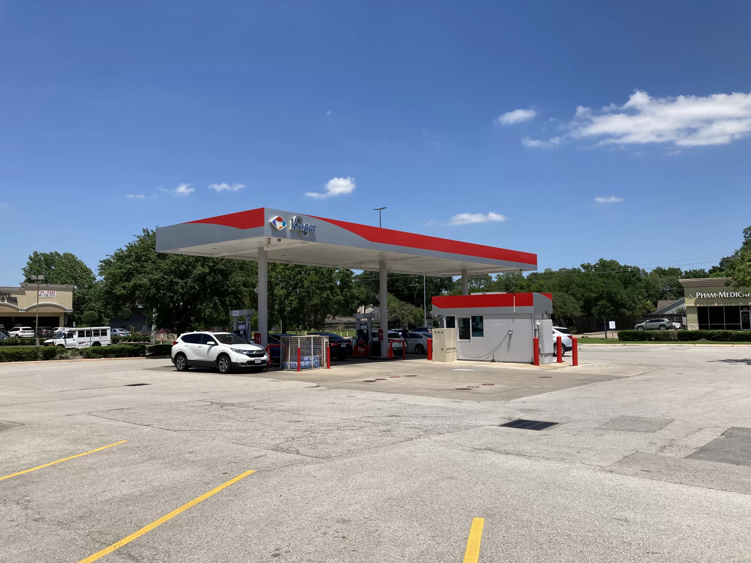
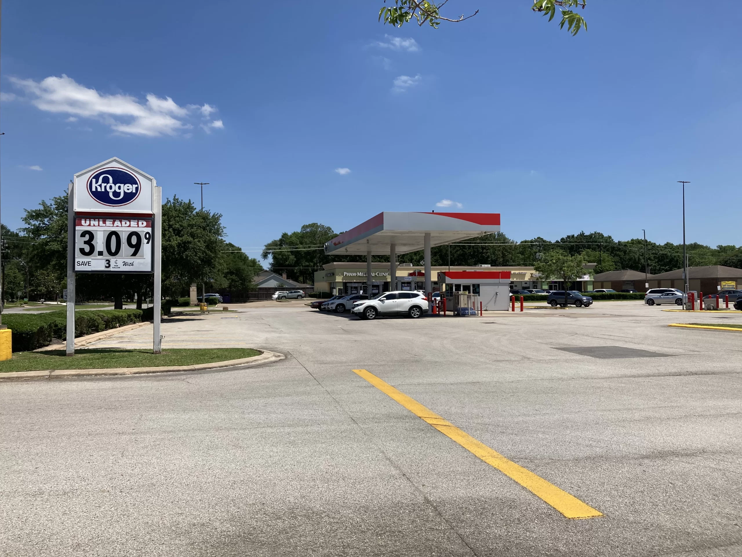
With two other Kroger stores nearby but no other Kroger fuel centers for several miles, this little 8 pump gas station is usually quite busy. I imagine folks who regularly shop at one of the other Kroger stores in the area come here to redeem their fuel points for discounts on gasoline. This Krogertsons fuel center is also a great place for logo watchers, and lets us add a couple more fonts and logos to this store’s already eclectic hodgepodge of typefaces (including Kroger’s bubbly and abstract gas/convenience store logo).
I think that about wraps it up. Thanks for indulging me on a trip to my Krogertsons. If you are ever there and see me zipping through the parking lot using a shopping cart like a scooter, don’t hesitate to say hello. And if you’ve stayed with me through all of this, you’ve earned yourself one of these.


It’s crazy hearing you say that a 57,000 square foot grocery store is tiny – in my area a store that size would be considered huge! Outside of the Super Walmarts and Targets, Floridian grocery stores rarely crack 60,000 square feet, the only exceptions to that being a few offbeat prototypes lingering from years past that never caught on. Even with Publix taking over 60 or so Albertsons stores in Florida, it’s not uncommon to see Publix a bit lost on how to fill those 55,000-60,000 square foot buildings. I’m sure Kroger had the opposite problem with these stores, trying to figure out what departments and products need to be cut in these stores.
Even with the decor swaps, this store still feels a lot like an Albertsons. Still having the original lighting helps with that, as I always associate Albertsons stores from this era with bright fluorescent lighting. I also like that Kroger kept the floor tile in this store too – it matches the current decor nicely, and I’d hate to see what the concrete looks like under there!
Awesome post, I thoroughly enjoyed it (and thanks for the link as well)! You’re right, aspects of this store definitely feel familiar to me as that Ridgeland Krogbertsons is in fact my local store. It’s refreshing to see fresh and local décor in here, though! I think that package looks very good in this Albertsons store format. Like you, I always enjoy the local flair aspects of it as well. This implementation even goes a step further in calling it “Dairy Fresh from Texas” — the basic package just says something like “from the farm” instead!
Really great pictures, too — besides just the photography itself being good, it’s cool seeing some elements that aren’t always common, such as the floral and sushi décor. Kroger also used the overhang and soffit areas very effectively with this package — bountiful didn’t lend itself as well to things like that. And speaking of bountiful, I can confirm that the meat and seafood décor is in fact another fresh and local element, not bountiful. Some fresh and local stores use different style signage, and that may be present in other Houston fresh and local locations.
I find it interesting that Kroger kept the existing signage here when updating it — even if they had elected to keep the Times New Roman logo, I’m surprised they didn’t elect to replace the Albertsons Food and Pharmacy signs. Not that I’m complaining!! Here in the Delta Division, they’ve been pretty diligent about updating all signs to the new logo lately, and sadly that includes all the secondary signage as well… so, over in Tupelo, the surviving Albertsons Food and Pharmacy signs there were unfortunately replaced 🙁
You can tell from this post that you really like this post, and I’m glad to see that! Adjusting to the one in Ridgeland after being used to 100K+ sf stores, including a Marketplace location, was quite the change, and sometimes I still prefer driving to Madison to a larger store. But living just a couple blocks away from the Ridgeland one is super convenient, and I definitely understand and agree with the feeling of it being more of a “neighborhood” style store. I enjoyed reading about yours!
I’m glad you were able to document your local Kroger! Krogertsons actually, this is actually the sister store to the Blue & Grey Market Krogertsons I shop at fairly regularly at 249 & Cypresswood. Although both Krogertsons have Neighborhood decor and a similar layout, there are some subtle and not-so-subtle differences. The 249 store received Banner decor, which I don’t think this store ever did, but 249 retained Albertsons’ ‘Tetris piece’ floor. That was until Hurricane Harvey flooded the store quite severely and the store was basically gutted. 249 then re-opened with a concrete floor and Neighborhood.
Although your Krogertsons is older, it is slightly better looking than the 249 store in current times. I attribute this to two reasons: your Krogertsons has actual flooring cover (I agree, exposed concrete belongs in a garage or driveway, not in a supermarket) and your store has a dual fascia design which makes it look more upscale especially with the Neighborhood decor. With the fascia design 249 has, Neighborhood actually looks really grey and boring. It didn’t look bad with Banner, but Banner is long gone at that store.
I believe Kroger’s 249 store uses the Cypress name as part of the Neighborhood decor package. Like with Energy Corridor at your store, Cypress is a name that kind of works, but really doesn’t. When you think of Cypress, you generally think of stuff west of 249…generally things somewhat west of 249. There really isn’t an obvious name they could have used for the 249 store since that store is in a rather nameless area (it isn’t really Tomball, Willowbrook, Klein, or anything else either), but I think Champions would have worked. Of course, Kroger has the ‘real’ Champions Kroger down Cypresswood a few miles so maybe that’s why they didn’t use that even though that store does not use Neighborhood decor.
That new Kroger street sign signage is interesting because that is a recent development. I’m glad it doesn’t have the spoon melon cart logo, but that typeface is quite strange for Kroger! Dickinson also recently received signage like that so it isn’t just something which is at this store. I’m not really sure if it looks better than the infamous Kroger serif logo, but both versions look quite strange. It’s also odd that this store had an interim sign that was likely salvaged from another Krogertsons!
I agree that I don’t like that Kroger has added that upper shelving tier which really makes the aisles cavernous feeling and it also takes the store sight lines away. Those upper shelves are also often messy looking. Oh well, it seems all Houston Krogers that I’ve seen has this now.
I agree with you that these Krogertsons stores are very easy to navigate and that is why even with some issues with the flooring and decor at the 249 store, I still shop there over pretty often over the many other generally larger Kroger stores we have on the NW side. The layout of the store is excellent, especially since Kroger dumped Albertsons’ odd lunch meats on the back actionway design which used two different orientations for the center aisles, and they pack almost everything you could want into a sub-60k store which reduces useless wasted steps. Once you see how these Blue & Grey Market Krogertsons are packaged, it makes the larger Kroger stores, and those from other grocers, seem rather mediocre. To be fair, Randall’s/Safeway/Albertsons also does a pretty good job at putting a lot of stuff into similarly sized stores, but there is another major Houston grocer who does an absolutely terrible job at utilizing space in their ugly stores and they also have terrible layouts to go along with it. Why be Hebbed there when you can shop at a Krogertsons like this?
I had to go searching for the new street sign typeface (ITC Avant Garde Gothic Std Bold), I found it in a “confidential” brand guidelines document that was distributed to vendors as Kroger prepared to roll out their new logo. It seems they have become less strict about its use than the vendor guidelines would indicate, though it continues to appear in advertising it is barely on their website and is still a pretty rare sight on major store signage.
The wild thing to me about all of the signs and the different fonts used for them is that every single one has been replaced recently… but only the street signs received an update that matches Kroger’s current branding. I was absolutely floored when I saw the Albertson’s Food and Pharmacy signs replaced by identical copies. I suppose there is some cost savings, but still… I really would get a kick out of seeing someone from Kroger corporate’s marketing department taking a look at the store.
I’ve been looking forward to this post for a while now. I have a connection to this Krogerstons. It was the only one I’ve ever shopped with any regularity. When I lived in the Westchase area I consistently chose this Kroger over Fiesta, or HEB. I’m glad to see it’s still going strong!
If you look at pictures of the store from older Google reviews, it seems like this store was renovated fairly recently. I live near this store but typically shop at the Eldridge/Briar Forest location.
I believe the décor was renovated in the middle of 2017, coinciding roughly with the removal of the “Signature” sign from the façade.
Eldridge-Briar Forest is a very nice store, but I wish it used its additional size better. With a few exceptions (deli, cheese shop, and organic grocery, notably), it is largely just slightly more of the same selection of products as this store one block away.