Editor’s Note: Today’s post is a guest submission from HHR’s good friend Anonymous in Houston with the photos being taken by Mike.
Also, Mike will be the featured speaker tonight at 7 pm (10/5) for the Houston Preservation Society. Click Here to live stream the broadcast!
The subject of today’s post here at Houston Historic Retail is something of an oddity here in the 2020s, a suburban Houston-area Randall’s store that appears to be doing quite well. The South Shore Harbour Randall’s is located at 2951 Marina Bay Dr. in League City, TX. For those not familiar with the South Shore Harbour area, it is located just south of Clear Lake and is located in League City near where the NASA Johnson Space Center area meets with Seabrook and Kemah. South Shore Harbour is also located near where the Harris-Galveston county line is located. The South Shore Harbour Resort and Conference Center is located right near the Randall’s store.
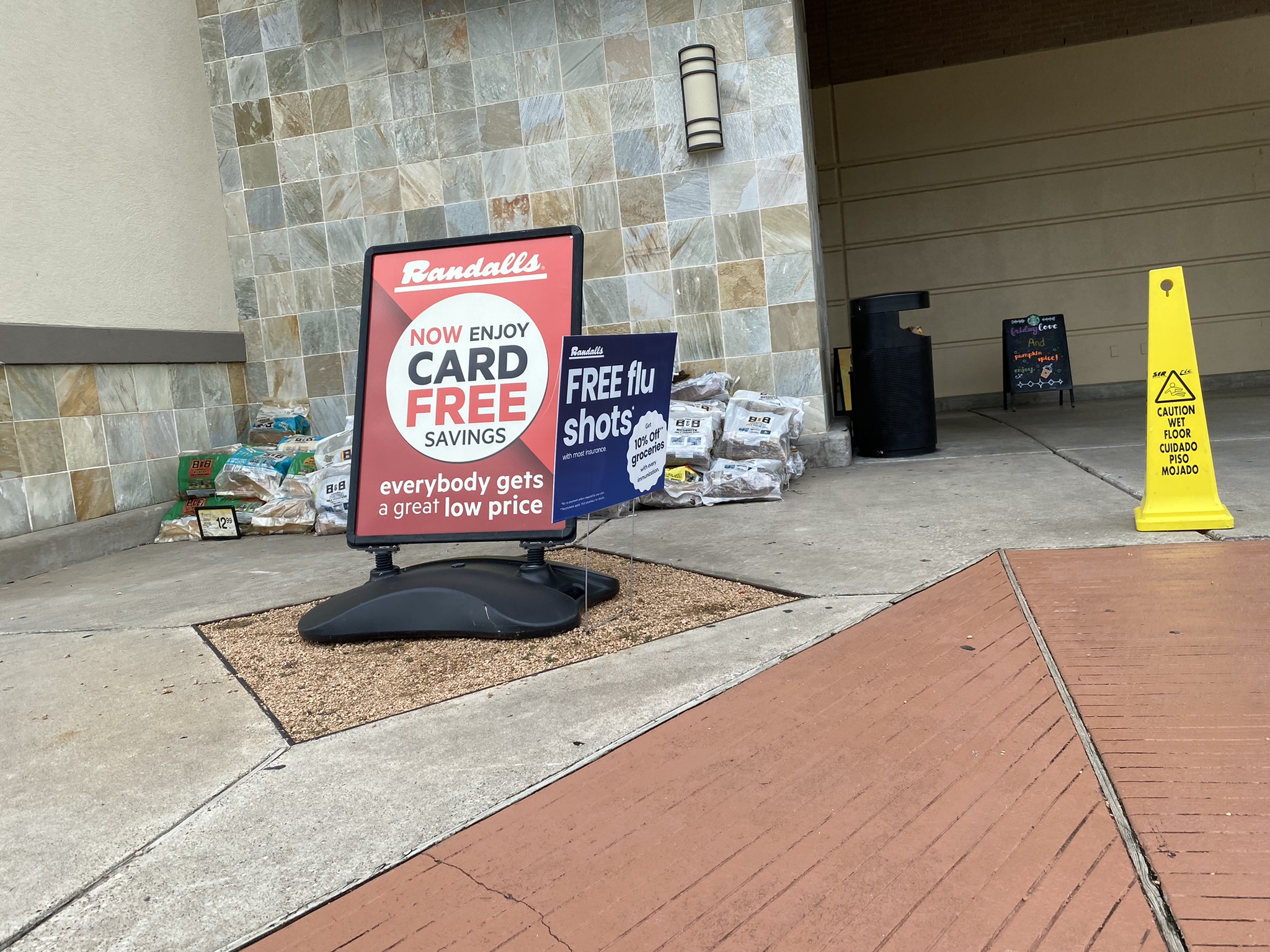
Without even stepping inside this Randall’s, we can tell that it appeals to shoppers who like colorful, classic things!
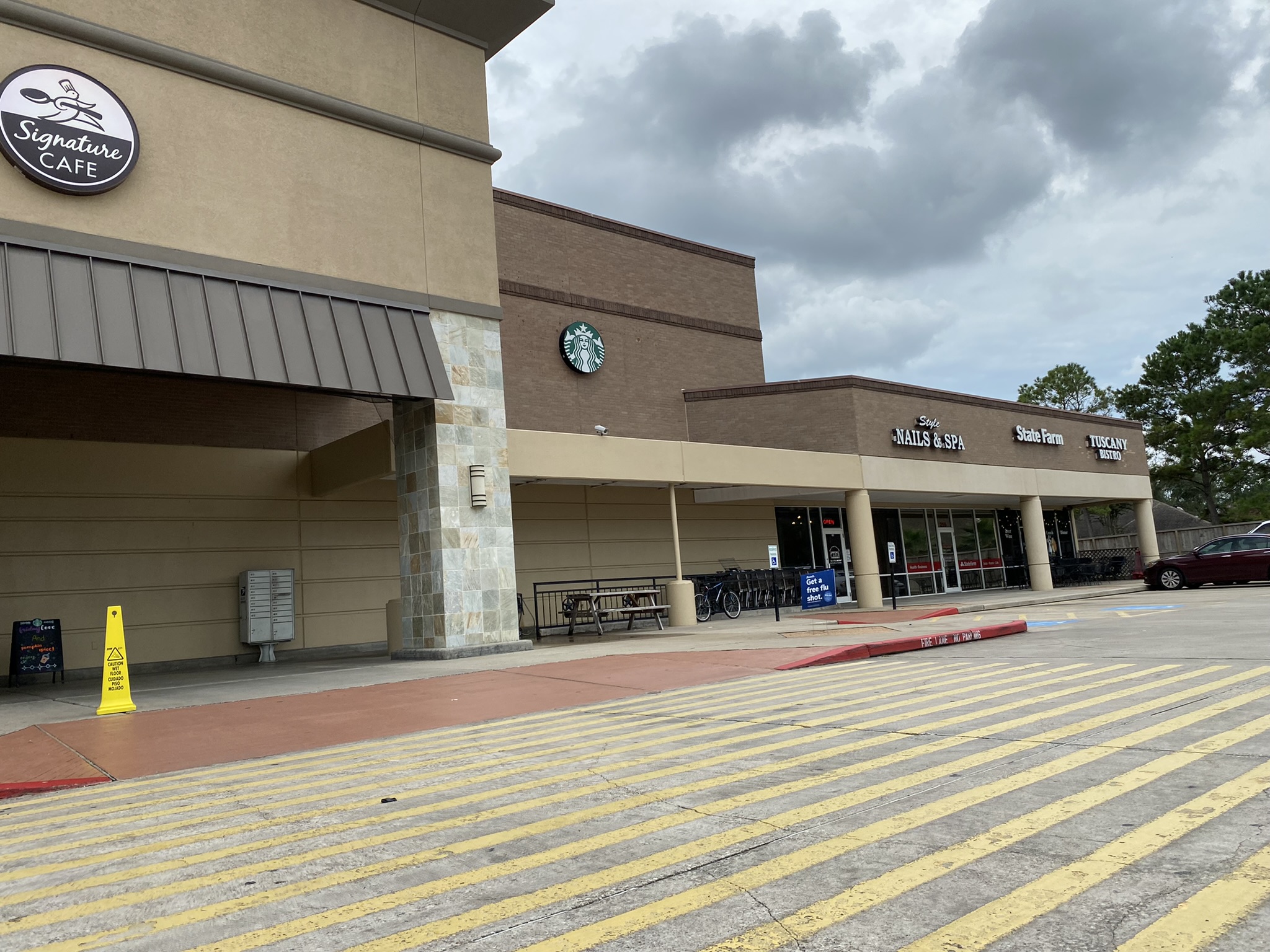
Here’s how Randall’s integrates with the rest of the shopping center.
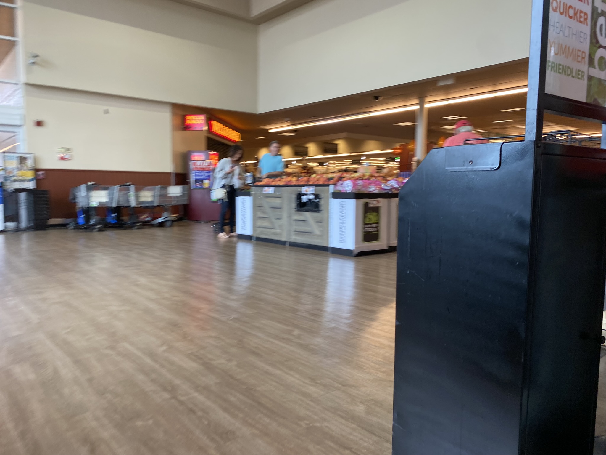
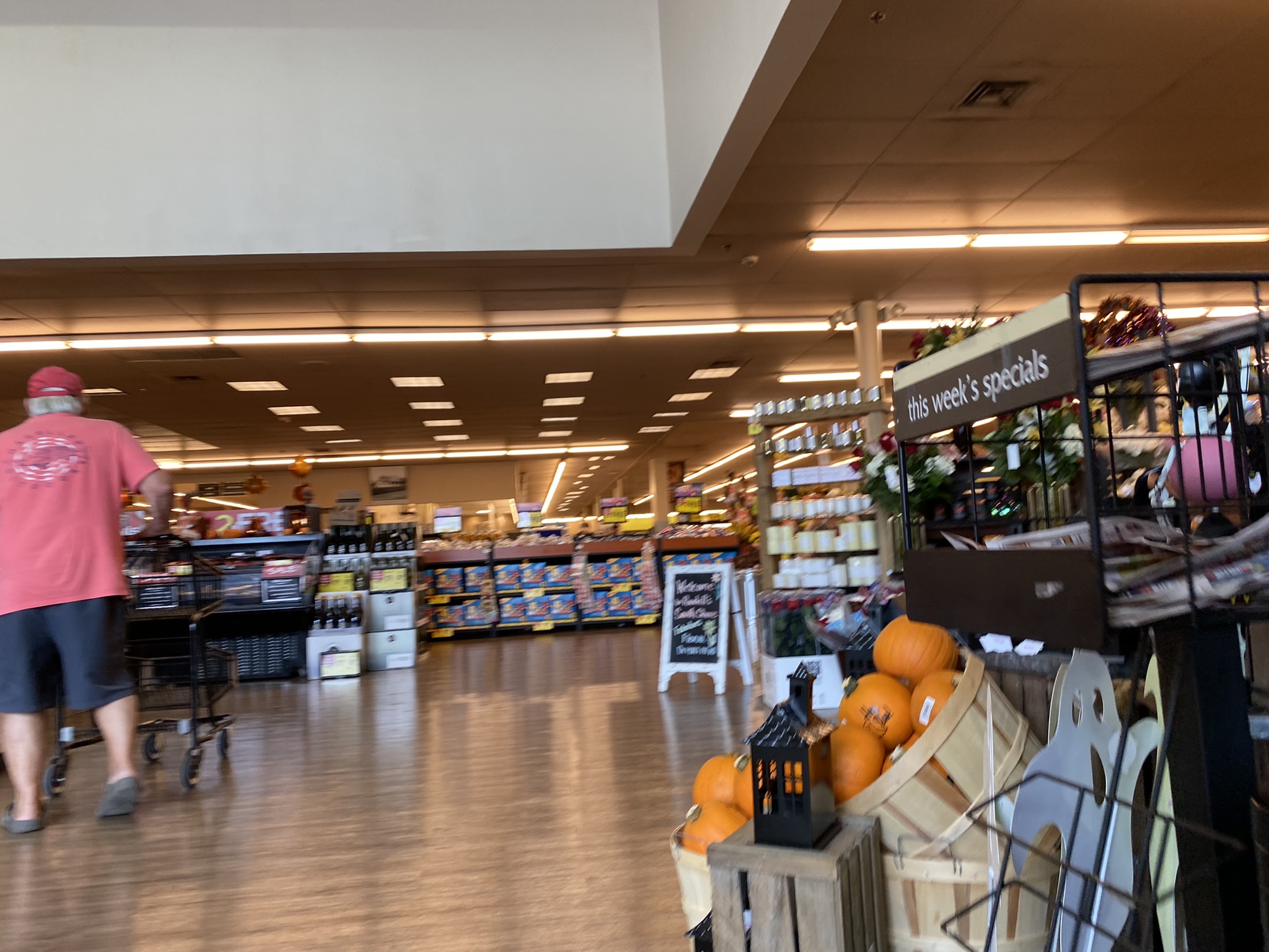
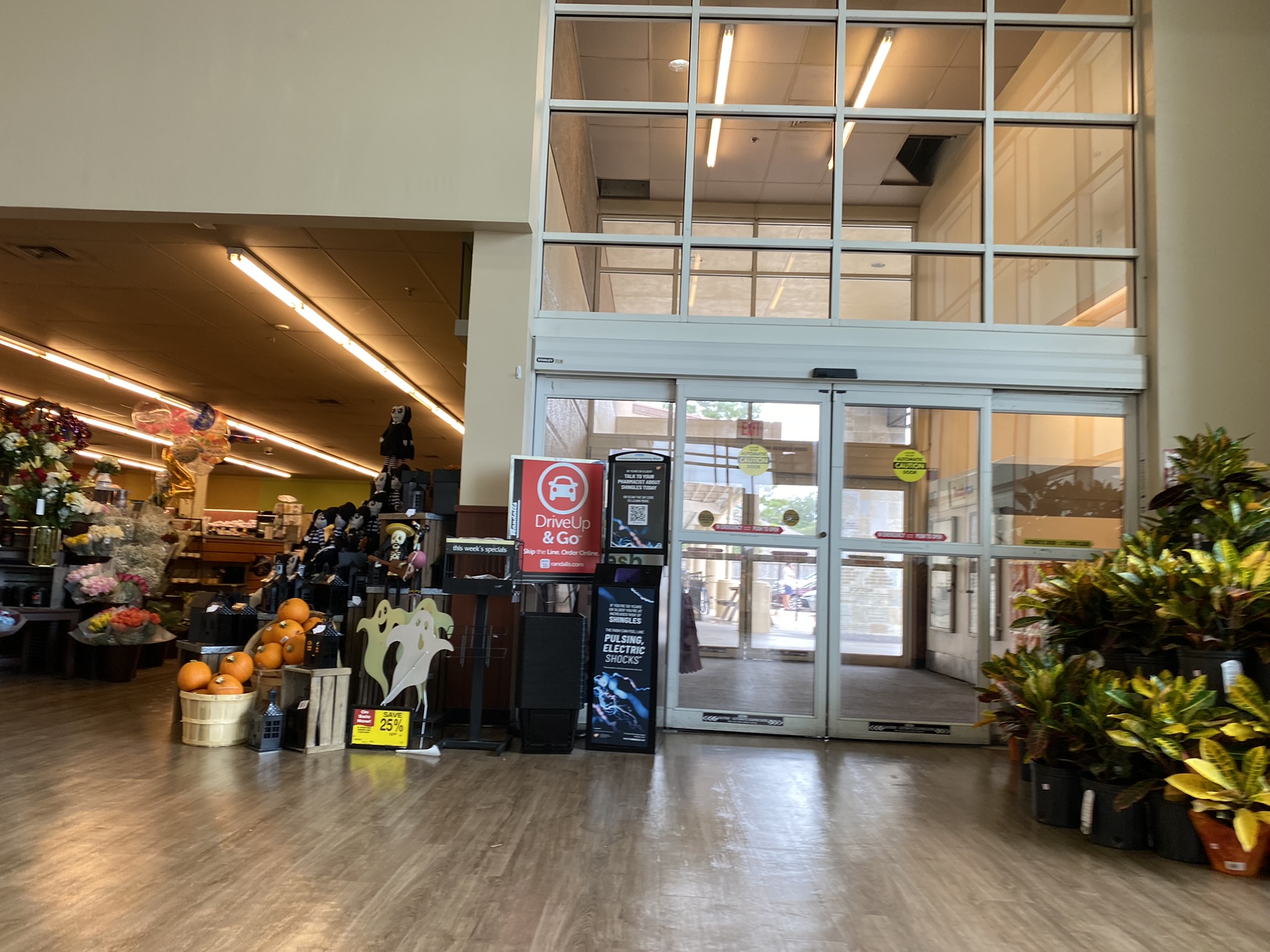
As we step further inside, we see one of the largest classic Randall’s grand entrances that still remains in the Houston area.
Although that sales circular holder almost certainly dates from the early Safeway Lifestyle days, it’s still not completely out of date with this store’s new decor.
The South Shore Harbour area, and the neighboring Clear Lake area, is one of Houston’s more affluent suburbs in the metro area. Although the presence of a Randall’s in an affluent area might not be too surprising, the reality is that Randall’s has generally struggled since the Safeway merger in similar suburban areas as competitors such as HEB have moved in as one can read about in this comprehensive HHR page about the history of Randall’s. Indeed, other Clear Lake Randall’s, such as the famed Boris Yeltsin Randall’s on El Dorado and State Highway 3, have closed over the years. The South Shore Harbour Randall’s, along with the Galveston Randall’s, are the only remaining Randall’s stores on the far southeast side of the Houston metro area.
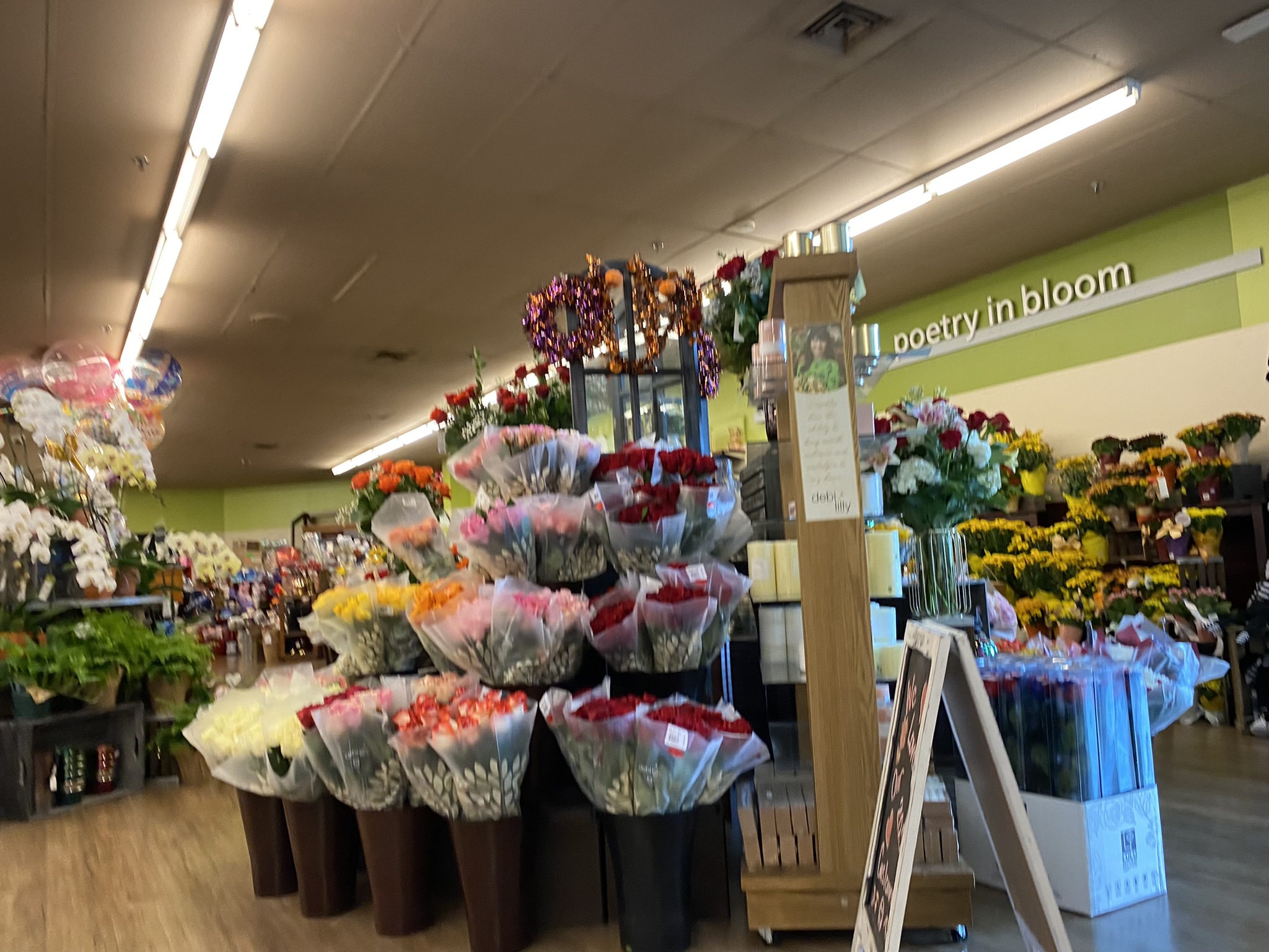
In the pre-Safeway merger days, Randall’s always emphasized their large floral departments by putting them near the store entrance. Safeway has more or less maintained this at many Randall’s locations including this one.
The green decor color of Colorful Lifestyle v2 is a much better fit for the floral department than the old standardized beige of regular Lifestyle v2. With this being at the entrance of the store, it immediately gives the shopper a brighter scene than they would have seen before the remodel.
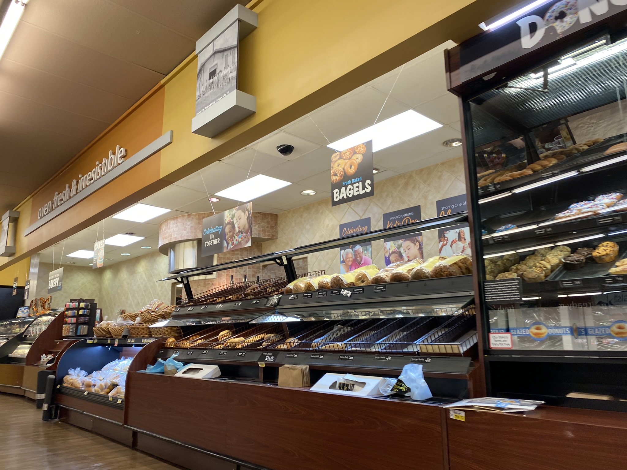
Packaged bread is not always placed out along the walls at Randall’s stores as it often is at Safeway stores elsewhere in the country, but here it is against the walls. These colors aren’t too different from the old Lifestyle v2 colors.
While the upper donuts sign is probably new, the lower one on the glass is probably a holdover from the original Lifestyle decor.
As is common at many Houston Randall’s stores, this Randall’s uses the smaller version of Lifestyle decor due to smaller wall sizes here than what is generally the case at stores built by Safeway.
Randall’s designed this store with multiple ceiling heights throughout the store. Here, some painted-over paneling decorates one of the ceiling height transitions. This is certainly a unique look for stores carrying Safeway decor.
While the Galveston Randall’s has close competition from Kroger, it does not have competition in modern times from HEB. The South Shore Harbour Randall’s, on the other hand, does have competition from both HEB and Kroger in the Clear Lake and League City areas. That makes the ability of the South Shore Harbour Randall’s to stay alive all the more remarkable.
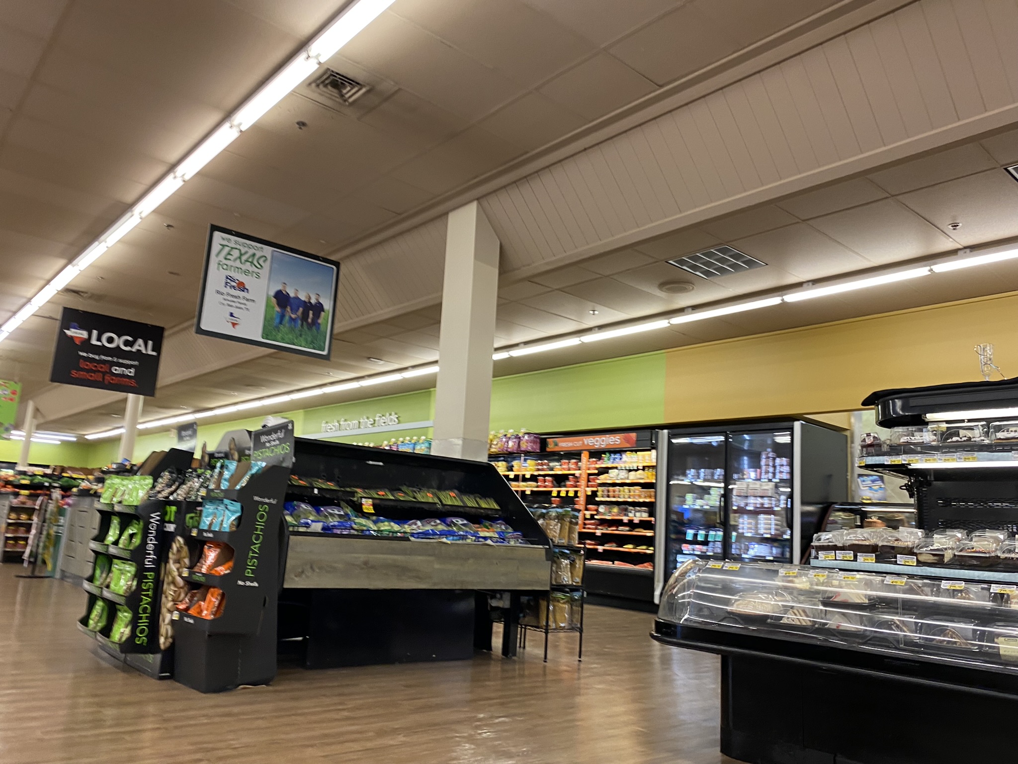
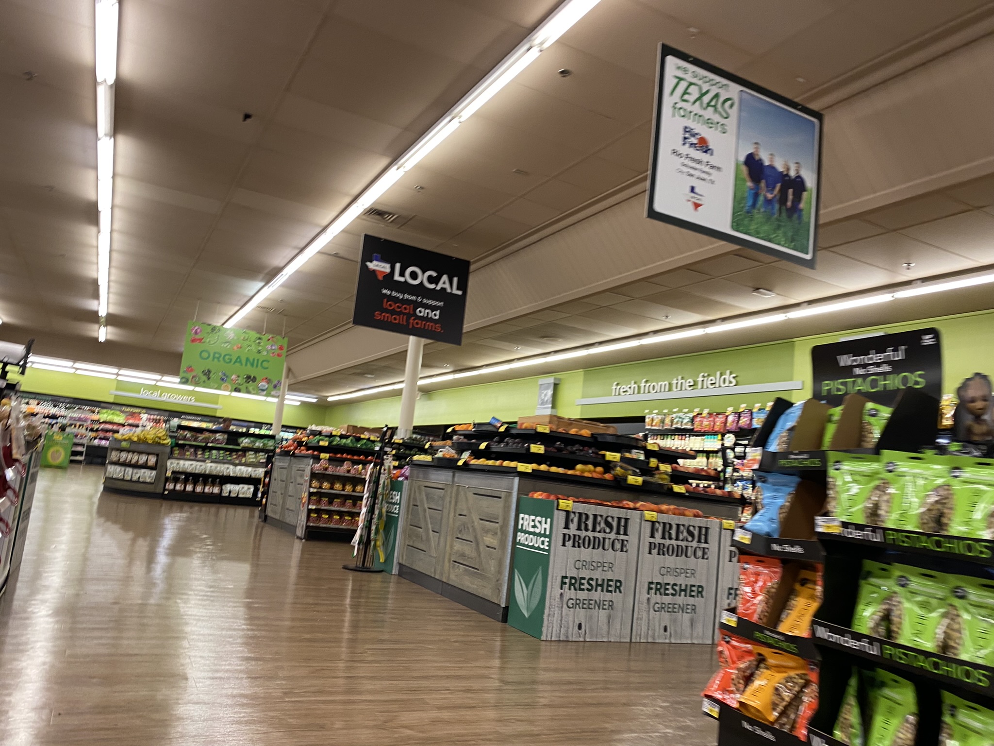
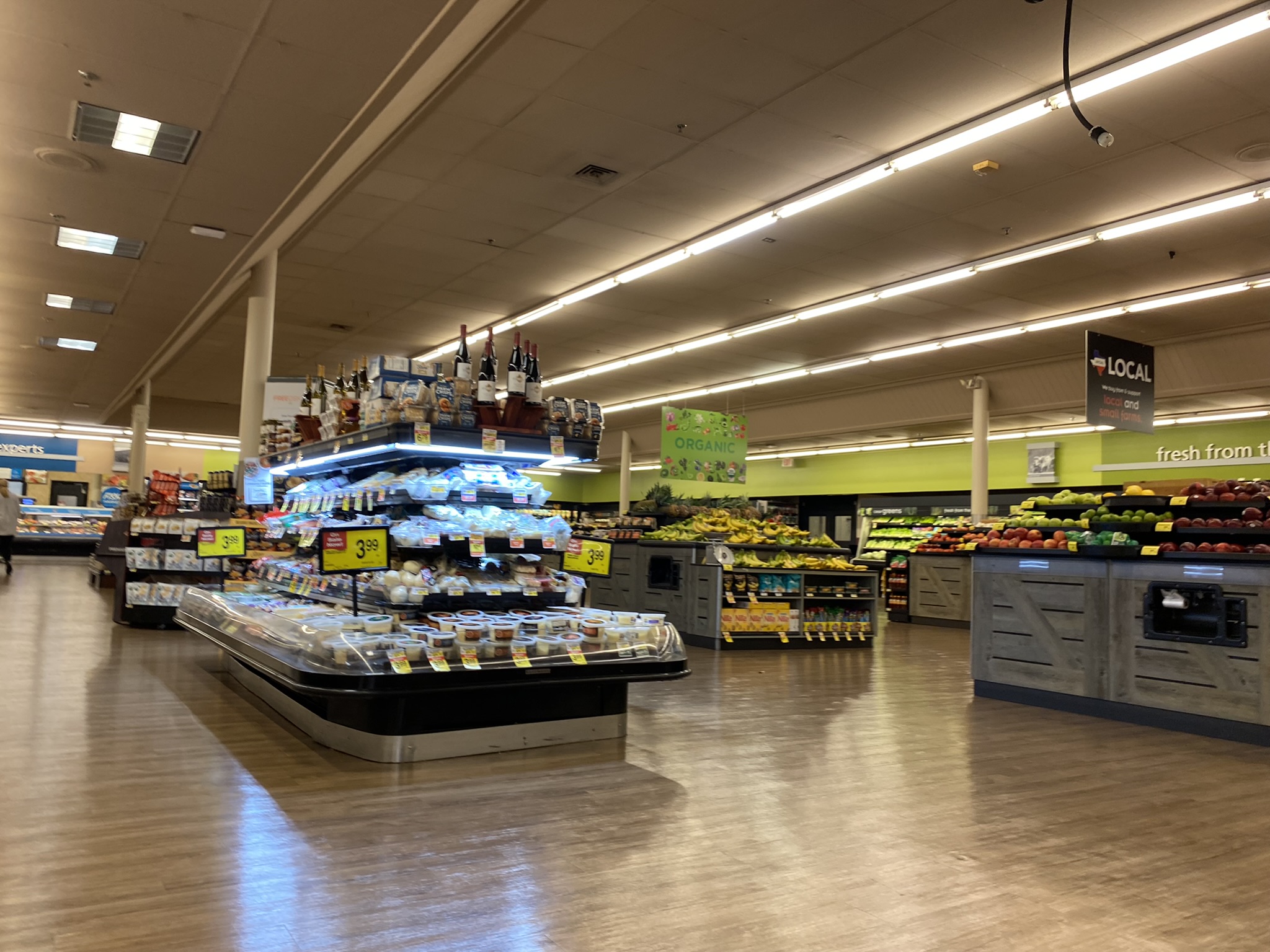
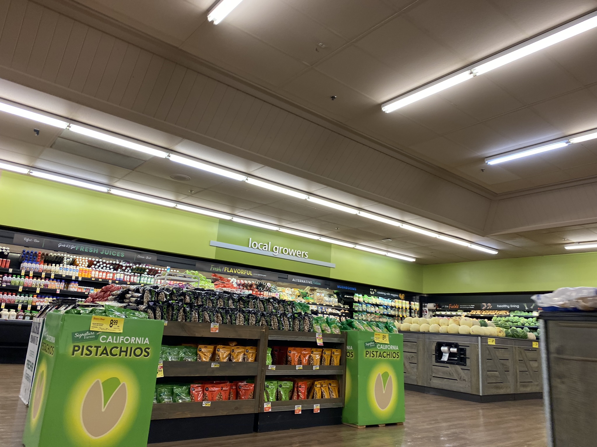
The produce department here is large enough that it uses both the “Fresh from the Fields” and “Local Growers” signs from the Lifestyle decor.
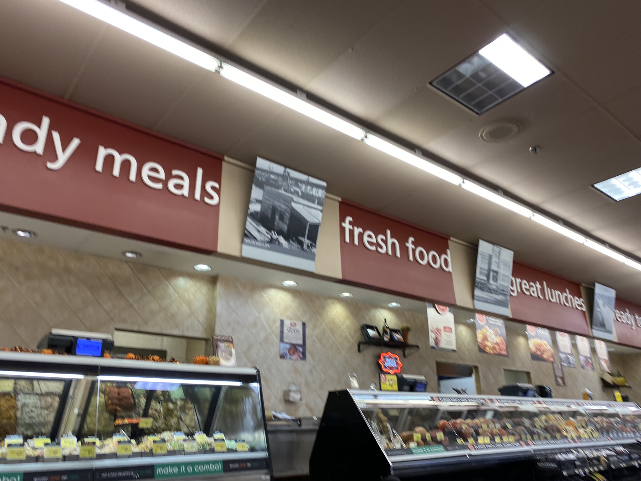
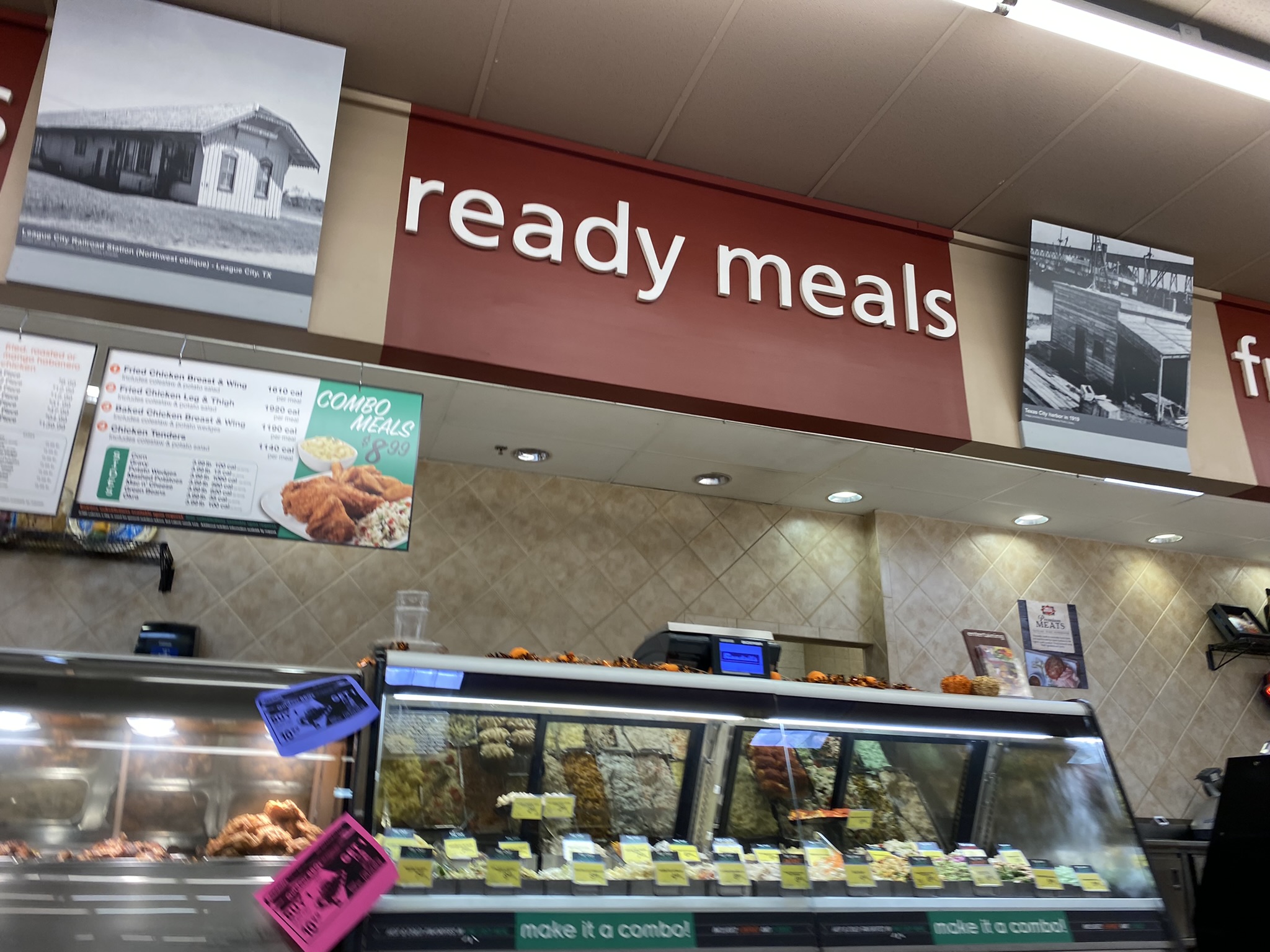
The red color used in the deli is not tremendously different from the colors used before the renovation, but local flair has replaced the pictures of food items that would have been here before.
Here is a closer look at some of the new Colorful Lifestyle v2 local flair. The photo on the left is from League City and the photo on the right is from Texas City. Texas City very briefly had a Randall’s location that operated from 1993 to 1995 before the location was sold to Albertsons.
Although brighter colors have replaced the warm earthtone beige on the walls with the new remodel, Randall’s has kept a classy looking fake wood floor in many parts of the store including the produce area. Also note some of the burned out lights in this photo. This store does have a fair number of bulbs which aren’t working, but the store is generally still quite bright especially with natural light coming from the entrance area. The brighter colors of the new decor might help with the brightness.
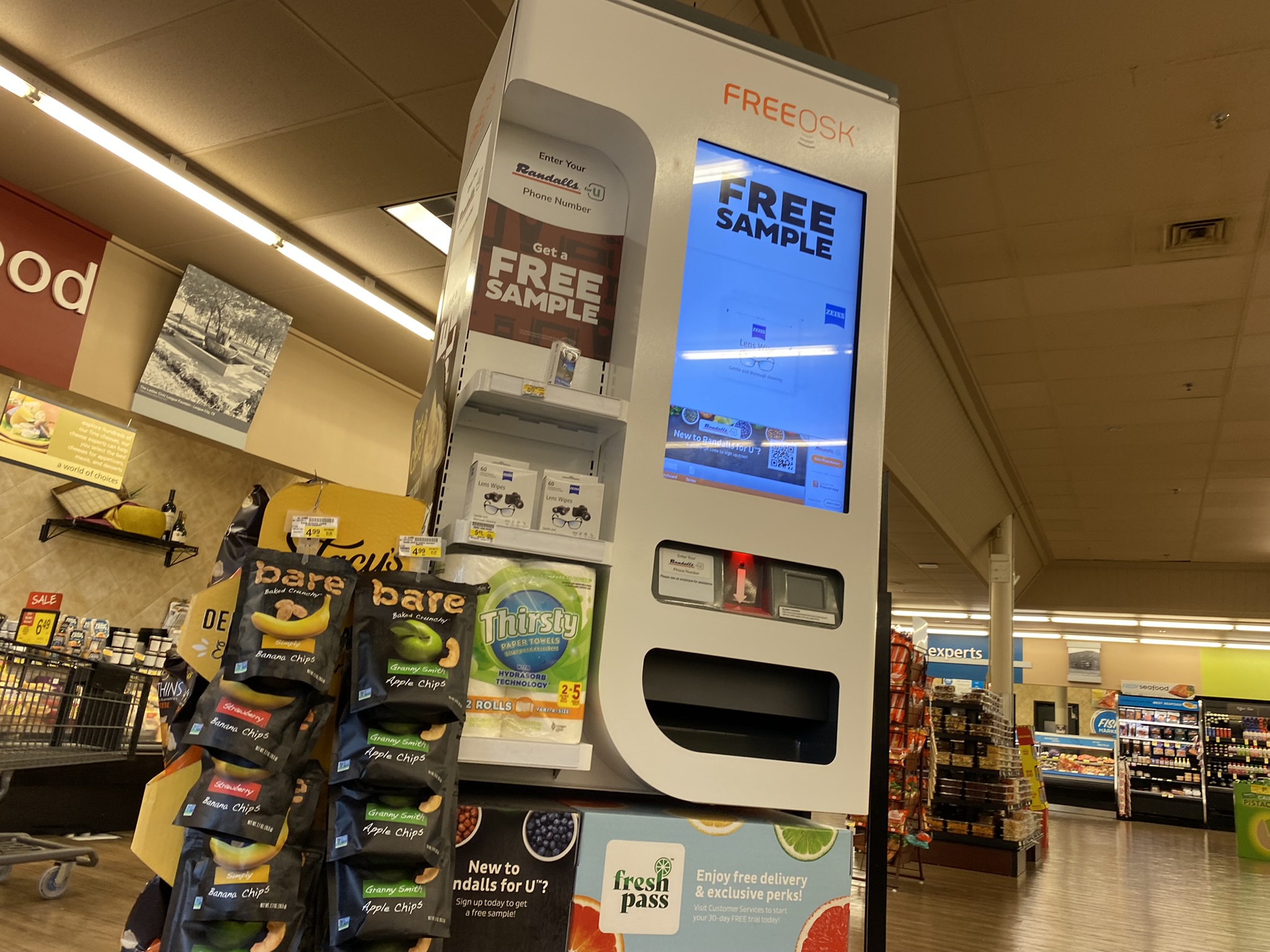
Here is the Freeosk, an automated kiosk which gives free samples. In this case, the Freeosk is giving away samples of lens wipes.
As was the case before the remodel, this location mixes basic, unlighted department signage with 3D, lighted department signage. Here is an example of the basic, unlighted signage in the produce department. The “Local Growers” sign is oddly missing local flair around it.
The South Shore Harbour Randall’s, Randall’s Food Markets #51, opened in Fall 1991 during a time when the South Shore Harbour master-planned community was being developed. Randall’s designed the store to use their ‘New Generation’ design that was supposed to be their blueprint for success in Houston’s suburbs and in new communities Randall’s was moving into in the 1990s such as College Station and Lufkin. These stores were designed to be less fancy than Randall’s Flagship stores, but they were still designed to be relatively high-end compared to most competitors. While Randall’s Flagship stores might have moved the image of the Randall’s chain upwards, Randall’s still wanted working-class shoppers to feel welcomed at their stores along with the wealthier shoppers like was common at Randall’s stores built in the early-to-mid 1980s. This 1992 grand opening video from the Lufkin Randall’s mentions the ‘New Generation’ concept and also shows what Randall’s was like in the early 1990s.
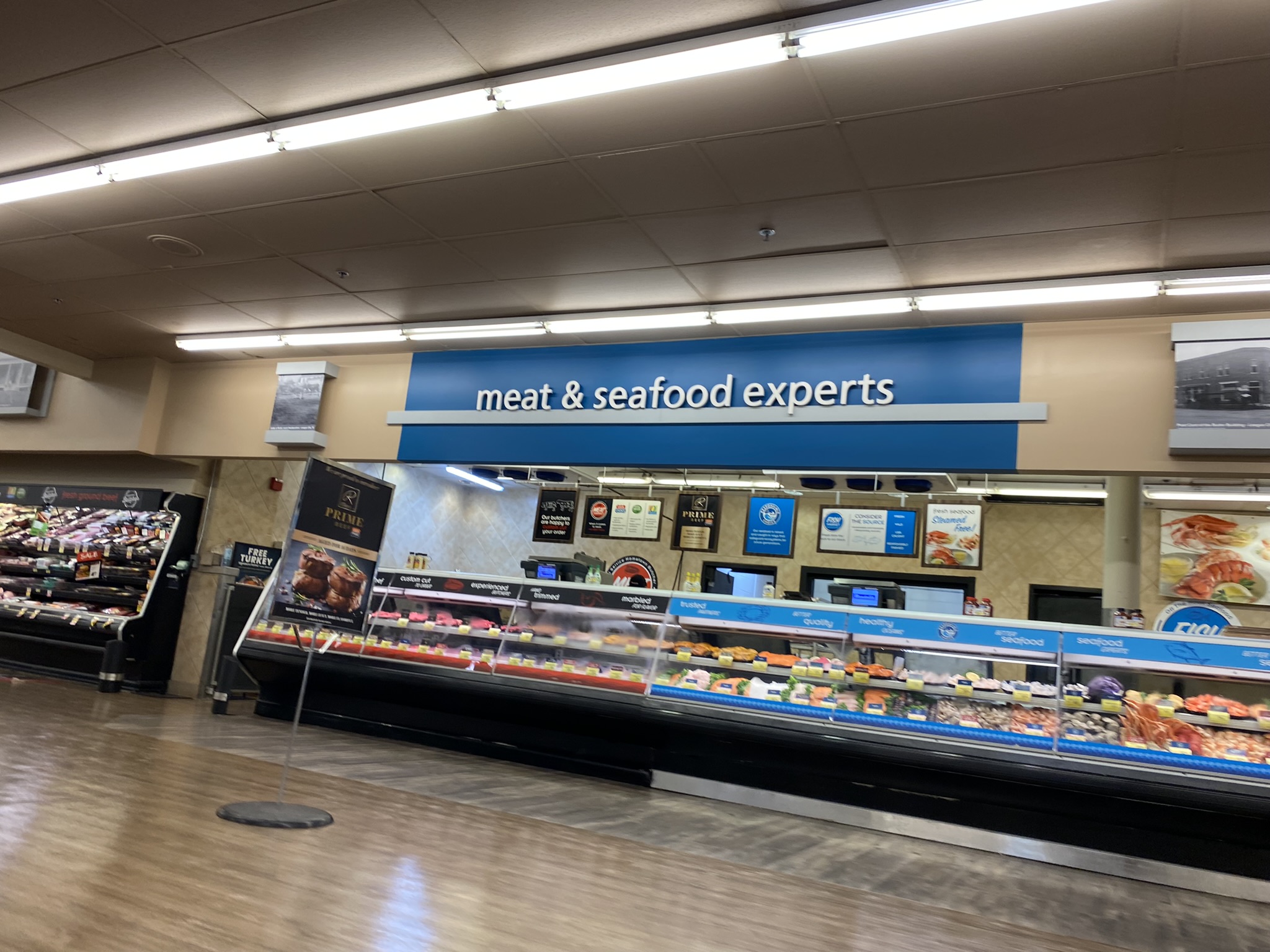
Here we see where the produce department transitions to the meat & seafood departments.
Here is the meat & seafood counter. That Signature Reserve ‘R’ logo reminds me a lot of the old Randalls ‘R’ Cola logo from the 1990s!
Here is the back actionway of the store with a rather large selection of meats compared to some smaller Randall’s stores elsewhere in the Houston area.
Here is an example of the more elaborate 3D, lighted department signs compared to the more austere basic signs such as those in the produce department.
Here are the frozen foods coolers.
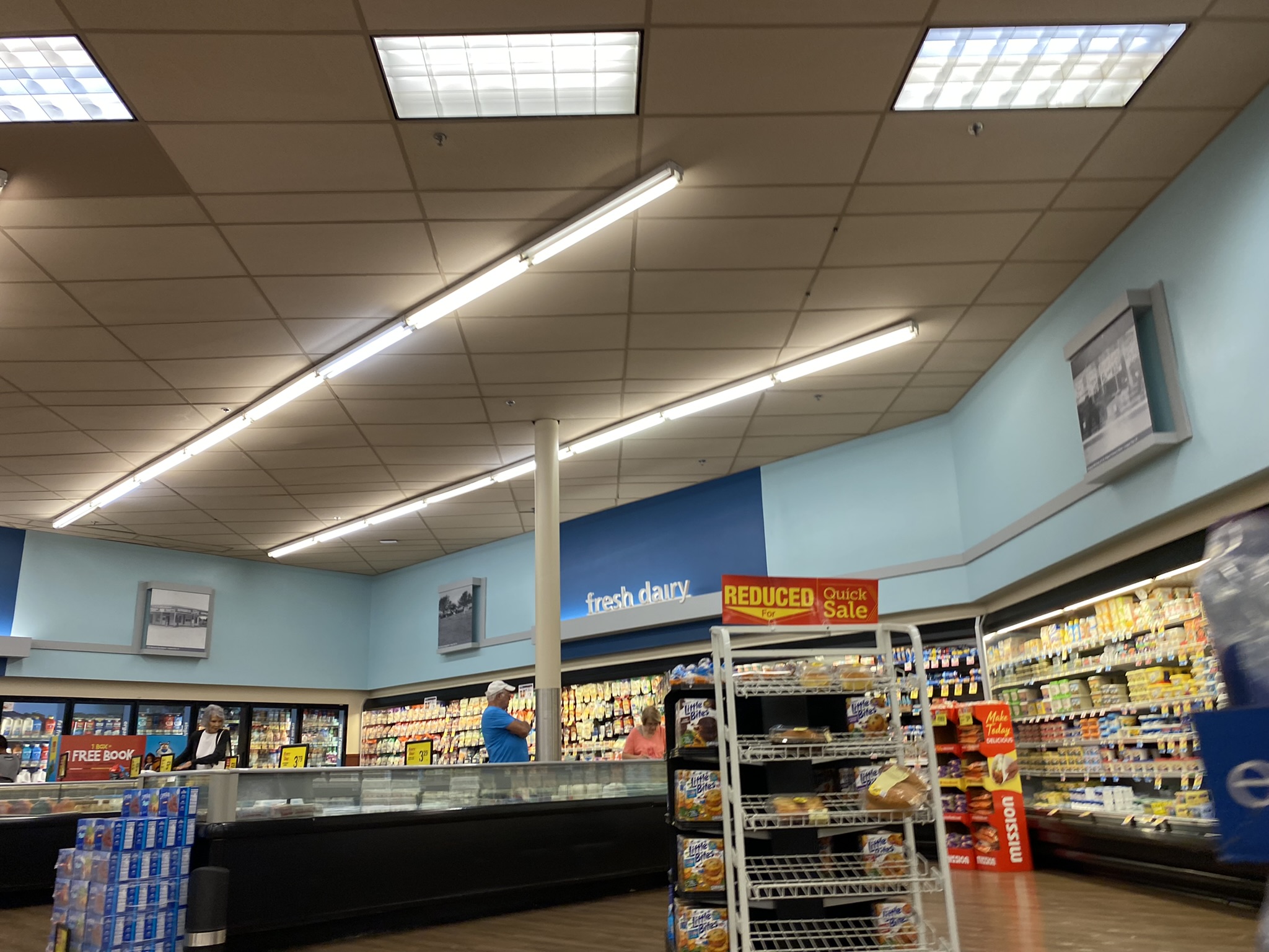
As is common with Randall’s stores built by Randall’s, this store has a dairy corner at the back of the store. This dairy corner is a bit larger than some of the ones at 1980s Randall’s stores.
It was a big deal for South Shore Harbour to land a Randall’s in 1991 because Randall’s was a really big deal in the Houston area at the time. The chain was still glowing from their success in the 1980s and competitors such as Kroger were still in the process of developing concepts such as the Kroger Signature stores that would ultimately successfully compete against Randall’s later in the 1990s and into the 2000s. Other competitors, such as HEB, Albertsons, and Wal-Mart’s Supercenters, had not entered the Houston area yet. One major competitor of note that Randall’s would have had in the NASA area at the time was the Fiesta Mart in the Webster/Friendswood area at 20740 Gulf Freeway that opened in 1989, but that store, no matter how fancy it was, ultimately had a short life as it had closed by 1994.
The blue colors used in the dairy department are one of Colorful Lifestyle v2’s more striking features. This certainly gives the store a brighter look than it had before with the Lifestyle v2 beige.
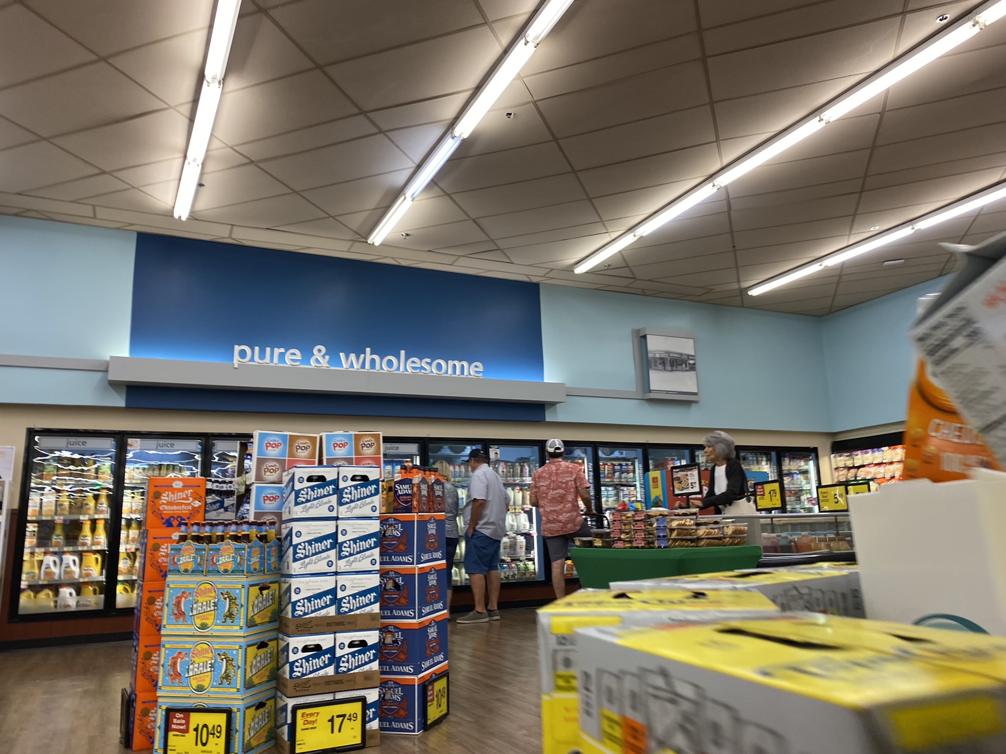
It is quite unlikely that Bob Onstead would have considered beer to be pure and wholesome! Of course, that slogan is intended to describe dairy products.
Here is another look at some local flair around this store. We can also see some of the different colors used in this store in this photo.
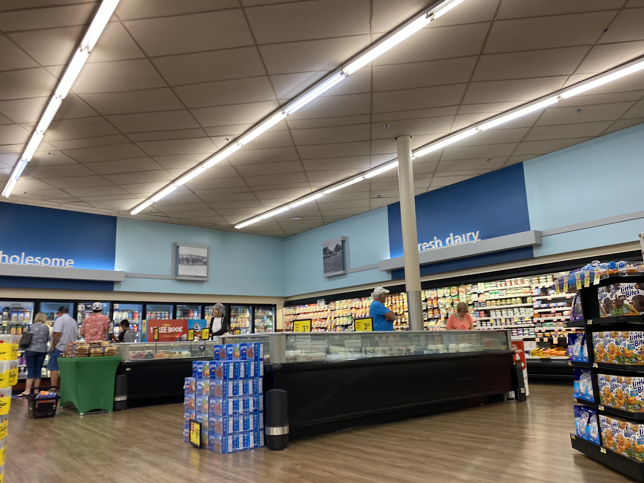
Just as the dairy corner is a common Randall’s design, the continuation of the dairy department along the far side wall of the store is also a common Randall’s design. Beer and wine were certainly not common Randall’s items during the time that this store opened. In 1991, Randall’s was still not selling beer and wine in their stores.
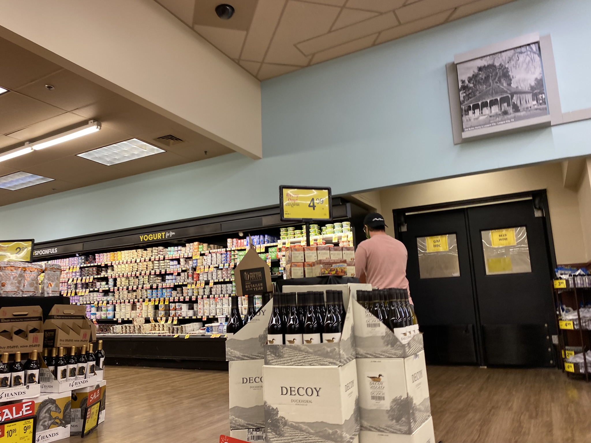
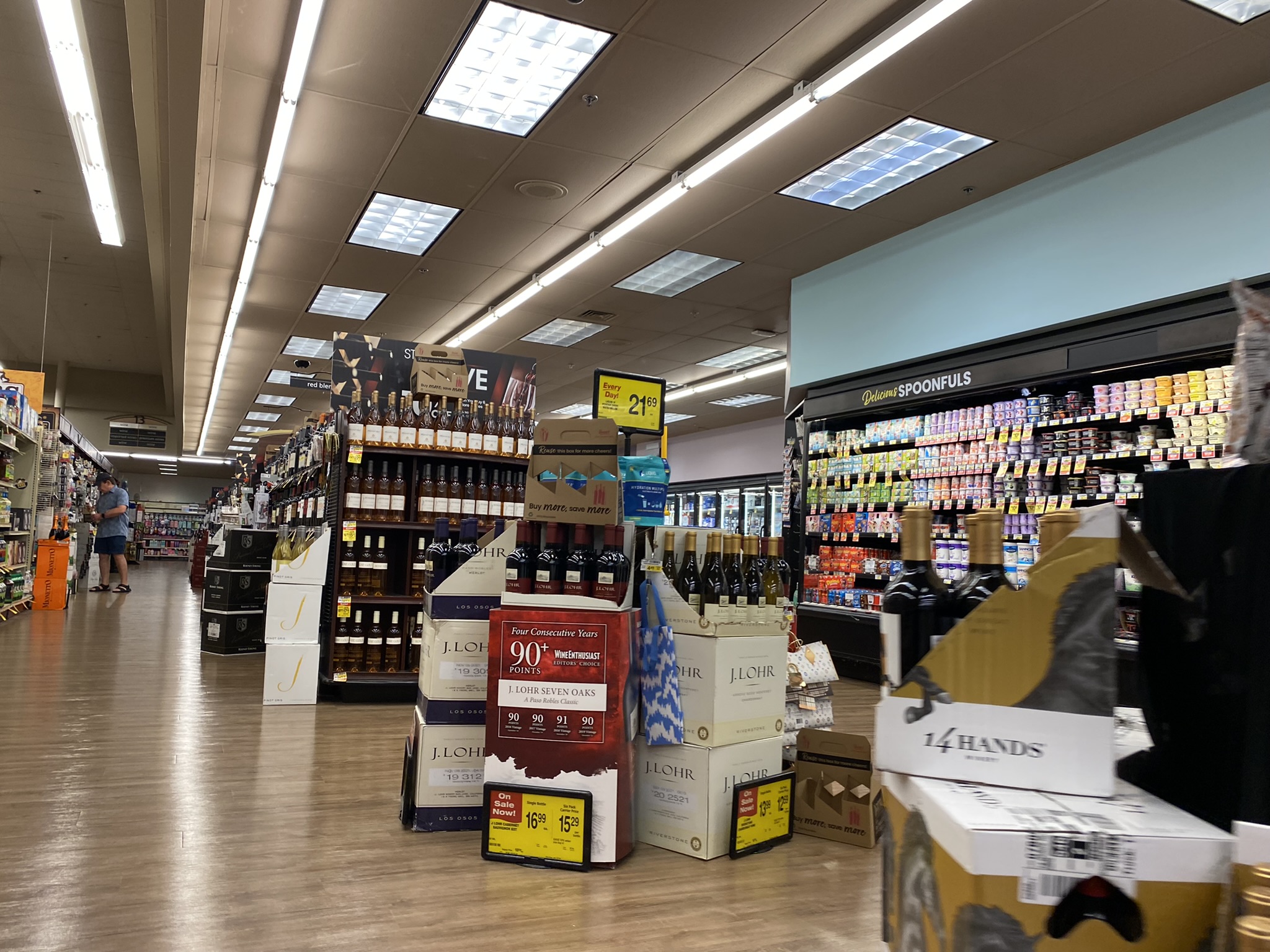
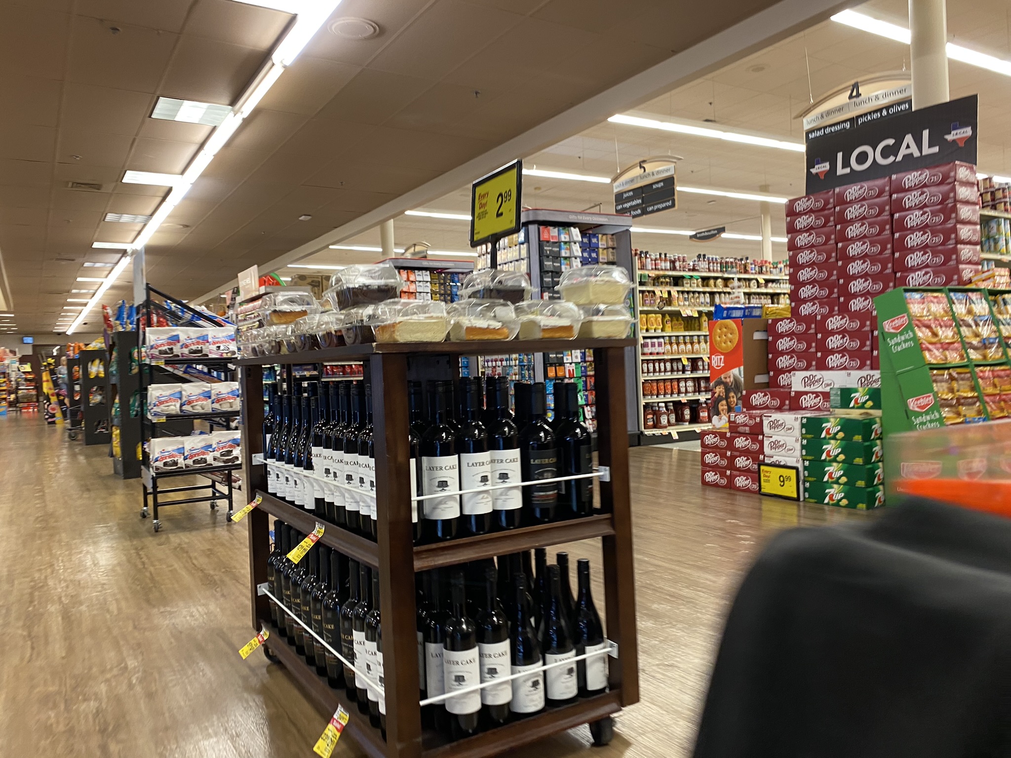
This Randall’s has a larger wine selection than some of the other smaller Randall’s stores in the Houston area. Here, wine and candy share an aisle.
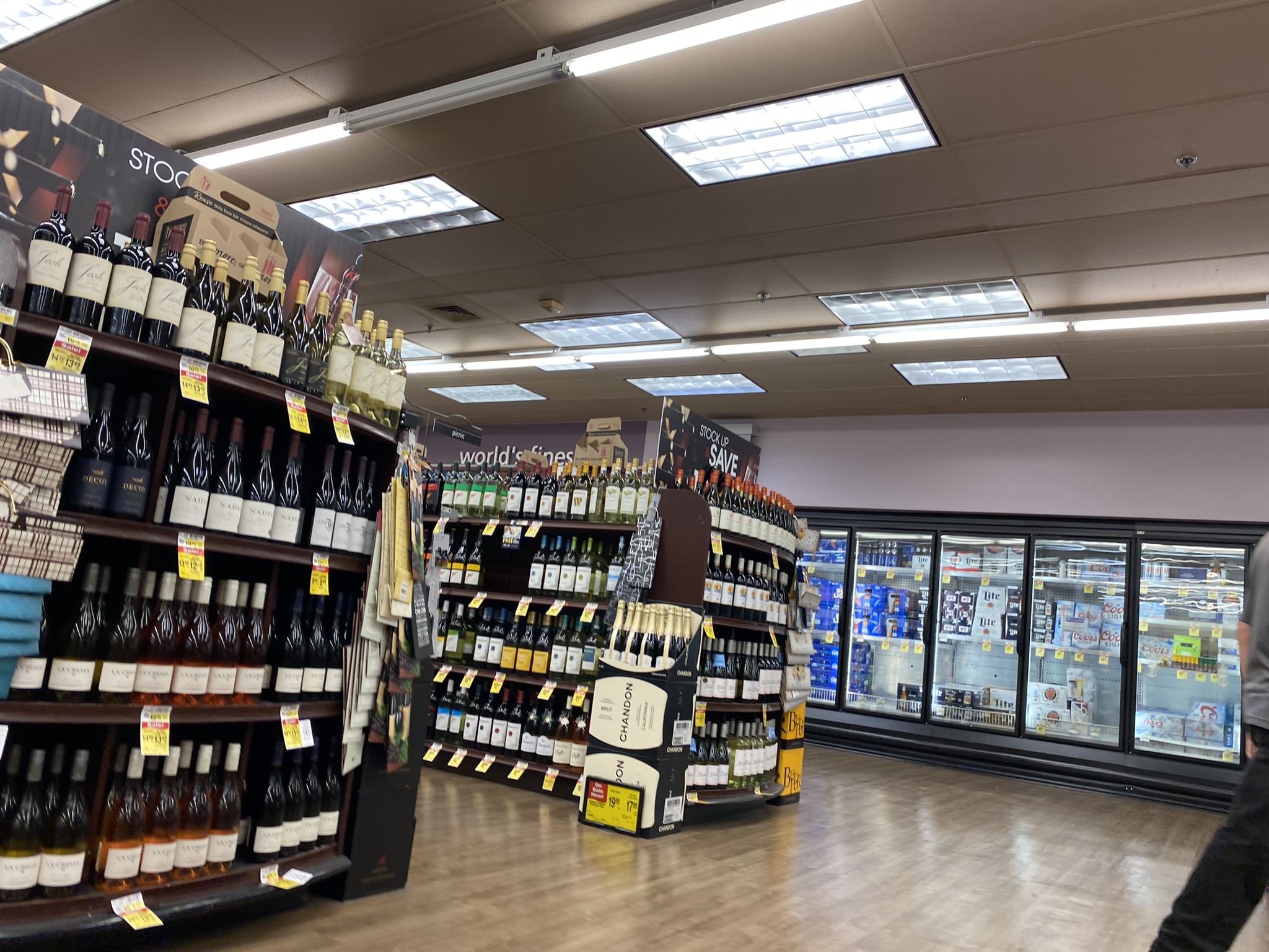
Here we see yet another color, lavender, that is a part of the Colorful Lifestyle v2 palette.
Loyal Houston Historic Retail readers might already know that HEB made a splash in the Clear Lake area recently when they closed their HEBertsons location at El Camino Real & Bay Area Blvd. late in 2021 and opened a new store across Interstate 45 from Baybrook Mall. Just from observing the parking lot of this new HEB, the new HEB seems to be very successful. Randall’s surely must have sensed that their South Shore Harbour might lose some business to the new HEB and so the Randall’s recently received an update. The fairly common Safeway Lifestyle v2 décor that the South Shore Harbour Randall’s had was updated to the Safeway Colorful Lifestyle v2 décor package. Not only has the new décor given the Randall’s a more colorful look, the store also now integrates local flair. This is common with the Safeway Colorful Lifestyle v2 décor. As one can see in the photos of this store, historical images from League City and elsewhere in the area are featured around the store.
Here is another look at the wine displays along with another look at varying ceiling heights at this store.
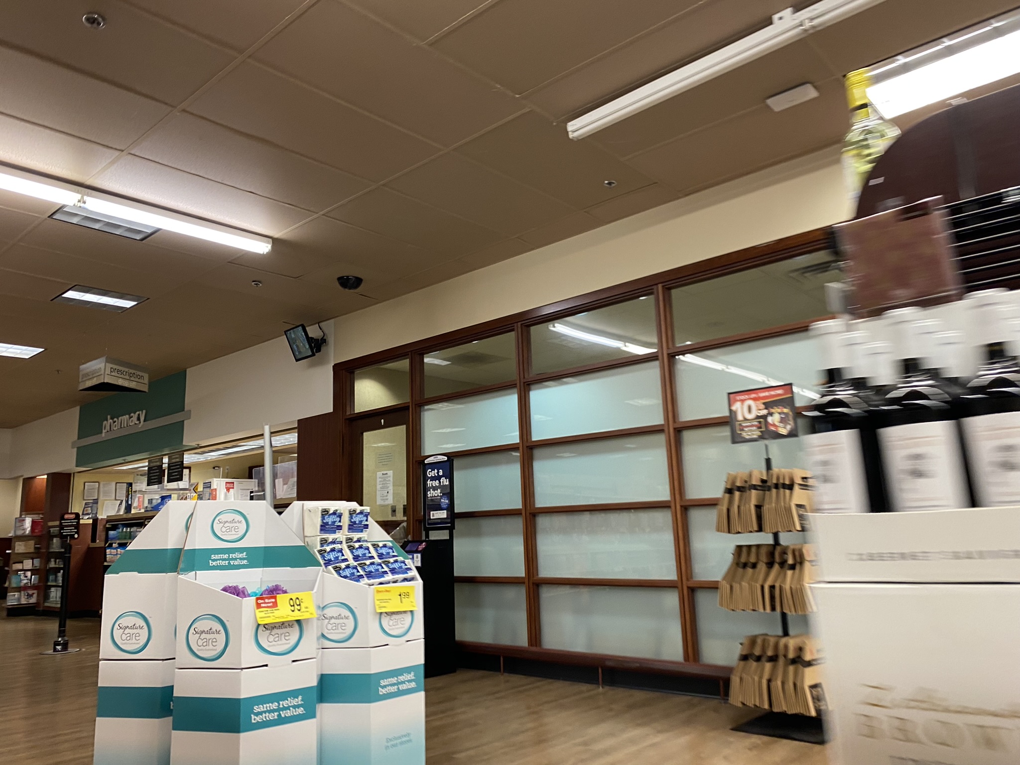
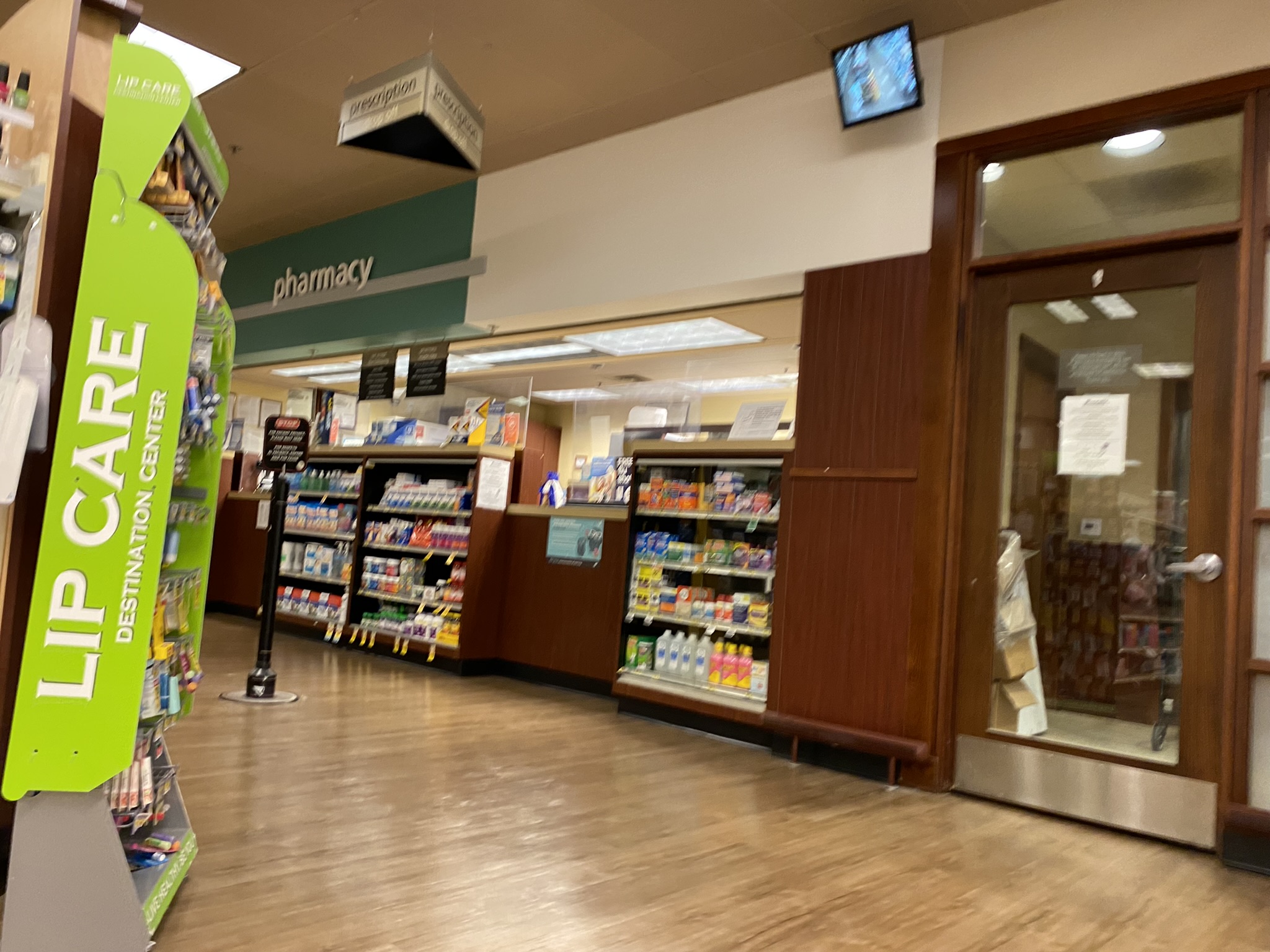
Here is a look at the pharmacy area. The woodgrain finishes were a part of the previous decor package, but it still has a classy look with the new decor as well.
Here is a closer look at the teal and white colors used in the pharmacy area.
Here is a look at the front end of the store. In many ways, this has not changed too dramatically with the new decor package.
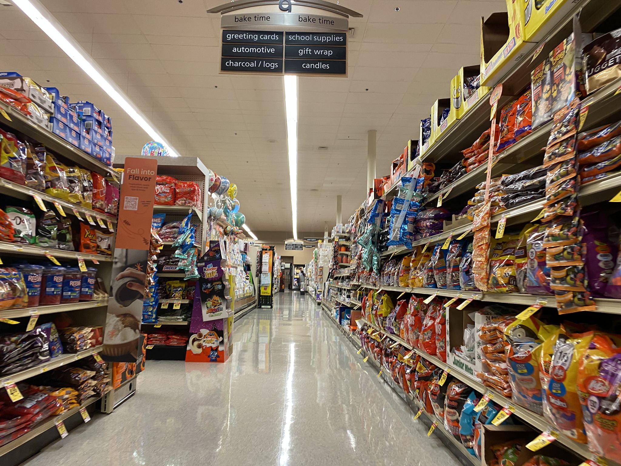
Although this store has Colorful Lifestyle v2 decor, it did not get the new aisle markers which are typically used with Colorful Lifestyle v2. Instead, the old Lifestyle v2 aisle markers are used instead. Don’t ask me what the items in this aisle have to do with baking!
Here’s a closer look at one of the endcaps on the aisle cut-throughs used at this location.
While the new décor is sure to make the Randall’s more competitive against the new HEB and other competitors in the area, it’s hardly a given that Randall’s will be able to compete against other stores. In fact, the League City area is slated to get one of the first new Gordon Food Service Stores in the Houston area in the next few weeks. That said, this Randall’s seems to be well-managed given that it has a 4.3 user review rating on Google Maps as of the writing of this blog post. This ties it with the highest-rated Randall’s stores in the Houston area. If this store continues to offer a higher-end shopping experience, it might be able to carve a successful niche for itself in a relatively affluent area.
Here’s a look at more cut-through endcaps. We also see the kind of flooring Randall’s uses in the parts of the store which don’t have the fake wood. I much prefer this kind of flooring to bare concrete.
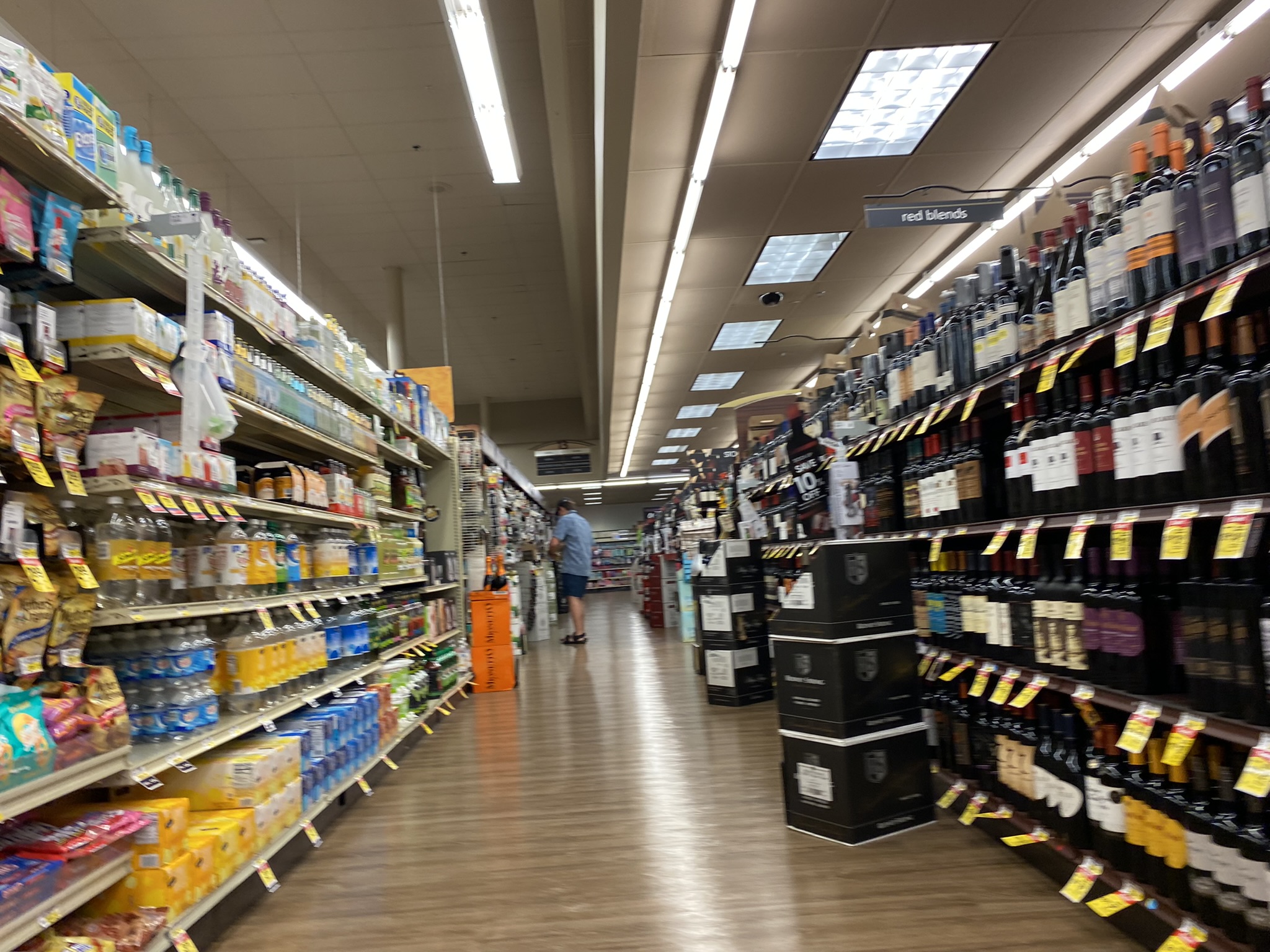
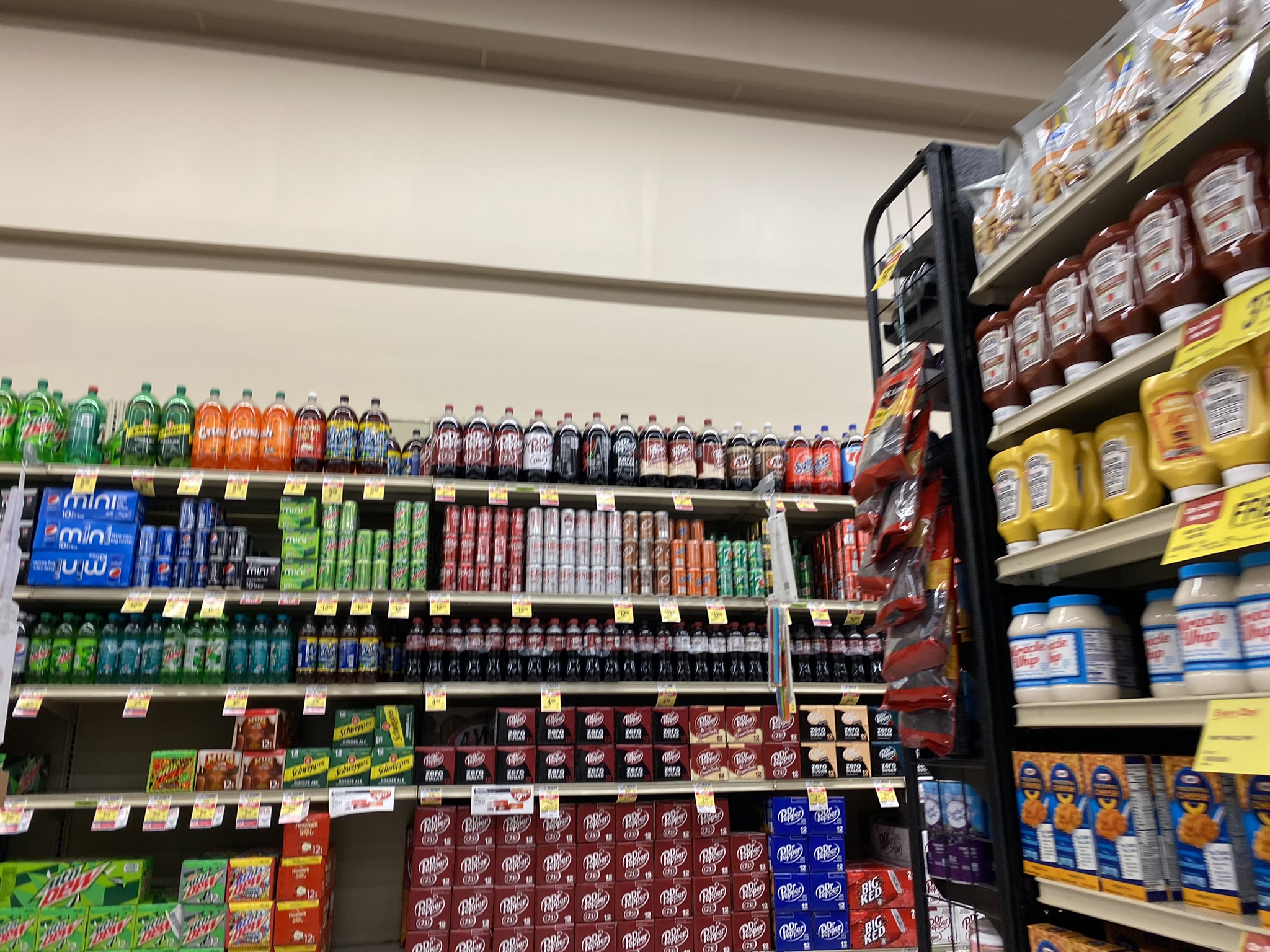
It’s not too common in my experience to see a Randall’s or Safeway store put their soft drinks along a wall, but this is the case here. This part of the store is rather undecorated. This might be because it is a rather odd design for a Safeway store.
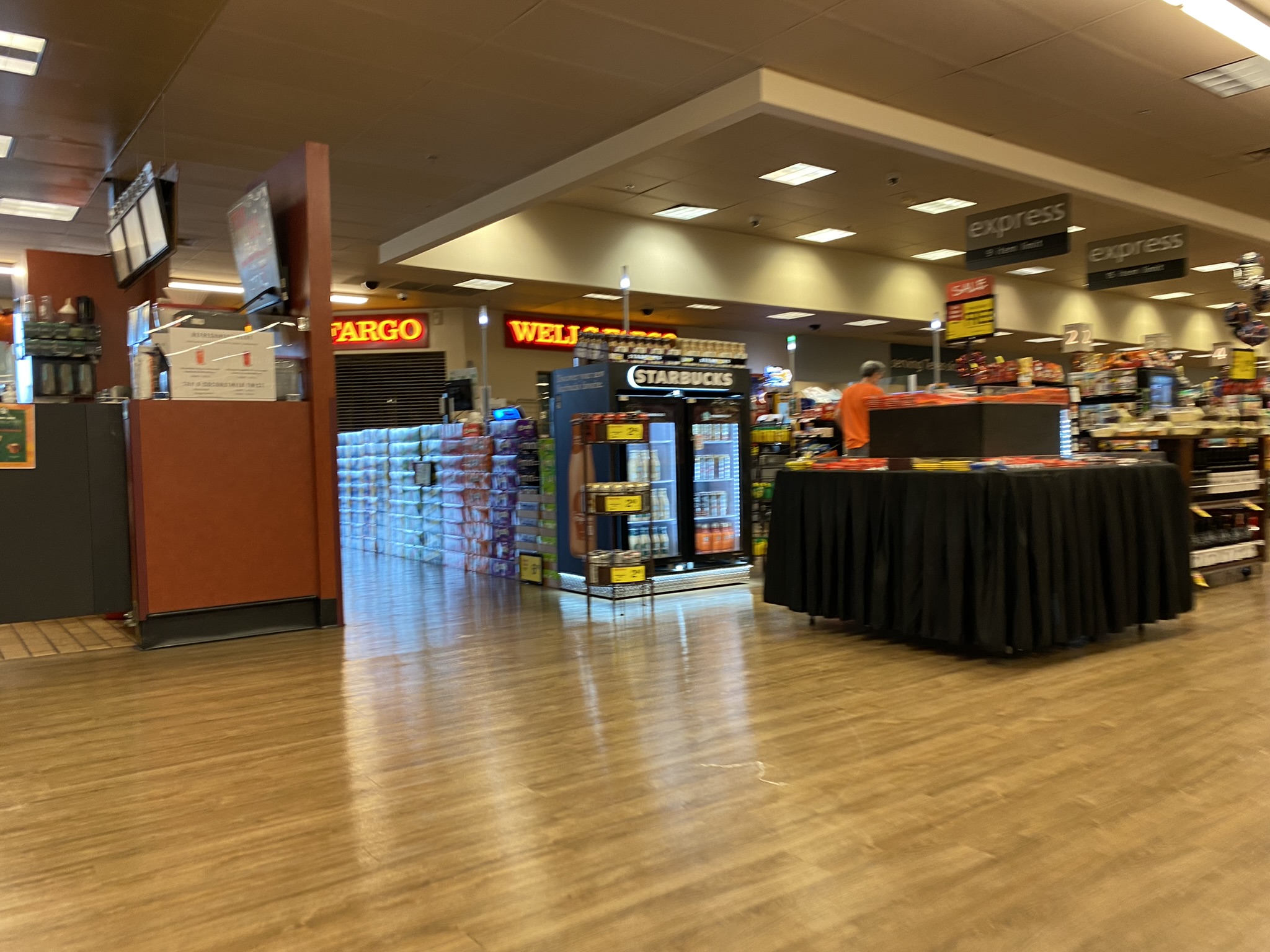
Unlike most other Houston area Randall’s stores, the in-store Wells Fargo Bank has not been removed.
Here’s a view from the register area of the store to the back of the store. Unlike 1970s and 1980s Houston Safeways which had a raised ceiling in the front and a lower rear part, this store has the opposite design.
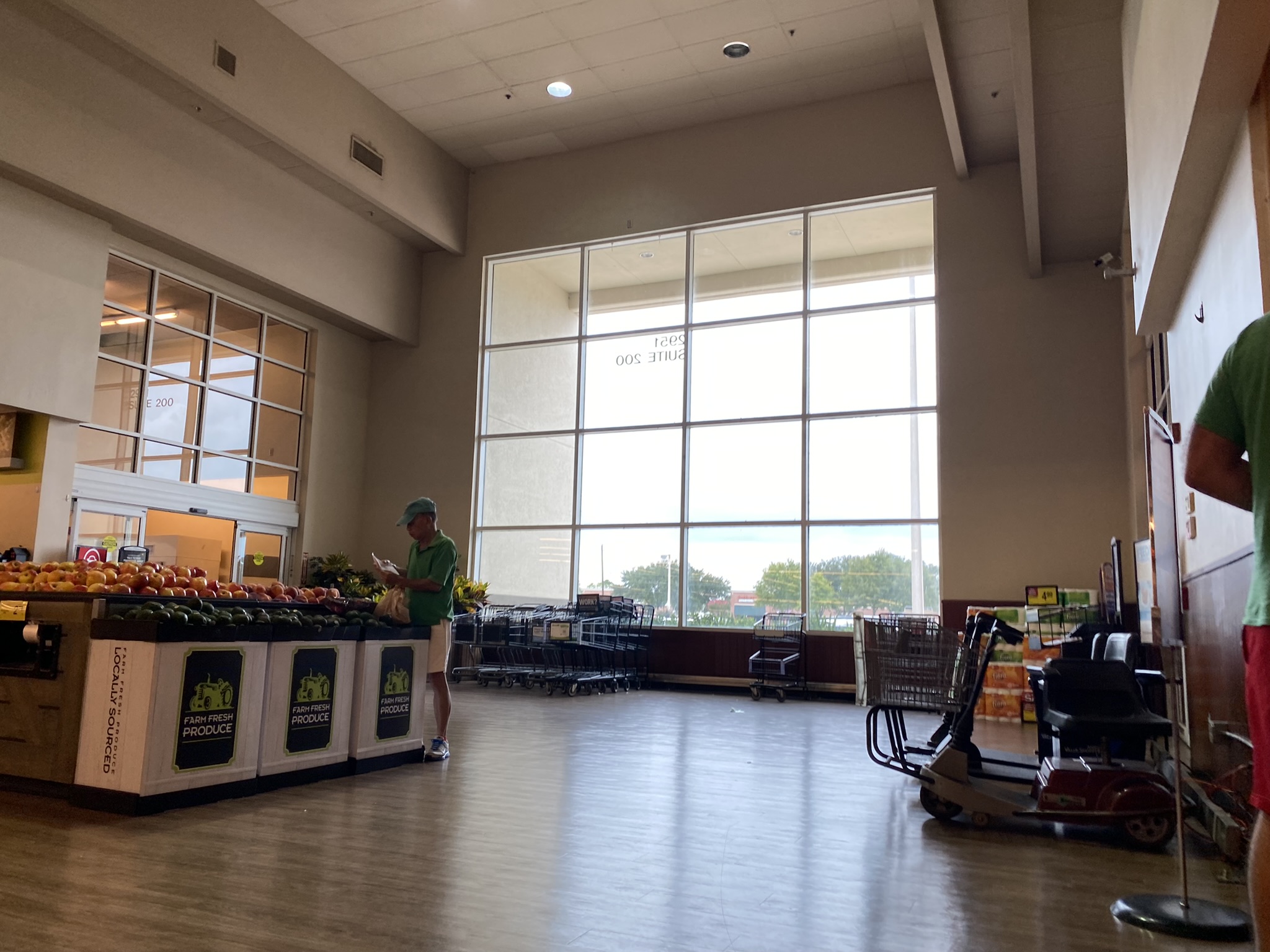
The large window at the grand entry allows a lot of natural light to enter the store.
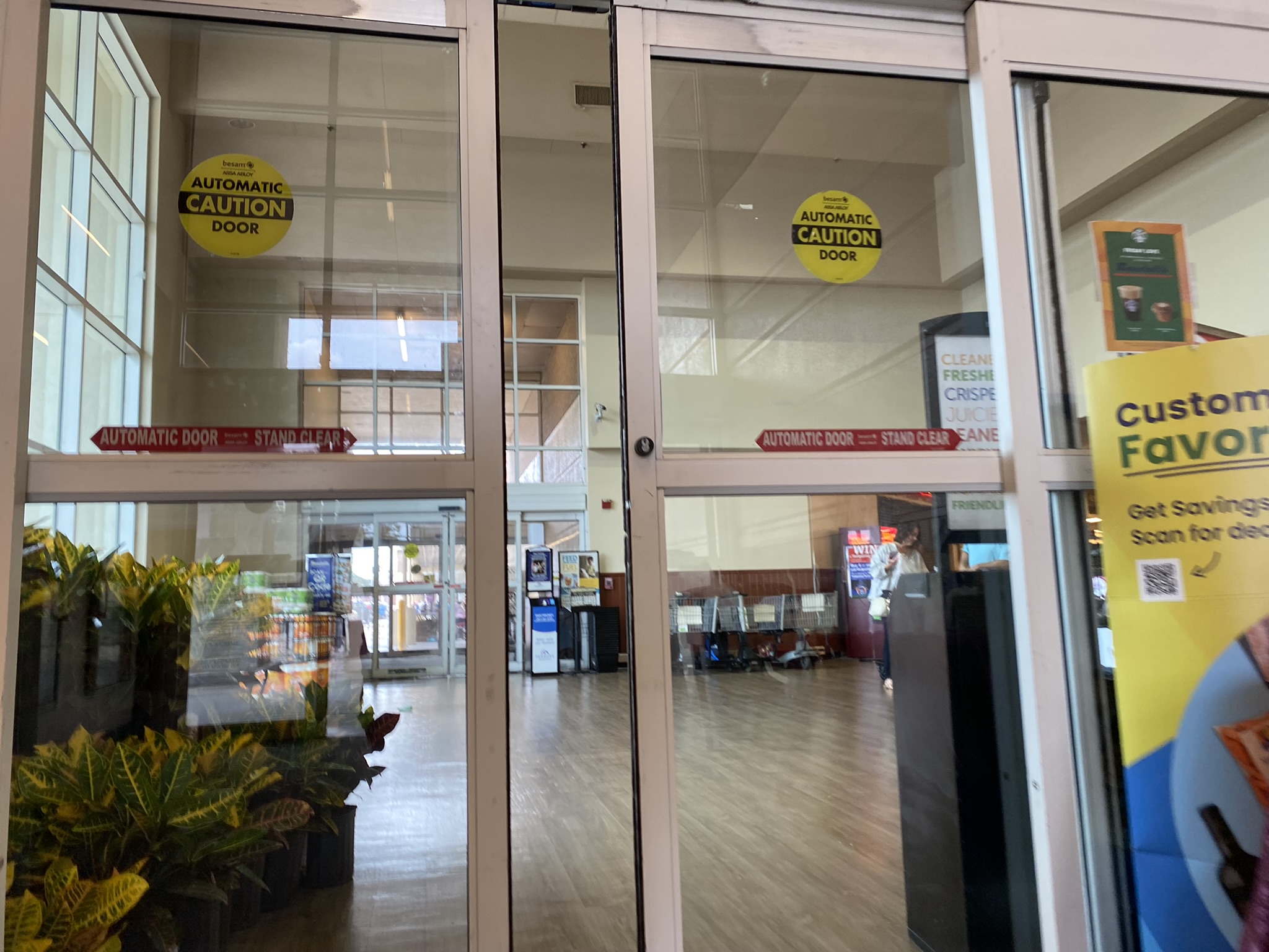
In addition to the grand entrance, there are also smaller vestibules which leads shoppers in and out of the store.
Do you have any thoughts or memories about the South Shore Harbour Randall’s? Do you have any thoughts about the Safeway Colorful Lifestyle v2 décor package that this Randall’s store features? If so, or if you have any other thoughts about this Randall’s, feel free to leave a comment in the comments section below! We love hearing from our readers!
I have an old college friend who moved within walking distance of this Randalls and, as a result, I’ve visited this store more in the last year than I have in the prior 20 years’ combined. Until reading this well-done article, I had no idea this store was spruced up or that it was better than the few other local Randalls. It is a nice store in a very nice part of town.
Strangely enough, by visiting this store more often, I’ve been tempted to visit the other local Inner Loop stores and they aren’t too bad. The West U/Bellaire store is the best, followed by Bissonnet/Wesleyan, and the South Post Oak one is still decent but definitely the third best.
Thanks for the comment, I’m glad you liked the post! I will agree with your ranking of inside the Loop Randall’s locations, the Vanderbilt Square Randall’s on W. Holcombe is probably the nicest of the three. Like Vanderbilt Square, Weslayan is also a Flagship Randall’s (which used to mean a lot more than it does now) so that does give it an edge over the W. Bellfort Kosher Randall’s which was built as a traditional 1980s Randall’s store. Even that W. Bellfort store is a pretty nice place to shop though. All of these Randall’s stores are pretty nice.
W. Bellfort is the only store on this list, including the South Shore Harbour Randall’s, which has Safeway’s Lifestyle v3 decor package as compared to Safeway’s Colorful Lifestyle v2 decor package which all the other stores have. Colorful Lifestyle v2 is actually newer than Lifestyle v3, but I suppose it depends on how you want to look at it. Colorful Lifestyle v2 is a variation on the mid-2000s Lifestyle v2 decor, but with more colorful and variable colors and with local flair photos. I like both Lifestyle v3 and Colorful Lifestyle v2. I probably give Colorful Lifestyle v2 a small edge, but it is close.
This remodel is pretty colorful for a modern era Randalls store. This decor package makes the store look much more inviting which is needed. I am glad that a lot of grocers are ditching the drab 2010’s look in favor of something more appealing to the eyes. With LED lighting getting more vibrant, the beige and vanilla designs are just not suited for those colors.
Hi Je, the funny thing about Colorful Lifestyle v2 decor package that Randall’s/Tom Thumb seems to favor in current times is that it is really only a slight modification of the Lifestyle v2 decor package that came out in the mid-to-late 2000s. The main differences is that the monotone beige and brown colors are replaced with varied vivid colors, the use of local flair, and the use of brighter flooring tiles. Even though these differences are small, the actual effect it has on stores is dramatic.
The old beige Lifestyle v2 decor, IMO, looked good in some stores, but it looked quite bad in others. It all depended on the amount of lighting the store had. Unfortunately, Safeway also started using dim lighting in a lot of their stores in the 2000s when they rolled out Lifestyle v1/Lifestyle v2. The dark lighting and beige/brown colors made stores look very dark and dingy. Stores that kept brighter lighting, like the Champions Randall’s, look much better with the beige Lifestyle v2. Nonetheless, Colorful Lifestyle v2 is a much nicer, brighter look without giving up the comforting and classy look compared to many other supermarkets’ modern decor.
I completely agree that LEDs make these more bland stores just look awful. They tend to blow out colors, and when there’s not much to reflect, you end up with a dull looking store. I do wish grocers would look into that faux-neon LED style lighting which is growing in popularity. They’re cheap, don’t break as easily a neon tubes, and energy efficient.